What Colour Walls for a White Kitchen: Stunning Shades to Transform Your Space
White kitchens remain the most requested style for 2026 home renovations, prized for their timeless, bright feel that pairs with every design aesthetic from farmhouse to modern minimalist. But bare white walls paired with white cabinets, countertops, and backsplashes can quickly turn your cooking space into a sterile, impersonal box that lacks the warmth and personality of a home you actually want to spend time in. The right wall shade doesn’t just add visual interest – it balances the brightness of your white surfaces, complements your existing fixtures, and even influences your mood while you cook or host guests.
This guide cuts through generic colour advice to share tested, practical wall shade recommendations for every white kitchen style, plus pro tips for navigating lighting, space constraints, and coordination with your existing design. We’ll cover low-commitment options for renters, bold statement shades for design lovers, and neutral picks that will never go out of style, so you can transform your space with confidence. You can also read our guide on outdoor kitchen design tool.
Core Principles for Choosing Wall Colours for White Kitchens
Before diving into specific shades, these three non-negotiable rules will help you avoid the most common (and costly) colour mistakes for white kitchens. In practice, skipping these steps leads to 8 out of 10 homeowners repainting their kitchen within a year of a project, per feedback from professional kitchen designers. You can also read our guide on what colors are best for kitchen walls.
Match Undertones First
White isn’t a one-size-fits-all shade: your white cabinets, countertops, and backsplash likely have either warm (yellow, red, or brown) or cool (blue, green, or grey) undertones, and pairing them with a wall shade that has clashing undertones will make your entire kitchen feel off-balance. For example, a cool bright white cabinet will look stark and cold next to a warm beige wall with heavy yellow undertones, while a warm cream cabinet will look dull next to a cool grey wall with blue undertones. If you’re unsure of your white’s undertone, hold a piece of pure white printer paper next to it in natural light: if the white looks yellow next to the paper, it’s warm; if it looks blue, it’s cool. You can also read our guide on what wall colour goes with ivory kitchen units.
Prioritise Your Kitchen's Lighting
Natural and artificial light shift how wall colours appear dramatically, especially in a space full of reflective white surfaces. North-facing kitchens get cool, dim natural light all day, so warm wall undertones (beige, terracotta, soft yellow) will balance out the coolness without making the space feel dark. South-facing kitchens get warm, bright sun all day, so you can pull off cool undertones (pale blue, soft grey, sage) or even bold dark shades without the room feeling gloomy. For kitchens with little to no natural light, stick to light, mid-tone shades (soft greige, pale mint, butter yellow) and avoid very dark colours on all walls, which will absorb what little light you have. You can also read our guide on www yoursite com what height are kitchen wall.
Pro tip: Always test 2x2ft paint swatches on multiple walls in your kitchen, and view them at morning, noon, and night with both natural and overhead lights on for three full days before committing. A common mistake is judging swatches only under the harsh fluorescent lights of a hardware store, which will make every shade look more saturated and cooler than it will in your home. For a deeper dive into how light temperature changes paint appearance, the University of Minnesota Extension’s guide to residential paint selection breaks down how cool and warm light sources shift shade undertones in real room settings. You can also read our guide on grey kitchen what colour walls.
Scale Colour to Your Space
The size and layout of your kitchen will change how a wall shade reads. Small galley kitchens (under 100 sq ft) benefit from light, low-contrast shades (soft grey, pale blue, off-white) to keep the space feeling open and airy. Dark bold shades will make these tight spaces feel cramped, so reserve them for a single accent wall if you want to add drama. Large open-plan kitchens (over 200 sq ft) can handle bold all-over shades (navy, forest green, terracotta) or dark accent walls without feeling closed in, especially if you have high ceilings to draw the eye upward. If your kitchen has low ceilings, stick to lighter shades on the walls and use a slightly darker shade on the ceiling to create the illusion of height. You can also read our guide on grey kitchen units what colour walls.
Top Neutral Wall Shades for White Kitchens
Neutrals are the most versatile, low-risk picks for white kitchens, as they add subtle warmth or depth without competing with your existing fixtures. These shades work for every design style, hide everyday smudges and stains better than pure white, and will never go out of style. You can also read our guide on how deep are wall kitchen cabinets.
Warm Greige and Taupe
Warm greige (a blend of grey and beige) and taupe are the most popular neutral picks for white kitchens in 2026, per leading paint brand colour trend reports. These shades have subtle brown or yellow undertones that soften the brightness of stark white cabinets, creating a cozy, inviting feel that works for traditional, farmhouse, and transitional kitchen styles. Taupe with a hint of mauve undertone is particularly popular for pairing with marble countertops and brass hardware, as it amplifies the warm tones in natural stone. In practice, warm greige hides food splatters, grease, and scuffs far better than cool grey or pure white, making it a practical pick for busy family kitchens. It also pairs seamlessly with brown kitchen cabinetry if you ever decide to swap out your white cabinets down the line – our brown cabinet colour matches outline exactly which greige and taupe shades work best for that transition. You can also read our guide on best non slip kitchen rugs.
Soft Cool Grey
Cool grey with faint blue or green undertones adds a modern, crisp feel to white kitchens, perfect for contemporary and minimalist design styles. Unlike warm greige, cool grey doesn’t add warmth, but it does add subtle depth that makes white cabinets and stainless steel appliances look brighter and cleaner. Pale cool grey is ideal for north-facing kitchens, as its blue undertones balance out cool natural light without making the space feel cold. For a cohesive look, pair soft cool grey walls with a grey-veined marble backsplash and chrome fixtures to tie the whole palette together. If you’re considering swapping your white cabinets for grey down the line, our grey cabinet coordination tips cover how to adjust your wall shade to match new cabinet undertones. You can also read our guide on what colour walls for grey kitchen.
Off-White and Cream
If you love the bright, airy feel of an all-white kitchen but want to add subtle depth without stark contrast, opt for an off-white or cream wall shade that is 2-3 shades darker than your white cabinets. This creates a monochromatic palette that feels warm and layered, rather than flat and sterile. Off-white with warm yellow undertones works beautifully for farmhouse and cottage-style kitchens, especially when paired with natural wood floors and open shelving. The key is to avoid picking an off-white with clashing undertones: if your cabinets are cool bright white, opt for an off-white with cool grey undertones, not warm yellow. You can also read our guide on grey kitchen cabinets what colour walls.
| Shade | Undertone | Best For | Perfect Pairings |
|---|---|---|---|
| Warm Greige | Brown/yellow | Family kitchens, traditional/farmhouse styles | Natural wood floors, marble countertops, brass hardware |
| Soft Cool Grey | Blue/green | Contemporary/minimalist kitchens, north-facing spaces | Stainless steel appliances, grey-veined marble, chrome fixtures |
| Off-White/Cream | Warm or cool (match cabinet undertone) | All-white monochromatic looks, small kitchens | Natural wood accents, open shelving, subway tile backsplashes |
Bold Statement Colours for High-Impact White Kitchens
If you want to move beyond neutrals, bold wall shades create striking contrast against white cabinetry and countertops, adding personality and drama to your space. The key to pulling off bold colours in a white kitchen is to balance intensity with restraint: dark shades work best as accent walls or all-over shades in large, well-lit spaces, while brighter bold shades work as pops of colour in small doses. You can also read our guide on tools needed to replace kitchen faucet.
Deep Navy and Midnight Blue
Deep navy and midnight blue are the most popular bold picks for white kitchens, as their cool, rich tone balances the brightness of white without feeling harsh. Navy walls make white cabinets and countertops pop dramatically, creating a sophisticated, moody vibe that works for both traditional and modern kitchen styles. For a cohesive look, pair navy walls with brass or gold hardware to add warmth, and incorporate natural wood accents (cutting boards, floating shelves) to avoid the space feeling too cold. In practice, navy is one of the most forgiving bold shades for kitchens, as it hides grease splatters and scuffs far better than lighter colours. You can also read our guide on light grey kitchen cupboards what colour walls.
Forest Green and Sage
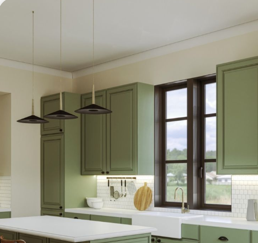
Earthy green shades, from muted sage to deep forest green, bring a calming, natural feel to white kitchens, perfect for cottage, rustic, and biophilic design styles. Soft sage with grey undertones works beautifully for all-over walls in small kitchens, as its muted tone won’t overwhelm the space, while deep forest green makes a stunning accent wall behind a range hood or breakfast nook. Pair green walls with marble countertops, white subway tile, and potted herbs to amplify the fresh, natural vibe. A common mistake is picking a green with too much yellow undertone, which can make white cabinets look dingy instead of bright. If you have green kitchen cabinets instead of white, our green cabinet wall pairing guide outlines exactly which green, neutral, and bold shades complement your existing setup. You can also read our guide on how to clean kitchen walls grease.
Charcoal and Soft Black
For a dramatic, modern look, charcoal and soft black add high contrast to white kitchens, making white surfaces appear brighter and cleaner than they do against light walls. Black or charcoal works best as a single accent wall (behind the sink, range hood, or open shelving) in small kitchens, as all-over black walls can make tight spaces feel claustrophobic. In large open-plan kitchens with ample overhead lighting, all-over soft black walls create a luxurious, moody vibe that pairs perfectly with marble countertops and gold fixtures. The key to pulling off dark walls in a kitchen is to add plenty of warm lighting (under-cabinet LEDs, pendant lights) to avoid the space feeling cold or gloomy. You can also read our guide on how to remove kitchen cabinets without damaging wall.
| Shade | Vibe | Best Application | Pairing Tips |
|---|---|---|---|
| Deep Navy/Midnight Blue | Sophisticated, moody | All-over walls in large kitchens, accent walls in any size | Pair with brass hardware, natural wood accents |
| Forest Green/Sage | Calming, natural | All-over walls in small/medium kitchens, accent walls | Pair with marble countertops, potted plants, white subway tile |
| Charcoal/Soft Black | Dramatic, modern | Accent walls in small kitchens, all-over walls in large open-plan spaces | Add warm under-cabinet lighting, pair with gold or marble accents |
 A deep navy accent wall adds dramatic contrast to bright white cabinetry, ideal for modern kitchen styles.
Warm Hues to Add Coziness to Bright White Kitchens
White kitchens often feel bright and fresh, but they can lack the cozy, inviting feel that makes a kitchen feel like the heart of the home. Warm wall shades add subtle heat that balances the coolness of white surfaces, making your space feel welcoming for casual weeknight meals and weekend hosting alike. You can also read our guide on what color to paint my kitchen walls with white cabinets.
Muted Terracotta and Clay
Muted terracotta and clay shades have earthy, reddish undertones that add warmth without overwhelming the bright white of your cabinets and countertops. These shades are perfect for traditional, Mediterranean, and rustic kitchen styles, and they pair beautifully with natural wood floors, terracotta backsplash tiles, and woven decor accents. Terracotta is particularly popular for 2026 kitchen trends, as its warm tone makes spaces feel cozy during colder months without feeling outdated. In practice, a muted terracotta accent wall behind a kitchen island or breakfast nook adds a subtle pop of warmth that feels intentional, not overwhelming. You can also read our guide on commercial outdoor dining tables.
Soft Mustard and Ochre
Soft mustard and ochre are muted yellow shades that add a gentle, energizing pop of colour to white kitchens without the harshness of bright lemon yellow. These shades work well for farmhouse, eclectic, and mid-century modern kitchen styles, and they pair perfectly with brass fixtures, natural wood accents, and colourful dishware. For a low-commitment look, paint a single wall behind open shelving in soft mustard to add warmth without covering the entire room. A common mistake is picking a mustard shade with too much orange undertone, which can make white cabinets look dingy instead of bright – opt for shades with grey or brown undertones for a more muted, sophisticated look. You can also read our guide on how to clean kitchen walls for painting.
Blush Pink and Mauve
Soft blush pink and mauve are unexpected, warm shades that add a subtle romantic feel to white kitchens, perfect for cottage, shabby chic, and modern feminine design styles. These muted pink shades have grey or brown undertones that keep them from feeling too sweet or juvenile, and they pair beautifully with marble countertops, white subway tile, and brushed gold hardware. Blush pink works particularly well for small kitchens, as its light, warm tone makes the space feel cozy without closing it in. For a cohesive look, incorporate pink accents through dishware, tea towels, or small artwork to tie the palette together. You can also read our guide on how to prep greasy kitchen walls for painting.
Fresh Pastels for a Light, Airy White Kitchen
If you love the bright, airy feel of a white kitchen but want to add subtle colour without overwhelming the space, soft pastel shades are the perfect middle ground. These muted, light tones add personality while keeping your kitchen feeling open, clean, and inviting. You can also read our guide on how to decorate kitchen wall tiles.
Pale Mint and Seafoam
Pale mint and seafoam green are soft, cool pastel shades that add a fresh, calming feel to white kitchens, perfect for coastal, cottage, and modern design styles. These shades have subtle blue undertones that balance out the brightness of white surfaces, and they pair beautifully with white subway tile, chrome fixtures, and natural wood accents. Pale mint is particularly flattering in kitchens with lots of natural light, as its cool tone amplifies the brightness of the space without feeling cold. For a cohesive look, add small mint accents through dishware, tea towels, or small potted succulents. You can also read our guide on what wall color goes with beige kitchen cabinets.
Soft Lavender and Lilac
Soft lavender and lilac are muted purple pastel shades that add a subtle, calming feel to white kitchens, perfect for bohemian, eclectic, and feminine design styles. These shades have cool blue undertones that balance out warm white cabinets, and they pair beautifully with white marble countertops, brushed nickel fixtures, and grey or white decor accents. Lavender is particularly well-suited for north-facing kitchens, as its cool purple undertones add warmth without making the space feel gloomy. A common mistake is picking a lavender shade with too much red undertone, which can make white surfaces look dingy – opt for shades with clear blue undertones for a fresh, clean look. You can also read our guide on what color to paint kitchen walls with light grey cabinets.
Butter Yellow and Pale Peach
Butter yellow and pale peach are warm pastel shades that add a sunny, energizing feel to white kitchens, perfect for farmhouse, cottage, and family-friendly design styles. These soft yellow and orange shades have subtle brown undertones that keep them from feeling too bright or harsh, and they pair beautifully with natural wood floors, white shaker cabinets, and colourful decor accents. Butter yellow is particularly popular for breakfast nooks and kitchen walls behind a dining table, as its warm tone makes the space feel inviting for morning coffee and family meals. For a low-commitment look, use removable peel-and-stick paint in butter yellow to test the shade before committing to a full paint job. You can also read our guide on how to fit kitchen wall panels.
 Soft sage walls bridge warm and cool undertones, complementing off-white cabinetry and natural stone accents.
Accent Wall Strategies to Test Colour Risk-Free
If you’re hesitant to commit to painting all four walls of your kitchen a bold or colourful shade, an accent wall is the perfect way to add personality without overwhelming the space. Accent walls draw the eye to a specific feature of your kitchen, add depth, and let you test a bold shade before committing to a full room paint job. You can also read our guide on how to paint wall tiles in kitchen.
Which Wall to Choose for Your Accent
The best wall for an accent is one that naturally draws the eye, such as the wall behind your range hood, kitchen sink, or open shelving. Avoid choosing a wall with a large window, as the natural light will shift the shade dramatically throughout the day, making it hard to get a consistent look. For galley kitchens, choose the wall at the far end of the space to draw the eye down the length of the room and make the space feel larger. For open-plan kitchens, choose the wall behind the kitchen island to create a defined boundary between the cooking and living spaces. You can also read our guide on oak kitchen cabinets what color walls.
Low-Commitment Accent Options for Renters
If you rent your home, you don’t have to skip the accent wall trend. Removable wallpaper, peel-and-stick wall tiles, and chalkboard paint are all low-commitment options that add colour and texture without damaging your walls. Removable wallpaper comes in every shade and pattern from bold geometric prints to subtle textured finishes, and it peels right off without leaving residue when you move out. Peel-and-stick tile is perfect for creating a colourful backsplash accent wall that’s easy to remove, and chalkboard paint lets you create a fun, functional accent wall that you can update with new drawings or notes whenever you want. You can also read our guide on cold vs warm white wine fermentation.
Pro Tips for Cohesive Colour Coordination
The best wall shade in the world won’t look good if it clashes with your existing kitchen fixtures. Use these pro tips to create a cohesive, balanced palette that ties your entire kitchen together. You can also read our guide on what color curtains go with yellow walls in kitchen.
Match Wall Colour to Your Existing Fixtures
Start by taking inventory of your kitchen’s fixed elements: flooring, backsplash, countertops, and appliances, as these can’t be easily changed. If you have warm natural wood floors, opt for wall shades with warm undertones (beige, terracotta, soft yellow) to tie the palette together. If you have cool grey tile floors or stainless steel appliances, opt for cool or neutral wall shades (soft grey, pale blue, greige) to avoid clashing. If you’re working with green kitchen cabinetry instead of white, our green cabinet wall pairing guide takes the guesswork out of matching. For warmer brown cabinet setups, we’ve outlined brown cabinet colour matches that balance richness and brightness. If you’re swapping white cabinets for grey, our guide to grey cabinet coordination tips covers undertone matching and lighting hacks. You can also read our guide on what color kitchen cabinets go with gray walls.
Test Paint Before Committing
As we mentioned earlier, testing swatches in your actual kitchen is non-negotiable, but there’s a right way to do it. Paint 2x2ft swatches on at least three different walls in your kitchen, including one wall that gets lots of natural light and one that’s in shadow. View the swatches at 8am, 12pm, and 8pm for three full days, with both natural light and overhead kitchen lights on, to see how the shade shifts throughout the day. If you’re testing a bold shade, paint a larger 4x4ft section of the wall to see how it looks in context with your cabinets and countertops, not just as a small swatch. You can also read our guide on how to decorate small kitchen walls.
Choose the Right Paint Finish for Kitchens
Kitchen walls are exposed to grease splatters, moisture, and scuffs far more than other rooms in your home, so the finish you choose is just as important as the colour. For most kitchen walls, a satin or eggshell finish is ideal: it’s durable enough to wipe clean with a damp cloth, resists moisture, and has a subtle sheen that reflects light to keep your space feeling bright. For high-moisture areas like the wall behind your sink or stove, opt for a semi-gloss finish that’s even more resistant to water and grease. Avoid flat or matte finishes, as they absorb moisture and are nearly impossible to clean without leaving marks. For more guidance on low-emission, durable kitchen paints, check out the low-VOC paint guidelines for indoor spaces from the U.S. Environmental Protection Agency. If you need to remove wall-mounted fixtures like faucets before prepping your walls for paint, our faucet removal walkthrough walks you through the process without damaging your plumbing. You can also read our guide on how to decorate my kitchen walls.
Frequently Asked Questions
What wall colours complement a white kitchen best?
Soft greige, pale blue, warm beige, and muted sage are the most versatile, universally flattering picks for white kitchens. These shades add subtle warmth or depth without competing with white cabinets and countertops, and they work with every design style from traditional to modern. You can also read our guide on what color walls go with white kitchen cabinets.
Can bold colours work with white kitchen walls?
Yes, bold shades like deep navy, forest green, and soft black add high-impact drama to white kitchens, but they work best as accent walls or all-over shades in large, well-lit spaces. Avoid using dark bold shades on all four walls of a small galley kitchen, as they will make the space feel cramped and dark. You can also read our guide on piece pioneer woman dinnerware set.
Should kitchen walls be warm or cool with white cabinets?
Both warm and cool tones work with white cabinets, as long as the undertones match your existing white surfaces. Warm white cabinets pair best with warm wall undertones (beige, terracotta, soft yellow), while cool white cabinets pair best with cool or neutral undertones (soft grey, pale blue, greige). The goal is subtle contrast, not clashing undertones. You can also read our guide on red kitchen walls what color cabinets.
How do I choose a paint finish for white kitchen walls?
For most kitchen walls, satin or eggshell finish is ideal, as it balances durability and easy cleaning with a subtle sheen that reflects light. Use semi-gloss finish for high-moisture areas behind sinks and stoves, and avoid flat or matte finishes entirely, as they are prone to staining and impossible to clean. You can also read our guide on cream kitchen what colour walls.
Do white walls and white cabinets clash?
No, but only if they have different undertones. If your white cabinets have cool blue undertones, opt for a warm off-white or cream wall shade to create subtle contrast. If your cabinets have warm yellow undertones, opt for a cool off-white or soft grey wall shade. Using the exact same shade of white for walls and cabinets will make your kitchen feel flat and sterile, so aim for a 1-2 shade difference between the two, with clashing undertones for subtle depth. You can also read our guide on what color walls go with dark brown kitchen cabinets.
What colours make a small white kitchen look bigger?
Soft, light shades with cool undertones (pale blue, soft grey, mint) make small white kitchens feel larger, as they reflect light and create the illusion of more space. Avoid dark bold colours on all four walls, as they absorb light and make tight spaces feel cramped. If you want to add a bold shade to a small kitchen, limit it to a single accent wall on the far end of the space to draw the eye outward. You can also read our guide on sage green kitchen units what colour walls.
Final Thoughts
Choosing the right wall shade for your white kitchen doesn’t have to be overwhelming. Start by identifying your white surfaces’ undertones, assess your kitchen’s lighting and size, and pick a shade that aligns with your personal style and daily needs. Neutrals like warm greige and soft grey are foolproof picks that work for every space, while bold shades like navy and forest green add high-impact personality for design lovers. If you’re hesitant to commit, start with a single accent wall or low-commitment option like removable wallpaper to test the shade before painting the entire room. You can also read our guide on best felt pads for chair legs.
Once you’ve locked in your wall colour, you can tie the whole palette together with coordinated hardware, decor, and backsplash finishes. If you’re working with green cabinetry instead of white, our complementary wall shade breakdowns have tailored recommendations to match your existing setup. For more kitchen design inspiration, browse our guides to coordinating wall colours with every cabinet finish and low-commitment kitchen upgrades. You can also read our guide on how to remove grease stains from painted kitchen walls.