How to Choose Kitchen Wall Color: Expert Tips for Stunning Results
As the most frequently used room in most homes, your kitchen’s wall color sets the tone for everything from morning coffee runs to holiday dinner prep. A mismatched shade can make a sunlit space feel gloomy, clash with your new cabinets, or make a compact galley kitchen feel even more cramped. But the right hue elevates your space, boosting both its functionality and your enjoyment of it every day. Whether you’re renovating a 2026 build or refreshing a rental, this guide walks you through every factor to consider, common pitfalls to avoid, and actionable steps to land a flawless finish.
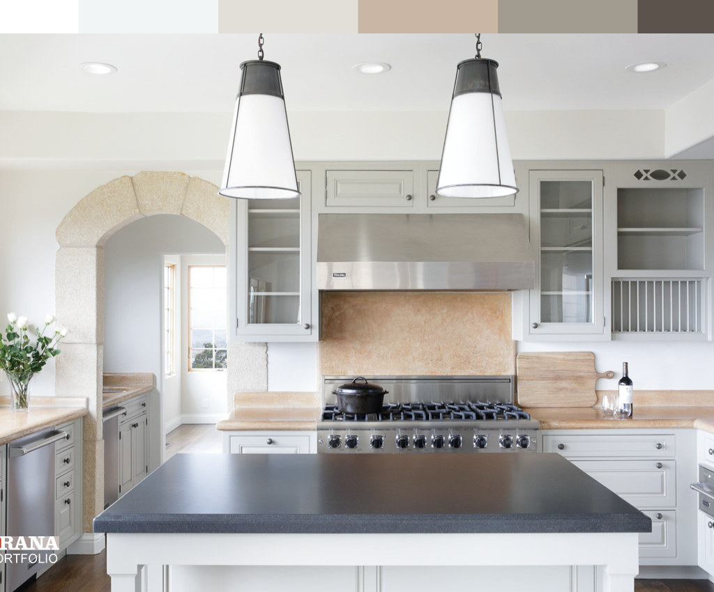
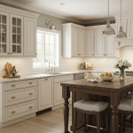
 Soft gray walls in a modern farmhouse kitchen complement white shaker cabinets and brass hardware
Credit: www.goodhousekeeping.com
Core Factors That Shape Your Kitchen Wall Color Choice
Picking a paint swatch you love is only the first step. Four key, often overlooked, factors will determine how that color looks and performs in your space long-term. For more on this, see our guide on how to choose wall color for kitchen.
Assess Your Kitchen’s Natural and Artificial Lighting
Light is the single biggest variable that changes how paint appears on your walls. South-facing kitchens get warm, bright direct sunlight all day, which can wash out cool, desaturated tones. North-facing spaces get cool, dim indirect light, which can make warm shades look muddy or orange. If your kitchen has no windows, artificial lighting will be your only guide: note the Kelvin temperature of your bulbs — cool LEDs (3000-4000K) sharpen undertones, while warm incandescent or warm LEDs (2700K) soften them.
In practice, most homeowners underestimate how much artificial light shifts paint tones: a soft gray that looks neutral in daylight can read as purple under cool under-cabinet LED strips, a very common error in kitchen renovations. For more on this, see our guide on what wall color goes with white kitchen cabinets.
 Layered overhead and under-cabinet lighting can shift how wall colors appear throughout the day
Credit: www.brookfieldresidential.net
Account for Layout, Size, and Ceiling Height
Your kitchen’s dimensions will drastically change how a color feels. For galley kitchens under 60 square feet, light, high-contrast neutrals like warm white or soft greige reflect 20-30% more ambient light than dark shades, making the space feel up to 25% larger. For spacious open-concept kitchens over 200 square feet, you can safely use bold, saturated shades to create defined zones (e.g., a deep navy accent wall behind the stove to anchor the cooking area). If your ceiling is lower than 8 feet, paint it the same color as your walls to create a seamless, taller appearance. For high ceilings, a shade 1-2 tones lighter than your walls will keep the space from feeling cavernous. For more on this, see our guide on how to choose paint color for kitchen walls.
Coordinate With Permanent Fixtures
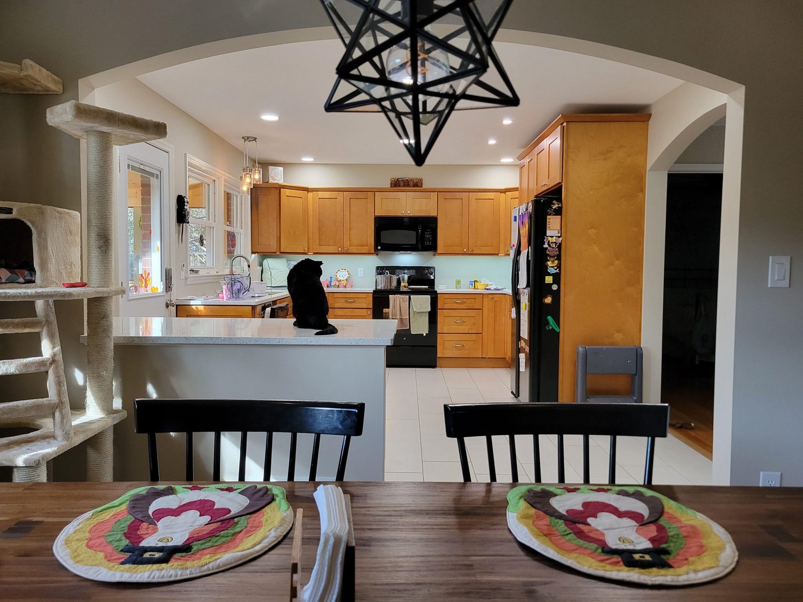
Your wall color needs to work with the fixed elements you can’t easily change: cabinets, countertops, flooring, and backsplash. The biggest mistake here is ignoring undertones: warm oak cabinets have yellow or orange undertones, so pair them with warm off-white, greige, or soft terracotta walls, not cool gray which will create a muddy, clashing look. Cool gray or navy cabinets pair best with cool white, soft blue, or pale gray walls to maintain a cohesive feel. If you have forest green or sage kitchen cabinets, soft cream or warm white walls create a balanced, earthy look, while cool gray walls add modern contrast — for more specific pairing ideas, check out our guide to coordinating shades for green cabinetry. For darker walnut or cherry wood cabinets, our guide to wall colors that complement wood tones has tailored recommendations for warm wood palettes. For more on this, see our guide on how to pick wall color for kitchen.
Popular Kitchen Wall Color Palettes for Every Aesthetic
Once you’ve accounted for your space’s constraints, you can narrow down palettes that fit your style and use case.
Timeless Neutrals for Versatility
Neutrals are the safest choice for most kitchens, as they work with every cabinet and countertop style and never go out of fashion. Warm whites (with yellow or beige undertones) brighten dim, north-facing kitchens, while cool whites (with blue or gray undertones) keep south-facing spaces from feeling too warm. Greige (a blend of gray and beige) is a 2026 favorite for its ability to pair with both warm and cool fixtures, making it ideal for homes with mixed undertones in their cabinets and countertops. Neutrals also make it easy to update your decor seasonally: swap out throw pillows, rugs, and small appliances without worrying about clashing with your wall color. For more on this, see our guide on what wall color goes with grey kitchen cabinets.
Bold Accent Walls for Personality
If you’re hesitant to commit to a saturated shade across all four walls, an accent wall behind your stove, sink, or breakfast nook adds personality without overwhelming the space. Deep navy, forest green, and burnt orange are top 2026 picks for farmhouse and modern kitchens, as they pair beautifully with white or light wood cabinets. For small galley kitchens, reserve bold shades for the far end wall to draw the eye down the space and make it feel longer, rather than painting a side wall which can make the room feel narrower.
Soft Pastels for Cozy, Inviting Spaces
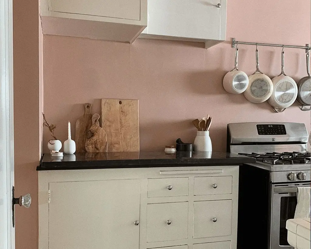
Light pink, soft blue, buttercream, and pale lavender bring warmth and charm to cottage, shaker, and vintage-style kitchens. These shades work especially well in homes with dark cabinets, as they reflect light and prevent the space from feeling heavy. Pastels also work well in rental properties, as they’re easy to paint over if you move to a new home. Avoid pastels in high-traffic kitchens with young kids, however, as they can show scuff marks and stains more easily than neutral tones.
Earthy Tones for Natural, Grounded Vibes
Warm browns, muted olives, soft terracotta, and sage green connect your kitchen to natural elements like wood countertops, stone backsplashes, and potted herbs. Earthy tones also pair well with indoor kitchen herbs and potted plants, creating a cohesive natural vibe that feels fresh and alive. These shades are perfect for rustic, farmhouse, and sustainable design styles, as they create a cozy, lived-in feel that feels intentional rather than sterile. For a 2026 twist, pair earthy walls with matte black hardware for a modern, grounded look.
Match Wall Colors to Your Kitchen’s Design Style
Your kitchen’s overall aesthetic will narrow down your color options even further. Use these guidelines to find a shade that enhances, rather than clashes with, your design vision.
Modern and Japandi Kitchens
Modern and Japandi kitchens prioritize clean lines and uncluttered spaces, so wall colors should be subtle and unobtrusive. Soft greige, warm white, and pale gray are top picks, as they let your cabinet hardware, countertop edges, and open shelving take center stage. For a bold modern twist, a matte black accent wall behind floating shelves adds drama without clutter.
Traditional and Craftsman Kitchens
Traditional and craftsman kitchens feature detailed cabinetry, wood moldings, and classic fixtures, so warm, inviting colors are the way to go. Creamy buttercream, soft yellow, and muted sage complement cherry, oak, and maple wood cabinets, and pair beautifully with brass or oil-rubbed bronze hardware. Avoid cool, desaturated tones here, as they can clash with the warm wood finishes common in this style.
Rustic and Farmhouse Kitchens
Rustic and farmhouse kitchens lean into natural, cozy materials like reclaimed wood, stone, and wrought iron, so earthy, warm tones are a perfect fit. Warm terracotta, deep barn red, and muted olive green enhance the organic feel of these spaces, and pair seamlessly with apron-front sinks and open wood shelving. For a bright, airy farmhouse look, opt for warm white walls with natural wood trim.
Minimalist and Galley Kitchens
Minimalist and galley kitchens thrive on simplicity, so stick to low-contrast, light shades to avoid visual clutter. Soft white, light greige, and pale gray create an airy, uncluttered feel that makes narrow spaces feel larger. If you want a pop of color, add it through small, removable decor like dish towels and potted plants rather than wall paint, to maintain the space’s calm, focused vibe.
Use Color Psychology to Support Your Daily Routine
Colors don’t just look good — they actively impact your mood, appetite, and energy levels while you’re in the kitchen. Warm tones like soft yellow, terracotta, and pale orange stimulate appetite and energy, making them ideal for open-concept kitchens where you host guests or have young kids who need encouragement to eat. As the University of Minnesota Extension notes, cool tones like soft blue and muted sage can reduce stress in high-traffic kitchen spaces, making them ideal for families with young children or anyone who finds cooking overwhelming. If your kitchen doubles as a homework station or coffee nook, opt for soft, calming shades to support focus and relaxation. For a gourmet kitchen where you love to entertain, a bold accent wall can add energy and create a natural focal point for conversation.
Pick the Right Paint Finish for Durability and Style
The finish you choose will impact both how your color looks and how well it holds up to daily kitchen messes. For 2026, modern paint formulas have improved drastically, so you no longer have to choose between style and durability:
- Matte/Flat: Best for low-traffic gourmet kitchens with minimal splatters. Modern matte finishes now include stain-resistant technology that makes them far more washable than older formulas, but they still show grease splatters and scuff marks more easily than sheen finishes.
- Satin: The most popular choice for family kitchens, as it has a soft, low-luster finish that hides wall imperfections while resisting stains, grease, and moisture. It’s easy to wipe down with a damp cloth for quick cleanups.
- Semi-Gloss/Gloss: Ideal for high-moisture areas like the wall behind your stove or sink, as it repels grease and water and is extremely easy to clean. Avoid full gloss in large spaces, however, as it can reflect too much light and feel harsh. For kitchen spaces where you prepare food, opt for low-VOC, GREENGUARD-certified paint to minimize indoor air pollutants, a recommendation from the U.S. Environmental Protection Agency for spaces where food is prepared.
Step-by-Step Color Testing Process to Avoid Costly Mistakes
Never skip testing paint samples before committing to a full wall. Follow this 5-step process to ensure you love your color in every light:
- Pull 3-5 narrow paint chips that coordinate with your permanent fixtures (cabinets, countertops, flooring) to narrow down your options.
- Paint 2×2 foot sample boards (not just small chips) on multiple walls, including near windows, dark corners, and next to your backsplash, to account for texture and existing paint layers.
- Observe the samples at 7am, 12pm, and 7pm for 3 consecutive days to catch shifts in natural and artificial light.
- Hold samples next to your cabinet doors and countertop edges to check for undertone clashes that aren’t visible from a distance.
- If you have a wall-mounted kitchen faucet, you’ll need to remove it before painting to get an even finish behind the fixture — follow our prep steps for painting behind fixtures to avoid damaging your plumbing.
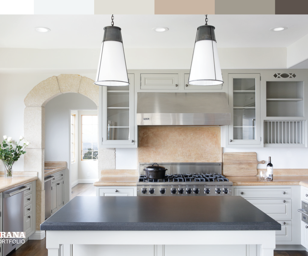
 Compare paint swatches next to your permanent fixtures to spot undertone clashes
Credit: www.jswpaints.in
Common Kitchen Wall Color Mistakes to Skip
Even experienced DIYers make these avoidable errors:
- Ignoring undertones: A cool gray wall will clash with warm oak cabinets, creating a muddy, unflattering look. Always test samples next to your permanent fixtures to check for harmony.
- Matching wall color exactly to your backsplash: This flattens the space and eliminates visual depth. Choose a wall color 1-2 shades lighter or darker than your backsplash, or pick a complementary tone.
- Choosing a color based solely on a digital photo: Screens display colors with different brightness and saturation levels than real life, so always test in person.
- Forgetting about trim and ceiling: White or light trim makes bold wall colors pop, while matching trim to walls creates a seamless, cohesive look. Don’t paint your walls without considering how they’ll interact with your existing trim.
Frequently Asked Questions
What factors affect choosing kitchen wall color?
The 4 most impactful factors are your kitchen’s natural light exposure, the undertones of permanent fixtures (cabinets, countertops, flooring), layout size, and your daily use case (e.g., family meal prep vs. occasional entertaining). Testing samples in your actual space is non-negotiable, as digital swatches and store chips often appear different in home lighting.
How do lighting conditions influence kitchen wall color?
Natural light shifts color temperature throughout the day: south-facing light is warm and bright, which can wash out cool tones, while north-facing light is cool and dim, which can make warm tones look muddy. Artificial light also plays a role: cool LED bulbs (3000-4000K) sharpen color undertones, while warm incandescent bulbs (2700K) soften them. Always test samples at morning, midday, and evening to catch these shifts.
Which kitchen wall colors make a space look bigger?
Light, high-contrast neutrals like warm white, soft greige, and pale cream reflect the most ambient light, making compact kitchens feel up to 25% larger. Avoid dark, saturated shades in galley or windowless kitchens, as they absorb light and make the space feel cramped.
Can kitchen wall color impact mood and appetite?
Yes: warm tones like soft yellow and terracotta stimulate appetite and energy, making them ideal for open-concept kitchens where you host gatherings. Cool tones like soft blue and sage promote calmness, making them better for kitchens that double as homework stations or quiet breakfast nooks.
Should I paint my kitchen walls the same color as the rest of my home?
It’s not required, but using a complementary or analogous color from your home’s existing palette creates flow between spaces. For open-concept kitchens, choose a wall color that sits 1-2 shades lighter or darker than adjacent room walls to define the space without feeling disjointed.
Final Tips for a Flawless Finish
Choosing the perfect kitchen wall color doesn’t have to be overwhelming. By accounting for your space’s unique lighting, fixtures, and daily use, testing samples thoroughly, and avoiding common undertone clashes, you can create a kitchen that feels both beautiful and functional for years to come. Ready to start your project? Grab 3-4 coordinating paint chips this weekend, paint 2×2 foot test patches on multiple walls, and observe them over 3 days to find your perfect match. For more kitchen design guidance to tie your new look together, explore our resources on coordinating cabinet and countertop palettes.

Ethan Cole is a kitchen innovation enthusiast and food technology writer at DiningGadgets.com. With over 8 years of experience reviewing cookware, smart kitchen tools, and design trends, he helps readers discover gadgets that make cooking easier and dining more enjoyable. When he’s not testing the latest kitchen appliances, Ethan enjoys experimenting with recipes and sharing practical tips for modern homes.
Similar Posts