White Kitchen What Color Walls: Stunning Shades to Transform Your Space
White kitchens remain one of the most popular home design choices in 2026, prized for their timeless brightness, ability to boost resale value, and effortless pairing with every design style from modern farmhouse to industrial minimalist. But that all-white palette comes with a common headache: choosing the right wall color to avoid a sterile, clinical feel, or clashing with your existing countertops, flooring, and hardware. The wrong shade can make a small galley kitchen feel cramped, wash out warm wood accents, or look completely different at 8pm under overhead lighting than it does at 2pm in natural sun.
In this guide, we’ll break down exactly how to pick a wall color that complements your white cabinets, works with your kitchen’s unique lighting and layout, and fits your personal style and maintenance needs. From timeless neutral shades to bold statement hues and soft pastels, we’ll cover every option with practical, 2026-tested guidance to help you create a kitchen that feels fresh, inviting, and uniquely yours. For more on this, see our guide on what color to paint my kitchen walls with.
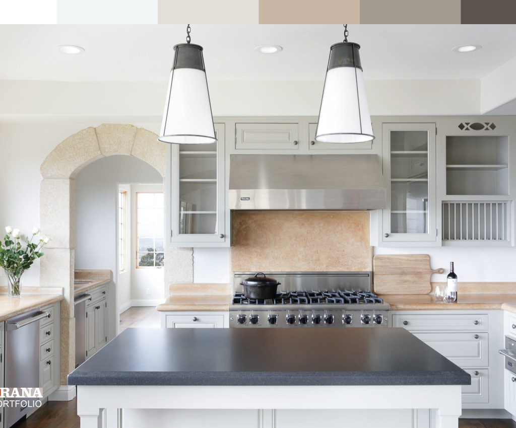
 Soft warm gray walls complement white cabinetry and warm wood flooring for a balanced, modern farmhouse look.
Credit: www.kylieminteriors.ca
Soft warm gray walls complement white cabinetry and warm wood flooring for a balanced, modern farmhouse look.
Credit: www.kylieminteriors.ca
Key Factors That Make or Break Your White Kitchen Wall Color Choice
Before you browse paint swatches, there are four core considerations that will narrow your options and prevent costly, frustrating mistakes. Skipping these steps is the most common reason homeowners end up with a wall color that looks great in the store but wrong in their actual space.
Kitchen Layout and Natural Light
The size of your kitchen and the direction it faces will drastically change how a paint shade appears. Small galley or galley-style kitchens benefit from light, reflective shades that maximize perceived space, while large open-concept kitchens with high ceilings can handle darker, bolder hues without feeling cramped. Natural light is even more impactful: north-facing kitchens get cool, bluish light that can make cool-toned wall colors feel icy, so opt for shades with warm undertones to balance the light. South-facing kitchens get warm, golden light that can make warm shades look yellowed, so cool-toned grays, blues, and greens will feel balanced. East-facing spaces get soft warm morning light, so neutral shades work well, while west-facing kitchens get intense orange-toned afternoon light that can make warm shades feel overwhelming, so muted cool or neutral tones are safer. For more on this, see our guide on what color walls go with white kitchen cabinets.
The National Kitchen and Bath Association recommends testing paint samples in your actual space for at least 48 hours to account for shifting natural and artificial light, a step most DIYers skip that leads to disappointing results. Always test paint samples on a 2×2 foot section of your wall, and live with them for 3 full days, checking the color at 9am, 2pm, and 8pm with overhead lights on to see how it shifts.
Existing Finish Palette
Your wall color doesn’t exist in a vacuum—it needs to pair seamlessly with your countertops, backsplash, flooring, and hardware to feel cohesive. If you have warm oak or walnut flooring and brass hardware, cool gray walls will feel jarring; opt for warm beige, taupe, or greige instead. If you have black granite countertops and matte black fixtures, soft warm gray or pale blue walls will balance the starkness without clashing. If you have marble countertops with gray veining, cool gray or soft sage green walls will tie the whole look together. If you’re considering switching to green cabinetry down the line, our guide to coordinating wall colors for green cabinetry walks through complementary shades that work as well with white as they do with green. If you have warm oak or walnut cabinetry instead of white, our guide to pairing wall colors with warm wood tones has tailored recommendations for balancing rich wood with bright wall shades. For more on this, see our guide on what color kitchen walls with white cabinets.
Personal Style and Maintenance Needs
Your wall color should match how you use your kitchen. If you have young kids, cook frequently, or host large gatherings, opt for higher-sheen paint (satin or semi-gloss) that resists grease, scuffs, and splatters and wipes clean with a damp cloth. If you prefer a matte, muted look, many 2026 paint lines offer washable matte finishes designed for kitchens that hide minor wall imperfections without sacrificing durability. For low-traffic guest kitchens or homes without kids or pets, flat or matte finishes work well for a soft, elegant look, but be prepared to spot-clean stains more frequently.
Budget and Long-Term Plans
If you’re planning to sell your home in the next 2-3 years, stick to neutral, widely appealing shades like warm greige, soft taupe, or pale blue that will appeal to the broadest range of buyers. If you’re planning to stay in your home for 5+ years, feel free to experiment with bolder shades or accent walls that reflect your personal style, as you won’t need to worry about resale appeal. For more on this, see our guide on white cabinets in kitchen what color walls.
Timeless Neutral Wall Shades for White Kitchens (2026 Trends)
Neutral wall colors are the most versatile option for white kitchens, as they pair with every design style, hardware finish, and cabinet shade, and feel warm and inviting rather than sterile. 2026’s most popular neutral shades have subtle undertones that work with both cool and warm white cabinetry, making them a safe bet for first-time paint projects.
Warm Greige
Warm greige, a blend of warm beige and cool gray, is the best-selling kitchen neutral for 2026, thanks to its chameleon-like ability to pair with every finish from stainless steel to unlacquered brass. It has subtle warm undertones that prevent north-facing kitchens from feeling cold, but cool enough undertones to balance the golden light in south-facing spaces. It works equally well with modern, farmhouse, and traditional kitchen styles, and hides minor wall scuffs better than pure gray or beige. For more on this, see our guide on what color white for kitchen walls.
Soft Taupe
Soft taupe has subtle pink or brown undertones that add cozy, understated warmth to white kitchens, making it a perfect pick for cottage, farmhouse, and traditional design styles. It pairs beautifully with wooden accents, subway tile backsplashes, and woven textiles, and feels much warmer than cool gray without veering into yellow territory. It’s especially popular in open-concept kitchens that flow into living or dining spaces, as its neutral tone blends seamlessly with adjacent rooms.
Off-White and Cream
If you have cool, bright white cabinets, pure white walls can make the space feel sterile and clinical. Opt for off-white or cream shades with subtle yellow undertones, like Benjamin Moore White Dove or Sherwin-Williams Alabaster, to soften the contrast between walls and cabinets. These shades reflect light just as well as pure white, making small galley kitchens feel larger, but add enough warmth to make the space feel inviting rather than cold.
Pale Cool Gray
Pale cool gray with subtle blue or green undertones is the go-to neutral for modern, industrial, and minimalist kitchens. It creates a soft contrast with white cabinets that makes both shades pop without feeling stark, and pairs perfectly with black hardware, quartz countertops, and stainless steel appliances. It’s especially well-suited for north-facing kitchens, as its cool undertones balance the bluish natural light and prevent the space from feeling icy.
 Light neutral gray walls brighten a small galley kitchen without clashing with cool white cabinetry.
Credit: www.greenbayremodeling.com
Light neutral gray walls brighten a small galley kitchen without clashing with cool white cabinetry.
Credit: www.greenbayremodeling.com
Bold, High-Impact Wall Shades to Make Your White Kitchen Shine
If you want to add personality and drama to your white kitchen, bold wall colors are a fantastic option—as long as you use them strategically to avoid overwhelming the space. 2026’s most popular bold shades have muted undertones that feel sophisticated rather than loud, and pair beautifully with white cabinetry and neutral finishes.
Deep Navy Blue
Deep navy blue is the top bold pick for white kitchens in 2026, especially for accent walls behind kitchen islands, stoves, or sinks. It creates striking, sophisticated contrast with white cabinets, makes brass or gold hardware pop, and adds a cozy, grounded feel that’s perfect for open-concept kitchens that flow into living spaces. To keep it from feeling too dark, pair navy walls with light wood flooring, white subway tile backsplashes, and plenty of under-cabinet lighting.
Forest Green
Muted forest green with subtle gray undertones is a favorite for biophilic, farmhouse, and cottage-style kitchens, as it brings a natural, calming feel indoors. It pairs beautifully with wooden accents, potted herbs, marble countertops, and brass hardware, and feels fresh and vibrant without being overwhelming. It works best in kitchens with lots of natural light, as the muted undertones prevent it from looking muddy in dim spaces.
Terracotta
Warm, earthy terracotta is a popular pick for Southwestern, rustic, and Mediterranean-inspired kitchens, as it adds rich, grounded warmth that balances the crispness of white cabinets. It pairs perfectly with terracotta backsplash tiles, wooden ceiling beams, woven rugs, and brass hardware, and feels cozy and inviting without being too bright. It works especially well in kitchens with warm oak flooring and south-facing natural light, as the warm undertones complement the golden sun.
Soft Charcoal
Soft charcoal, a muted dark gray with subtle brown undertones, is a sophisticated alternative to pure black for modern and industrial kitchens. It creates dramatic contrast with white cabinets and stainless steel appliances, and hides grease stains, scuffs, and splatters far better than lighter shades, making it a practical pick for busy family kitchens. Pair it with matte black fixtures, light wood accents, and plenty of lighting to keep it from feeling too heavy.
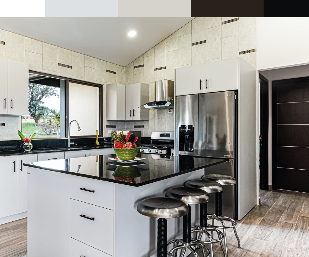 A dark charcoal accent wall behind the stove adds drama without overwhelming a bright white kitchen layout.
Credit: www.craftsmanpainters.com
A dark charcoal accent wall behind the stove adds drama without overwhelming a bright white kitchen layout.
Credit: www.craftsmanpainters.com
Soft Pastel and Light Hues for a Fresh, Airy White Kitchen
If you want to add subtle color to your white kitchen without committing to bold shades, soft pastel and light hues are the perfect choice. These shades add warmth and personality while keeping the space feeling bright, open, and calming—ideal for small kitchens or spaces with limited natural light.
Pale Blue
Pale blue with subtle gray undertones is a serene, timeless pick for coastal, cottage, and minimalist kitchens. It reflects natural light to make small galley kitchens feel larger, and pairs beautifully with stainless steel appliances, white subway tile, and light wood accents. Its cool, calming tone makes it perfect for kitchens where you spend a lot of time prepping meals or hosting breakfast.
Soft Sage Green
Muted sage green with gray undertones is a more versatile alternative to bright emerald green, as it works in both north and south-facing kitchens without looking too yellow or too icy. It’s a favorite for modern farmhouse and biophilic design styles, as it brings a natural, garden-like feel indoors, and pairs perfectly with wooden accents, potted plants, and marble countertops. It feels fresh and calming without overwhelming the space.
Blush Pink
Soft blush pink with gray undertones (not bright bubblegum pink) adds subtle warmth and charm to cottage, shabby chic, and romantic-style kitchens. It feels cozy and inviting without being overly feminine, and pairs beautifully with brass hardware, marble countertops, and white ceramic accessories. Its light tone reflects natural light, making it a great pick for small, dim kitchens.
Muted Lavender
Gray-toned lavender is a unique, calming pick for eclectic and modern kitchens, adding a subtle pop of color without feeling overwhelming. It pairs beautifully with white cabinets, brushed nickel hardware, and silver accessories, and feels soothing and unique without clashing with neutral decor. It works best in kitchens with lots of natural light, as darker shades of lavender can look muddy in dim spaces.
Accent Walls, Textures, and Patterns to Elevate Your White Kitchen
If you’re nervous about committing to a full wall of color, or want to add extra personality to your space, accent walls, textured paints, and wallpaper are fantastic low-commitment options that make a big impact.
Statement Accent Walls
An accent wall is a single wall painted a different shade or finish than the rest of the room, and it’s the perfect way to add a pop of color or drama without overwhelming your white kitchen. The best spots for an accent wall are behind your stove, behind your sink, or the wall facing your dining area—avoid walls with upper cabinets or large windows, as they’ll hide the accent. For small kitchens, stick to a 1-2 foot wide accent wall to avoid making the space feel cramped. If you’re new to bold colors, start with a muted shade like soft navy, terracotta, or sage for a low-risk, high-reward update.
Textured Paint Finishes
Textured paint finishes like limewash, Venetian plaster, or sand-textured paint add subtle depth and tactile interest to your walls without extra decor or artwork. They hide minor wall imperfections like small cracks or nail holes, and catch light differently throughout the day, making your kitchen feel dynamic. For 2026, muted warm-toned textured finishes (warm greige, soft taupe) are especially popular for rustic and Mediterranean-style kitchens, as they add warmth without clashing with wooden accents. Choose a low-sheen textured finish for easy cleaning, as high-sheen textured paints can highlight every smudge.
Washable Wallpaper and Murals
Washable, moisture-resistant wallpaper is a renter-friendly alternative to paint, and 2026’s options include peel-and-stick designs that remove without damaging walls. Look for geometric patterns, botanical prints, or subtle textured designs that match your color scheme, and avoid uncoated paper wallpaper, which can mold in humid kitchen environments. Murals are a great option for a single accent wall, especially if you want to add a nature scene, abstract design, or custom pattern that feels unique to your home. For high-traffic kitchens, opt for vinyl wallpaper, which wipes clean with a damp cloth and resists splatters and steam.
Finishing Touches to Tie Your Wall Color to the Rest of Your Kitchen
Your wall color is just one part of your kitchen’s overall design—pairing it with the right hardware, backsplash, and decor will make the whole space feel cohesive and intentional, rather than mismatched.
Hardware and Fixture Pairing
The finish of your cabinet hardware, light fixtures, and faucet should complement the undertones in your wall color for a cohesive look. For warm-toned wall colors (beige, terracotta, blush, warm greige), pair with warm brass, oil-rubbed bronze, or warm black hardware to enhance the cozy feel. For cool-toned wall colors (gray, pale blue, sage, cool greige), pair with brushed nickel, matte black, or chrome hardware to keep the look fresh and modern. If you’re planning to upgrade your kitchen fixtures as part of your refresh, our quick guide to removing a wall-mounted faucet makes the process simple. Tip: match your light fixture finish to your cabinet hardware for a seamless, polished look.
Backsplash Coordination
Your backsplash is the bridge between your wall color, countertops, and cabinetry, so it should tie all three elements together. If you have bold or dark wall colors, keep your backsplash neutral (white subway tile, gray marble, beige ceramic) to avoid overwhelming the space. If you have neutral wall colors, feel free to go bolder with your backsplash: terracotta tile, green glass, black marble, or patterned ceramic can add personality without clashing. For a cohesive look, pick a backsplash color that has the same undertones as your wall color: warm taupe walls pair with warm beige tile, pale blue walls pair with cool gray marble.
Decor and Styling
Small decor touches are the easiest way to tie your wall color to the rest of your kitchen and add personality. Pick decor elements that pick up the undertones in your wall color: for warm greige walls, add wooden cutting boards, woven baskets, and potted succulents. For pale blue walls, add white ceramic canisters, blue glassware, and coastal-themed art. For bold navy walls, add brass canisters, gold-framed art, and white dishware to keep the look balanced. Avoid clashing undertones: warm yellow decor will look off against cool blue walls, so stick to shades that match your wall’s undertone family.
Keeping Your White Kitchen Walls Looking Fresh for Years
Kitchen walls take more abuse than any other room in the house, from grease splatters and food spills to steam and scuffs from pots and pans. Choosing the right paint finish and following simple cleaning tips will keep your walls looking fresh for years, and save you the cost and hassle of frequent repainting.
Best Paint Finishes for High-Traffic Kitchens
For most kitchens, satin or semi-gloss paint is the best choice, as it resists moisture, grease, and scuffs, and wipes clean with a damp cloth in seconds. Avoid flat or matte finishes unless you have a very low-traffic guest kitchen, as they absorb grease and stains and are nearly impossible to clean without repainting. If you love the soft, muted look of matte paint, many 2026 paint lines offer washable matte finishes designed for kitchens that hide minor wall imperfections but still hold up to regular cleaning. For households with allergies or asthma, the EPA recommends choosing low- or zero-VOC paint options to reduce indoor air pollutants, a guideline that’s especially important in high-traffic kitchen spaces where fumes can linger.
Easy Cleaning and Stain Removal Tips
The fastest way to keep your kitchen walls looking fresh is to clean spills and splatters as soon as they happen. For daily cleaning, use a soft cloth or sponge dampened with warm water and a small amount of mild dish soap, wiping in gentle circular motions. For stubborn grease stains, use a magic eraser dampened with water, but test it on a small, hidden area of the wall first to make sure it doesn’t scratch the paint. Avoid abrasive cleaners, scouring pads, or harsh chemical cleaners, as they can strip paint and leave permanent marks. After cleaning, dry the wall with a clean, dry towel to prevent moisture damage and mold growth.
When to Repaint or Touch Up
Most kitchen walls need a full repaint every 3-5 years, depending on how often you cook and how well you maintain them. Look for signs of wear like peeling, cracking, fading, or persistent stains that won’t wipe clean, as these are signs it’s time for a full repaint. For small scuffs, chips, or stains, spot-touch up the area with a small amount of matching paint and a small brush to avoid having to repaint the entire wall. If you notice peeling or discoloration from moisture, address the underlying issue (like a leaky pipe or poor ventilation) before repainting, as the problem will return if you don’t fix the root cause.
Frequently Asked Questions About White Kitchen Wall Colors
What wall colors complement a white kitchen best?
The most versatile options are warm greige, soft taupe, pale blue, and off-white, as they pair with every kitchen style, hardware finish, and cabinet shade, and feel warm and inviting rather than sterile. For a bolder look, deep navy, forest green, and soft charcoal are popular 2026 picks that add drama without clashing with white cabinetry.
Can I use bold wall colors in a small white kitchen?
Yes, as long as you use them strategically. Stick to one accent wall (behind the stove or island) instead of painting all four walls, choose a bold shade with light undertones (soft navy, muted terracotta) instead of very dark shades, and pair with light-colored countertops and flooring to keep the space from feeling cramped.
What paint finish is best for kitchen walls?
Satin or semi-gloss is ideal for high-traffic kitchens because they resist grease, moisture, and scuffs, and wipe clean easily. If you prefer a matte look, choose a washable matte finish designed for kitchens, which hides minor wall imperfections but still holds up to cleaning.
How do I test a wall color before committing?
Buy a sample pot of the paint, paint a 2×2 foot section of your wall (or a piece of poster board taped to the wall) and live with it for 3 full days. Check the color at 9am, 2pm, and 8pm with overhead lights on to see how it shifts in different natural and artificial light before making a final decision.
Can I use wallpaper in a kitchen?
Yes, as long as you choose a washable, moisture-resistant option. Peel-and-stick wallpaper is renter-friendly and easy to replace, while vinyl wallpaper holds up to splatters and steam. Avoid uncoated paper wallpaper, which can mold in humid kitchen environments.
How often do I need to repaint my kitchen walls?
Most kitchen walls need a full repaint every 3-5 years, depending on how often you cook and how well you maintain them. Spot-touch up small scuffs as needed to extend the time between full repaints, and always address underlying moisture or ventilation issues before repainting to prevent peeling or discoloration.
Final Thoughts: Pick a Shade That Makes Your Kitchen Feel Like Home
There’s no one "perfect" wall color for a white kitchen—the best choice depends on your space’s unique lighting, existing finishes, design style, and how you use the room. Neutral shades like warm greige and soft taupe are safe, versatile picks that work for every homeowner, while bold hues like navy and forest green add personality for those who want a statement space. If you’re nervous about committing to a full wall of color, start with a small accent wall or a sample pot to test the shade in your space before painting the entire room.
Remember, your kitchen is the heart of your home, so the best wall color is one that makes you feel happy and comfortable every time you walk in. Once your color scheme is locked in, you’ll want a space that’s as fun for hosting as it is beautiful—our roundup of top-rated home winemaking sets makes it easy to craft custom drinks for your next dinner party. If you’re dreaming of hosting Italian-themed dinner parties to show off your new space, our guide to authentic Italian dinner inspiration has menu ideas and hosting tips to get you started.