What Color to Paint Kitchen Walls: Stunning Ideas to Transform Your Space
The kitchen is the busiest room in most homes: a space for meal prep, family gatherings, casual coffee dates, and even hobby projects like home winemaking. Choosing the right wall color does more than just elevate its aesthetic—it impacts how spacious the room feels, how well it holds up to daily splatters and stains, and even how your food looks on the plate. Whether you’re refreshing a dated space or building a new kitchen from scratch, this guide breaks down actionable, 2026-approved guidance to help you pick a shade that transforms your kitchen into a space you love spending time in.
How Key Kitchen Features Shape Your Color Choice
The perfect kitchen wall color doesn’t exist in a vacuum: it needs to work with your space’s existing fixed features, lighting, and layout to feel cohesive and functional.
Factor In Room Size and Natural Light
Room size and light exposure are the two biggest drivers of how a paint shade will look in your kitchen. For spaces under 100 square feet, high-Light Reflectance Value (LRV 60+) shades like soft white, pale gray, and pastel blue reflect more light, making small areas feel significantly more open. North-facing kitchens get cool, bluish daylight, so warm off-whites or soft yellows balance that coolness without making the space feel dim. South-facing kitchens get warm, direct sun, so you can pull off cooler shades like pale blue or soft green without the room feeling cold at midday. East-facing spaces get soft, low-angle morning light, so warm neutrals work best to avoid a washed-out look by noon.
Coordinate With Cabinets, Countertops, and Backsplash
Your wall color should complement, not compete with, your largest fixed surfaces. If you have bold marble countertops with heavy gray veining, a soft warm white wall will let the countertop be the focal point. If you have a colorful mosaic backsplash, choose a neutral wall color to avoid visual clutter. For cabinetry, light walls create contrast with dark wood or espresso cabinets, preventing the space from feeling heavy, while colored walls add depth and personality to white or light wood cabinets. If you’re working with green kitchen cabinetry, soft warm whites or muted taupes let the cabinet color shine without competing. For brown kitchen cabinets, cool light grays or pale blues create a balanced, modern contrast that avoids a heavy, dated feel.
Match to Your Flooring and Fixtures
Warm hardwood floors pair beautifully with cool gray walls for a contemporary, balanced look, while cool tile flooring works best with warm neutrals like beige or cream to tie the space together. For metallic fixtures, brass and gold hardware pop against warm white, cream, or soft green walls, while chrome and stainless steel appliances pair seamlessly with cool grays, blues, and muted greens. If you’re planning to upgrade your hardware before painting, start by removing existing fixtures, including wall-mounted faucets, to ensure a clean, crisp paint edge.
Color Psychology: Pick a Shade That Fits Your Kitchen’s Purpose
Color has a proven impact on mood and energy, so your wall choice should align with how you actually use your kitchen. For busy weekday spaces used for quick meals and coffee, cool, calming shades like soft blue or pale green reduce stress and feel fresh, even at 6 a.m. If you host frequent dinner parties, warm hues like soft terracotta or warm beige create an inviting, energetic atmosphere that encourages guests to linger. For kitchens that double as a home classroom or homework spot, soft yellows or light greens boost focus and creativity, per color psychology research. Warm shades like red and orange are proven to stimulate appetite, but use them as accent walls rather than full coverage in small spaces, as they can feel overwhelming in large doses.
Top Kitchen Wall Color Palettes for Every Style
These versatile, widely loved shades work for nearly every kitchen layout and design aesthetic.
Timeless Neutrals (White, Off-White, and Soft Gray)
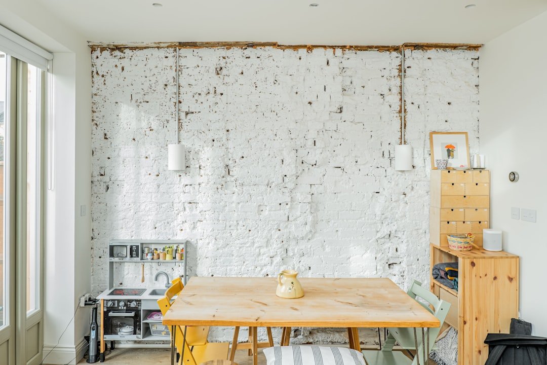
White and off-white are the most popular kitchen wall colors for good reason: high-LRV (70+) shades reflect maximum light, making small or dim kitchens feel significantly more open. Off-whites with warm undertones (avoid blue-based whites, which can feel clinical) pair with every cabinet and countertop style. For a modern look, choose a soft gray with warm undertones to avoid a cold, sterile feel. If you have white cabinets, a soft warm gray wall adds subtle depth without clashing.
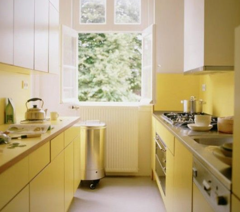 Soft white kitchen walls amplify natural light in small, north-facing spaces
Credit: www.jswpaints.in
Soft white kitchen walls amplify natural light in small, north-facing spaces
Credit: www.jswpaints.in
Warm Earth Tones (Beige, Taupe, Terracotta, and Soft Brown)
These shades create a cozy, grounded feel that’s perfect for family kitchens. Taupe with green undertones pairs beautifully with wood cabinets and natural stone countertops, while soft terracotta adds a subtle pop of warmth that works well with white or light wood cabinets. For a rustic look, choose a beige with yellow undertones to complement vintage hardware and open shelving. Unlike crisp whites, these shades hide minor wall imperfections better, a major plus for older homes with uneven drywall.
 Warm neutral wall tones complement natural stone and metallic hardware seamlessly
Credit: www.goodhousekeeping.com
Warm neutral wall tones complement natural stone and metallic hardware seamlessly
Credit: www.goodhousekeeping.com
Bold Statement Hues (Navy, Emerald Green, Charcoal, and Deep Red)
Full-wall bold colors work best in large kitchens (over 150 square feet) with ample natural light, as they can make small spaces feel cramped. Navy blue pairs seamlessly with brass fixtures and white countertops for a classic, sophisticated look; emerald green works beautifully with natural wood and marble for a luxe, organic feel. If you’re nervous about going bold, test a 2×2 foot swatch on your wall and live with it for 3 full days to see how it looks at sunrise, midday, and night.
Soft Pastels (Mint, Blush, Pale Blue, and Seafoam)
These low-saturation shades add a gentle, calming vibe without feeling overwhelming. Pale blue is ideal for coastal-style kitchens, while soft blush pink adds a touch of warmth to farmhouse spaces. Pastels work especially well in kitchens with dark cabinets, as they create a soft contrast that avoids a harsh look. For a modern twist, choose pastels with subtle gray undertones rather than strong yellow or blue undertones to avoid a dated feel.
On-Trend Color Combinations to Elevate Your Space
If you want to add more visual interest than a single solid shade, these 2026-approved combinations deliver high impact without feeling trendy in a year.
Two-Tone Walls
A popular modern take on two-tone walls uses two shades of the same color family (e.g., soft white on the top 2/3 of the wall, warm beige on the bottom 1/3) separated by a chair rail or crown molding. This technique draws the eye upward, making ceilings feel taller, and adds subtle depth without overwhelming the space. For a bold, defined look, use a crisp black chair rail to separate the two shades for a high-contrast finish.
Accent Walls
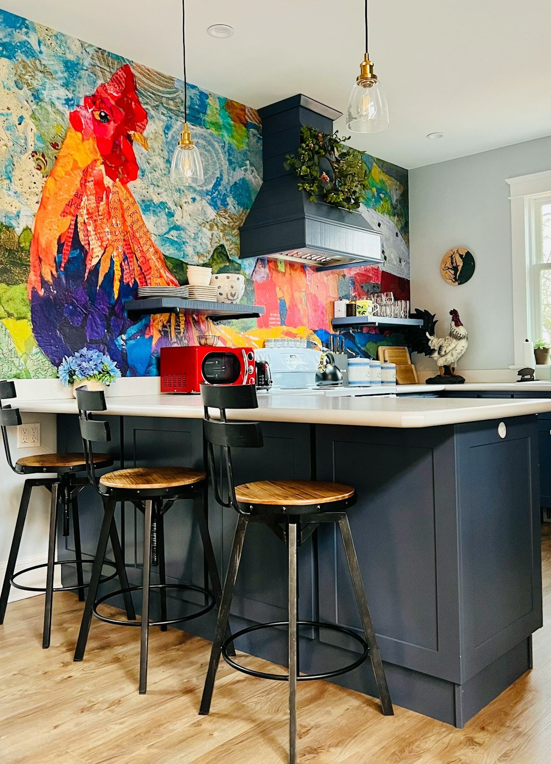
Accent walls work best behind key focal points: a kitchen island, a breakfast nook, or open shelving. Choose a shade 2-3 degrees darker than your main wall color for a subtle pop, or go bold with a deep jewel tone for a dramatic statement. If you have a stove or range hood, painting the wall behind it a dark, easy-to-clean shade (like matte black or deep navy) hides grease splatters and makes your cookware pop.
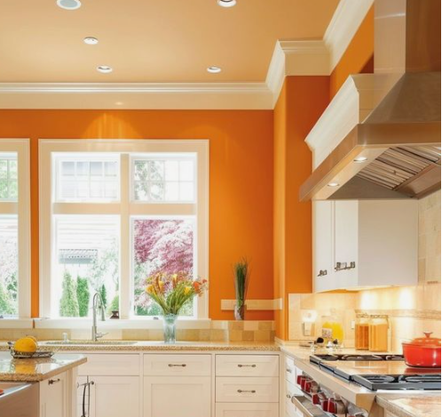 A bold navy accent wall adds personality to a minimalist kitchen layout
Credit: www.jswpaints.in
A bold navy accent wall adds personality to a minimalist kitchen layout
Credit: www.jswpaints.in
Dark Walls Paired With Light Finishes
Full dark walls (LRV 30 or lower) work surprisingly well in kitchens with lots of natural light, as long as you balance them with light countertops, cabinets, and flooring. Charcoal gray walls paired with white marble countertops and light oak cabinets create a cozy, sophisticated atmosphere that feels far from gloomy. For smaller spaces with limited light, use dark walls only on a single accent wall to avoid making the room feel closed in.
Paint Finishes and Textures: Balance Aesthetics and Durability
The finish you choose matters just as much as the color, especially in a high-traffic, high-splash space like a kitchen.
Matte vs. Gloss vs. Satin Finishes
- Flat/matte: High-LRV matte finishes hide wall imperfections perfectly, but have a scrubbability rating of less than 200 cycles, making them a poor choice for high-splash zones like behind the stove or sink. Best for low-traffic kitchen nooks or formal dining areas attached to the kitchen.
- Eggshell: A low-sheen finish with a scrubbability rating of 400–600 cycles, eggshell resists stains better than matte and is easy to wipe down with a damp cloth. Ideal for main kitchen walls away from direct cooking zones.
- Satin/semi-gloss: The gold standard for kitchens, with a scrubbability rating of 1000+ cycles. These finishes resist moisture, grease, and stains, and wipe clean easily. Use satin on walls near the stove and sink, and semi-gloss on trim and cabinets for a cohesive, durable look. Note that satin and semi-gloss finishes highlight wall flaws, so patch and sand all imperfections before painting.
Textured and Decorative Wall Options
If you want to add visual interest without bold color, consider a subtle textured finish: sand paint adds a gentle, tactile feel that hides minor wall dings, while limewash paint creates a soft, lived-in patina that works well in rustic and farmhouse kitchens. For a playful, functional touch, chalkboard paint on a small wall near the fridge is perfect for grocery lists and meal plans, while magnetic paint under your topcoat lets you hang photos, recipes, and kids’ art without damaging the wall. Pro tip: apply 2–3 coats of magnetic paint before your topcoat for the strongest hold.
Low-VOC and Zero-VOC Paints
In 2026, low-volatile organic compound (VOC) paints are widely available at all price points, and are the best choice for kitchens where you spend a lot of time cooking and eating. These paints release minimal harmful fumes, improving indoor air quality and reducing odors while painting and after. The U.S. Environmental Protection Agency confirms that low-VOC paints release significantly fewer harmful indoor pollutants than traditional solvent-based options, making them a safer choice for families with kids or pets.
Style-Specific Color Inspiration
Narrow down your options by matching your wall color to your kitchen’s overall design aesthetic.
Modern Minimalist
Stick to a monochromatic palette of soft whites, cool grays, and muted pastels. Choose a single accent shade (like soft sage or pale blue) for one wall to add subtle interest without cluttering the clean, uncluttered aesthetic. Pair with sleek hardware, frameless cabinets, and minimal decor for a cohesive look.
Rustic and Farmhouse
Warm, earthy neutrals are the way to go: creamy off-whites, warm beiges, and soft sage greens pair beautifully with wood cabinets, open shaker shelves, and vintage hardware. For a pop of personality, add a deep green or terracotta accent wall behind your farmhouse sink. Avoid cool, blue-based shades, which can clash with warm wood tones.
Coastal and Beachy
Soft blues, sandy beiges, seafoam greens, and crisp whites create a bright, airy vibe that mimics seaside scenery. Pair with white trim, natural fiber rugs, and light wood accents for a relaxed, breezy feel. For a modern twist, add a pale turquoise accent wall to add a subtle pop of color without feeling kitschy.
Industrial and Urban
Dark, moody shades like charcoal gray, matte black, deep navy, and rust red are perfect for industrial spaces. Pair with exposed brick, metal light fixtures, and stainless steel appliances for an edgy, sophisticated look. If you’re nervous about going fully dark, use a dark accent wall behind your range hood or island to add drama without overwhelming the space.
Practical Pre-Painting Tips for a Flawless Finish
Even the perfect color will look unprofessional if the paint job is sloppy. Follow these steps to ensure your refresh lasts for years.
Prep Your Walls Properly
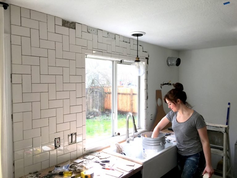
A common mistake homeowners make is skipping wall prep, which leads to peeling paint and uneven coverage. Start by removing all hardware, including cabinet handles, light switch covers, and wall-mounted faucets if you’re painting near them. Next, wash walls with a mild degreaser (especially near the stove and sink) to remove grease and grime that prevents paint from adhering. Patch any holes or cracks with spackle, sand smooth once dry, and prime the walls if you’re painting over a dark color or previously unpainted drywall.
Choose the Right Paint for Your Kitchen’s Needs
In practice, the finish you choose matters more than the brand for kitchen durability. For high-splash zones (within 3 feet of the stove or sink), opt for a satin or semi-gloss finish with a 1000+ scrubbability rating, per National Kitchen & Bath Association guidelines. For main walls away from cooking areas, eggshell is a great middle ground that hides imperfections while still being easy to clean. If your kitchen doubles as a space for home fermenting, opt for paint with a high scrubbability rating to stand up to occasional splashes from winemaking equipment. For at-home winemaking enthusiasts, avoid glossy finishes near storage areas, as they can reflect glare off glass carboys and make checking fermentation levels harder. If you store specialty fermenting gear on open shelves, pair it with a neutral wall color to avoid clashing with bright equipment labels.
Test Swatches Before Committing
Never rely on the paint chip alone—lighting in your kitchen (from windows, overhead lights, and under-cabinet lighting) will drastically change how a shade looks. Paint 2×2 foot swatches on at least two different walls in your kitchen, and live with them for 3 full days to see how they look at sunrise, midday, and night. If you’re choosing between two shades, bring home sample pots and paint large sections of the wall to get a true sense of the color.
Common Kitchen Wall Color Mistakes to Avoid
Even experienced DIYers make these avoidable errors when picking kitchen paint:
- Ignoring undertones: Every paint shade has undertones (warm yellow, cool blue, green, etc.). A white with cool blue undertones will clash with warm wood cabinets, making the space feel cold and uninviting. Always hold swatches up to your cabinets, countertops, and flooring to check for clashing undertones before buying.
- Going too bold in small spaces: Dark, saturated shades like deep navy or forest green can make kitchens under 100 square feet feel cramped and dark. If you love bold colors, use them on a single accent wall instead of full coverage.
- Skipping the finish test: A matte finish may look soft and luxurious in the store, but it will show every grease splatter and scuff mark in a busy kitchen. Always test the finish in a high-traffic area before painting the whole room.
- Forgetting about fixed features: If you have a beloved tile backsplash or vintage light fixture, make sure your wall color complements it, not competes with it. For example, a bright red backsplash will clash with a warm orange wall, but pair perfectly with a soft warm gray.
Frequently Asked Questions
What color makes a kitchen look bigger?
Light, high-LRV (60+) shades like soft white, pale gray, and pastel blue reflect more light, creating the illusion of more space. For small kitchens, avoid dark, low-LRV shades (below 30) as they absorb light and make the room feel cramped. Pro tip: painting the ceiling the same color as the walls draws the eye upward, making ceilings feel higher and the space feel larger.
Which wall colors increase appetite?
Warm, saturated shades like soft red, terracotta, and golden yellow are proven to stimulate appetite and encourage lingering, making them ideal for kitchens used for hosting dinner parties. Use these as accent walls rather than full coverage in small spaces to avoid feeling overwhelming.
What colors work best for small kitchens?
Soft, light neutrals (white, off-white, pale gray) and low-saturation pastels (mint, pale blue, blush) are the best choices for small kitchens, as they reflect light and create an open, airy feel. If you want to add personality, use a bold accent wall behind your kitchen island or breakfast nook.
What wall colors match stainless steel appliances?
Cool, neutral shades like soft gray, pale blue, and muted green complement stainless steel’s cool, sleek finish, creating a cohesive modern look. Warm neutrals like beige and cream also work well, as they create a soft contrast that makes stainless steel pop without clashing.
How often should I repaint my kitchen walls?
With proper prep and a durable satin or semi-gloss finish, kitchen walls will last 5–7 years before needing a full repaint. High-splash zones near the stove and sink may need touch-ups every 2–3 years to cover grease stains and scuffs.
Final Thoughts
Choosing the right kitchen wall color is equal parts art and science: you want a shade that fits your personal style, complements your existing fixtures, and holds up to the daily wear and tear of cooking, cleaning, and gathering. There’s no one-size-fits-all answer—your perfect color depends on your kitchen’s size, lighting, and how you use the space. Test swatches, prioritize durable finishes for high-traffic zones, and don’t be afraid to go bold if your space and style call for it. A fresh coat of paint is one of the most cost-effective ways to transform your kitchen, so take your time picking a shade you’ll love for years to come.
For more kitchen design guidance, browse our resources to coordinate your new wall color with green kitchen cabinets or brown kitchen cabinets for a perfectly cohesive refresh.