How to Pick Wall Color for Kitchen: Expert Tips for Stunning Results
Choosing the right kitchen wall color is one of the highest-impact, lowest-cost ways to transform your space — but it’s also one of the most commonly botched renovation steps. Unlike other rooms, kitchens have unique lighting conditions, high-traffic surfaces, and permanent fixtures like cabinets and countertops that skew how paint colors appear in real life. A shade that looks perfect in a store chip can look dull, harsh, or clashing when applied to your actual walls, leading to costly repaints and frustration. This 2026-updated guide breaks down expert-backed, step-by-step guidance to help you pick a wall color that fits your kitchen’s unique conditions, matches your style, and delivers stunning, long-lasting results.
1. Start With Your Kitchen’s Core Conditions
Before browsing paint chips, audit the fixed features of your kitchen that will impact how your chosen color looks and feels. Lighting and size are the two most critical factors to assess first. For more on this, see our guide on what wall color goes with white kitchen cabinets.
1.1 Audit Your Lighting (Natural and Artificial)
Lighting changes how paint colors appear more than any other factor, with shifts that can make a soft gray look blue in the morning and beige by evening.
- Natural light: Window direction dictates the tone of natural light your kitchen receives. South-facing windows cast warm, golden light all day, which amplifies warm undertones in paint and mutes cool shades. North-facing windows provide cool, bluish indirect light, which makes warm colors look dull and cool colors look crisp. East-facing windows bring bright, cool morning light that warms up by afternoon, so colors will shift from cool to warm as the day progresses. West-facing windows cast low, golden light in the afternoon and evening, making colors look far warmer after 3pm than they do at 9am.
- Artificial light: Bulb color temperature, measured in Kelvin (K), also impacts color appearance. Warm white bulbs (2700K–3000K) create a cozy, yellow-toned glow that softens cool paint shades. Cool white bulbs (3500K–4100K) emit bright, neutral light that makes warm colors look less saturated. Daylight bulbs (5000K+) are very cool and high-intensity, making all colors appear more vibrant, even harsh.
A common mistake homeowners make is picking paint chips under store fluorescent lighting, which is typically 4000K cool white and skews color tones. Always hold paint chips up to your actual kitchen windows and under your existing ceiling lights to get an accurate read. For more on this, see our guide on how to choose wall color for kitchen.
1.2 Factor In Kitchen Size and Layout
Color can visually expand or shrink a space, so your kitchen’s square footage and layout should guide your shade selection:
- For small galley kitchens (under 80 square feet), light, high-reflectance colors like soft white, pale blue, or warm light gray will make the space feel larger and airier. If you love dark colors, use them on a single accent wall rather than all four walls to avoid making the space feel cramped. For kitchens with ceilings under 8 feet, painting the ceiling the same color as the walls will create the illusion of higher ceilings.
- For large open-concept kitchens (over 200 square feet) that flow into living or dining areas, warm neutrals like beige or taupe can make the expansive space feel cozy rather than cavernous. Bold dark shades like navy or forest green work well on accent walls to define the kitchen zone without overwhelming the area.
2. Coordinate With Permanent Fixtures and Finishes
Your kitchen’s permanent features — cabinets, countertops, and appliances — are the best starting point for narrowing down your wall color options, as they are costly to replace and set the base tone for the space.
2.1 Match Wall Color to Cabinet Tones
Cabinets make up the largest surface area in most kitchens, so their undertone should be your first consideration when picking a wall color:
- Warm wood cabinets (oak, cherry, mahogany) have yellow, red, or orange undertones, so pair them with warm neutrals (beige, warm taupe, soft yellow) or cool shades (soft sage, pale blue) for contrast.
- Cool wood cabinets (maple, ash, painted white) have gray or blue undertones, so pair them with cool neutrals (cool gray, crisp white) or warm shades (soft terracotta, muted yellow) to add warmth.
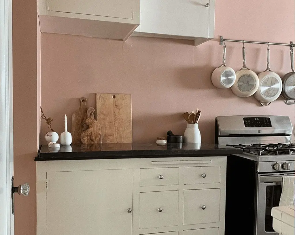
- Painted dark gray or black cabinets work best with light, bright wall colors (white, pale yellow, soft pink) to keep the space from feeling too dark.
If you’re working with green cabinetry, our guide to coordinating with green kitchen cabinets breaks down exact shade pairings for every green undertone, from muted sage to bold emerald. For homeowners with warm wood or brown cabinets, our recommendations for coordinating with brown kitchen cabinets eliminate the guesswork of matching neutral and bold wall tones. For more on this, see our guide on how to choose kitchen wall color.
2.2 Complement Countertops and Backsplashes
Countertops are the second largest surface in your kitchen, so their tone will impact how your wall color reads:
- Dark granite or quartz countertops with blue or gray veins pair well with light, warm wall colors (soft beige, warm white) to balance cool undertones.
- Light quartz or marble countertops with warm beige veining work with cool or neutral wall colors (soft blue, light gray) to avoid the space feeling overly yellow.
- If you have a patterned or colorful tile backsplash, choose a solid, neutral wall color to avoid visual clutter. For simple white subway tile backsplashes, you can opt for bolder wall colors, as the white tile acts as a visual buffer.
2.3 Align With Appliance Finishes
Stainless steel appliances are fully neutral, so they work with almost any wall color, but look especially crisp against cool-toned walls (soft blue, light gray) or bold dark walls (navy, charcoal) for high contrast. Black or black stainless appliances pair best with warm, light walls (off-white, soft yellow) to keep the space from feeling heavy. Colored appliances (like a red range or blue fridge) work best with neutral wall colors that let the appliance be the focal point, or a muted version of the appliance color on an accent wall for a cohesive look.
3. Leverage Color Psychology for Your Desired Kitchen Mood
Color has a proven psychological impact on mood and behavior, so your wall color should align with how you use your kitchen. Per research on color and mood from the American Psychological Association, warm tones stimulate energy and appetite, while cool tones promote calm and focus. Use these guidelines to match your color choice to your kitchen’s purpose:
- White/off-white: Timeless, airy, and low-commitment, these shades make small kitchens feel larger and work with any design style. Pair with warm wood accents and textiles to avoid a sterile feel.
- Warm neutrals (beige, taupe, warm gray): Cozy and versatile, these shades work with almost any cabinet or countertop tone, making them ideal for family-focused kitchens where you cook and entertain regularly.
- Cool tones (soft blue, sage green, light gray): Calm and refreshing, these shades hide smudges and grease stains better than warm tones, making them ideal for busy households. They work especially well in north-facing kitchens with cool natural light.
- Bold dark shades (navy, forest green, charcoal): Dramatic and personality-filled, these shades add depth to large kitchens or accent walls. Avoid using them on all four walls of a small kitchen, as they absorb light and make the space feel cramped.
- Warm energizing shades (soft yellow, muted orange, coral): Cheerful and appetite-stimulating, these shades work best as accent walls or in kitchens with plenty of natural light. Bright saturated versions can feel overwhelming if used on large wall surfaces.
4. Choose the Right Paint Finish for Kitchen Demands
Kitchen walls face unique stressors: steam from cooking, grease splatters, sticky fingerprints, and frequent cleaning. The right finish will balance style, durability, and ease of maintenance. For more on this, see our guide on what wall color goes with grey kitchen cabinets.
4.1 Finish Types and Their Ideal Use Cases
- Flat/matte: No sheen, perfect for hiding wall imperfections, and gives a soft, modern, low-sheen look. Best for low-traffic kitchens or households without kids/pets, as it shows smudges, grease, and steam stains easily. As of 2026, washable matte formulas are widely available from most major paint brands, making this a viable option for busy households if you opt for a scrubbable-rated product.
- Eggshell: Low, subtle sheen, slightly more durable than matte, and resists minor stains. It wipes clean with a damp cloth, making it a great middle ground for kitchens with moderate traffic.
- Satin/semi-gloss: Medium to high sheen, highly durable, and fully resistant to moisture, grease, and stains. It wipes clean easily, making it the most popular choice for high-traffic kitchens, families with kids, or households that cook frequently. It’s also ideal for trim, ceilings, and backsplashes. The only downside is that it highlights wall imperfections, so ensure your walls are smooth before painting.
- High-gloss: Very high sheen, extremely durable, and fully waterproof. Best reserved for trim, cabinets, and small accent walls, as it reflects too much light for large wall surfaces and can feel harsh in residential kitchens.
4.2 Low-VOC and Zero-VOC Paints for Healthier Kitchens
Traditional interior paints release volatile organic compounds (VOCs) that can cause headaches, respiratory irritation, and other health issues, especially in enclosed kitchen spaces where you cook and eat. As of 2026, most major paint brands offer low-VOC (less than 50 grams per liter) or zero-VOC options that meet or exceed EPA safety standards, with no compromise on color selection or durability. Look for certifications like GREENGUARD Gold or LEED to ensure the paint meets strict indoor air quality standards. The only tradeoff is a small upcharge (typically 10–15% more than traditional paints), which is well worth it for households with kids, pets, or respiratory conditions. For guidance on choosing low-emission paints that meet safety standards, the EPA outlines key certification labels to look for when shopping.
5. Test Swatches Rigorously Before Committing
Skipping the swatch test is the most common cause of regret when picking kitchen wall color. Even a shade you love in a store can look completely different in your space, so follow this testing process to avoid costly mistakes:
- Buy small sample pots of your top 3–4 color choices, including one shade two tones lighter and one two tones darker than your target. Undertones are hard to judge from a single swatch, so having multiple options side-by-side will help you spot clashing tones.
- Paint two 12×12 inch swatches on your wall: one near a window and one in a shadowed corner, to see how the color looks in both bright and low light.
- Let the swatches dry completely. Wet paint dries 1–2 shades lighter than its wet appearance, so wait at least 2 hours, or overnight, before judging.
- Observe the swatches at 8am (morning light), 12pm (midday light), 6pm (evening artificial light), and 9pm (under your kitchen’s task lighting) over 2–3 days. Walk around the kitchen to see how the color looks from the entryway, sink, and dining area, not just from one spot.
6. Accent Walls vs Full Paint Jobs: Which Is Right for You?
If you’re hesitant to commit to a bold color or have a small kitchen, an accent wall is a low-risk way to add personality to your space. For a cohesive, timeless look, a full paint job is the better choice.
- Accent wall pros: Low commitment, easy to update, and draws attention to a focal point like a statement range, open shelves, or exposed brick. It’s also ideal for renters who can’t paint all walls. Cons: Can feel unbalanced if not paired with a complementary main wall color.
- Full paint job pros: Creates a cohesive, flowing look that makes small kitchens feel larger (with light shades) or large kitchens feel cozier (with warm dark shades). Cons: More work, higher cost, and harder to change if you end up hating the color.
Use an accent wall for small galley kitchens, kitchens with a standout feature, or rental spaces. Opt for a full paint job for large open-concept kitchens, full renovations, or if you want a timeless, low-maintenance look.
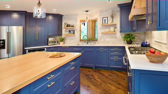
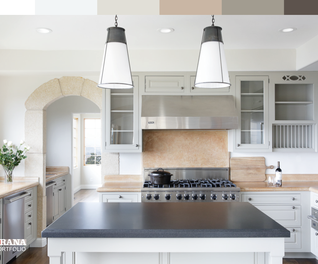
 A deep navy accent wall adds depth without overwhelming small kitchen spaces
Credit: www.goodhousekeeping.com
A deep navy accent wall adds depth without overwhelming small kitchen spaces
Credit: www.goodhousekeeping.com
7. Avoid Common Kitchen Wall Color Mistakes
Even experienced DIYers make these avoidable errors when picking kitchen paint:
- Picking a color under store lighting: Store fluorescent lights skew color tones, so always test swatches in your actual kitchen.
- Ignoring undertones: Every paint color has an undertone (warm, cool, neutral). A gray paint with a blue undertone will clash with warm wood cabinets, so always test swatches next to your permanent fixtures to check for clashing undertones.
- Going too dark in a small, low-light kitchen: Dark colors absorb light, making north-facing or windowless small kitchens feel like caves. If you love dark shades, use them on an accent wall and pair with under-cabinet lighting to brighten the space.
- Forgetting about the ceiling: The ceiling is part of your kitchen’s color palette. In most cases, a white or off-white ceiling keeps the space feeling airy. For high ceilings (10+ feet), a soft tint of your wall color on the ceiling can make the space feel more cohesive.
- Skipping primer: If you’re painting over a dark wall with a light color, or a wall with grease or water stains, use a stain-blocking primer first to ensure your topcoat looks true to the swatch.
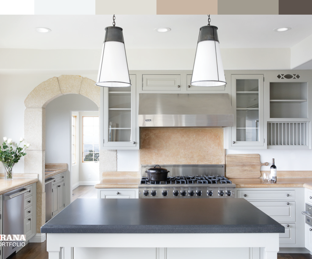 Warm neutral wall tones create a cozy, inviting atmosphere in family-focused kitchens
Credit: www.craftsmanpainters.com
Warm neutral wall tones create a cozy, inviting atmosphere in family-focused kitchens
Credit: www.craftsmanpainters.com
Frequently Asked Questions
What colors make kitchens look bigger and brighter?
Light, high-reflectance colors with cool or neutral undertones are your best bet for expanding small kitchens. Soft white, pale gray, and light blue reflect the most natural and artificial light, creating the illusion of more space. Avoid dark colors or warm, saturated shades on all four walls of a small kitchen, as they absorb light and make the space feel cramped. For a pop of color without sacrificing brightness, use a soft pastel on a single accent wall.
How do I choose a kitchen wall color with green cabinets?
Green cabinets have either warm (yellow, olive) or cool (sage, emerald) undertones, so your wall color should complement that undertone. Warm olive green cabinets pair beautifully with warm neutrals (beige, soft terracotta) or crisp white for contrast. Cool sage or emerald green cabinets work well with soft gray, pale blue, or warm white walls. For a bold look, pair deep green cabinets with a soft cream or pale yellow wall to keep the space from feeling too dark. For more tailored recommendations, check out our full guide to pairing shades for green cabinets.
What wall colors increase appetite in the kitchen?
Warm, saturated colors like soft red, burnt orange, and golden yellow are proven to stimulate appetite and create a cozy, energetic atmosphere. These colors work best as accent walls or in kitchens with plenty of natural light, as they can feel overwhelming in dark or small spaces if used on all four walls. For a more subtle appetite-boosting effect, use warm neutrals (terracotta, soft peach, warm taupe) instead of bright red or orange.
Can wall color affect kitchen lighting perception?
Absolutely. Light colors (white, pale gray, soft blue) reflect light, making your kitchen feel brighter and more open, even if you have limited natural light. Dark colors (navy, charcoal, forest green) absorb light, which can make a large kitchen feel cozy, but will make a small or low-light kitchen feel dim and cramped. If you have a dark kitchen with little natural light, stick to light, cool-toned wall colors and add under-cabinet lighting to compensate for the lack of natural light.
How often should I repaint my kitchen walls?
Kitchen walls take more abuse than other rooms in your home, due to steam, grease splatters, and general wear and tear. With a high-quality, scrubbable satin or semi-gloss finish, you can expect your kitchen paint to last 5–7 years before needing a touch-up or full repaint. If you notice fading, stains that won’t come out, or peeling, it’s time to repaint sooner.
Conclusion
The perfect kitchen wall color balances your personal style with your space’s unique lighting, size, and permanent fixtures. Light, cool tones open up small, low-light kitchens, while warm neutrals and bold accents add personality to large, sunlit spaces. No matter which shade you choose, testing swatches in your actual kitchen over multiple days is non-negotiable to avoid costly mistakes. Remember that your kitchen should feel like a space you love spending time in, so don’t be afraid to pick a color that brings you joy, even if it’s a little bold.
Ready to tackle your kitchen refresh? Unlike more involved updates like replacing a wall-mounted faucet, painting your walls is a low-cost, high-impact way to transform the space. For step-by-step guidance on removing outdated fixtures before you paint, check out our full guide to replacing a wall-mounted faucet.
Similar Posts








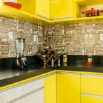
[…] Your wall color needs to work with the fixed elements you can’t easily change: cabinets, countertops, flooring, and backsplash. The biggest mistake here is ignoring undertones: warm oak cabinets have yellow or orange undertones, so pair them with warm off-white, greige, or soft terracotta walls, not cool gray which will create a muddy, clashing look. Cool gray or navy cabinets pair best with cool white, soft blue, or pale gray walls to maintain a cohesive feel. If you have forest green or sage kitchen cabinets, soft cream or warm white walls create a balanced, earthy look, while cool gray walls add modern contrast — for more specific pairing ideas, check out our guide to coordinating shades for green cabinetry. For darker walnut or cherry wood cabinets, our guide to wall colors that complement wood tones has tailored recommendations for warm wood palettes. For more on this, see our guide on how to pick wall color for kitchen. […]