Cream Kitchen Cabinets What Colour Walls: Stunning Color Ideas
Cream kitchen cabinets are a perennially popular choice for 2026, prized for their warm, timeless feel that works with everything from farmhouse to minimalist design schemes. But the wrong wall color can make your beautiful cabinetry look washed out, dull, or even clash with your existing finishes, leaving your kitchen feeling unbalanced instead of inviting. As noted by the National Kitchen and Bath Association, cream cabinetry has ranked among the top 3 most popular residential cabinet finishes since 2022, thanks to its flexibility across design styles — but pairing it with the right wall shade is the key to unlocking its full potential. Whether you want a soft, cozy backdrop or a bold, high-contrast statement, this guide covers stunning, practical color ideas to make your cream cabinets shine, plus expert tips to avoid common pairing mistakes.
Understanding How Cream Cabinets Interact With Wall Color
Before diving into specific shades, it’s helpful to understand why cream cabinets pair so well with such a wide range of wall colors. Unlike stark white cabinets, which have cool, neutral undertones, most cream cabinets have subtle warm undertones of yellow, beige, or soft taupe. This warm base means wall colors either need to complement that warmth for a cohesive, low-contrast look, or create intentional contrast to make the cream pop. In practice, this means cool-toned wall shades will often make cream cabinets appear more yellow by comparison, while warm or neutral shades will keep the palette balanced and harmonious. You can also read our guide on what colour walls go with white kitchen cabinets.
Foolproof Soft Neutral Pairings For Cream Cabinets
Soft neutrals are the most low-risk, timeless option for pairing with cream cabinets, as they create a calm, cohesive backdrop that lets your cabinetry and decor take center stage. Ideal for small kitchens, open-concept layouts, or anyone who prefers a low-fuss, forever-style palette, these shades avoid clashing with cream’s warm undertones while adding subtle depth to the space.
Warm Grays And Greiges
Warm grays (often called greiges) blend the calm neutrality of gray with the cozy warmth of beige, making them the perfect match for cream cabinets with subtle yellow or taupe undertones. Widely available shades like Sherwin-Williams Agreeable Gray, Benjamin Moore Edgecomb Gray, and Farrow & Ball Cornforth White work for every design style, from farmhouse to modern minimalist. They pair seamlessly with natural wood accents, stainless steel appliances, and marble countertops, and won’t close in small spaces. These shades are also a foolproof pick if you’re coordinating brown cabinetry with warm wood accents, as they won’t clash with natural timber tones. You can also read our guide on what color kitchen cabinets go with knotty pine.
Soft Beige And Taupe
If you want a slightly warmer, more inviting neutral, soft beige and taupe shades like Sherwin-Williams Accessible Beige, Benjamin Moore Balboa Mist, and Valspar Sand Dune add depth without overwhelming your cream cabinets. These tones are ideal for open-concept kitchens that flow into dining or living areas, as they create a seamless, cohesive neutral palette across multiple spaces. They also work beautifully with terracotta accessories, woven jute rugs, and ceramic canisters for a cozy, lived-in feel.
Common Neutral Pairing Mistakes
The most common error when choosing neutral wall colors for cream cabinets is picking a shade with cool blue or purple undertones, which can make warm cream cabinetry look dingy, yellow, or outdated in comparison. Always test neutral swatches next to your cabinet doors in natural light to ensure the undertones align. You can also read our guide on what color kitchen cabinets go with gray walls.
 Soft sky blue walls create a calm, airy backdrop for warm cream cabinets, perfect for coastal or cottage-style kitchens.
Bold Contrast Pairings For High-Impact Kitchens
If you want your cream cabinets to stand out as a statement feature, bold contrast wall colors are the way to go. These rich, saturated shades make cream pop, adding drama and personality to your space — but they require careful planning to avoid feeling overwhelming.
Deep Navy And Charcoal
Deep navy (like Sherwin-Williams Naval or Benjamin Moore Hale Navy) and charcoal (like Benjamin Moore Black Fox or Sherwin-Williams Iron Ore) create a sophisticated, moody backdrop that makes cream cabinets feel bright and crisp. This pairing is perfect for modern, industrial, or transitional kitchens, and pairs beautifully with brass or matte black hardware, concrete countertops, and open wood shelving. In practice, this combo works best in kitchens with at least 6 hours of daily natural light; for dimmer spaces, use the bold shade on a single accent wall behind your range instead of all four walls to avoid closing in the room. You can also read our guide on sage green kitchen units what colour walls.
Rich Jewel Tones
Emerald green, deep teal, and burgundy are unexpected, high-impact options that complement cream’s warmth beautifully. Shades like Farrow & Ball Green Smoke or Sherwin-Williams Cocalo add a touch of luxury to traditional or eclectic kitchens, and pair well with brass fixtures, marble countertops, and vintage decor. A common mistake is pairing jewel tones with cool-toned stone countertops, which can create a clashing, disjointed look — opt for warm-toned granite or butcher block instead for cohesion.
When To Use Bold Contrasts
Bold wall colors are ideal for large kitchens (over 200 sq ft) or spaces used primarily for entertaining, as they create a dramatic, memorable atmosphere. If you have a small kitchen or limited natural light, limit bold shades to a single accent wall, or use them on lower cabinet fronts instead of walls for a subtler effect. You can also read our guide on navy kitchen what colour walls.
Warm Earth Tone Pairings For Cozy, Rustic Kitchens
Warm earth tones bring a natural, grounded feel to your kitchen, enhancing cream’s inherent warmth to create a space that feels like a cozy gathering spot for family and friends. These shades are perfect for farmhouse, rustic, or cottage-style kitchens, and pair beautifully with natural wood accents, woven textiles, and vintage decor.
Terracotta And Burnt Sienna
Soft terracotta (like Sherwin-Williams Cocalo or Benjamin Moore Rustic Refined) and burnt sienna add a warm, sunbaked glow that complements cream cabinets perfectly. These shades work especially well if your cream cabinets have subtle yellow undertones, as they enhance the overall warmth of the space. Pair them with terracotta tile backsplashes, jute rugs, and open wooden shelves for a cohesive, rustic look. You can also read our guide on best fabric for cloth napkins.
Soft Mustard And Ochre
Muted mustard and ochre shades (like Benjamin Moore Hawthorne Yellow or Sherwin-Williams Golden Rule) add a subtle pop of color without feeling overwhelming. These tones are ideal for kitchens with south-facing windows, as they balance harsh afternoon sun with warm, inviting color. Avoid pairing them with cool gray countertops, as the contrast can feel jarring.
Cool Blue And Green Pairings For Calm, Airy Kitchens
Cool blues and greens add freshness and calmness to your kitchen, balancing cream’s warmth to create a spa-like, serene space. These shades are perfect for coastal, cottage, or Scandinavian-style kitchens, and work especially well in rooms with lots of natural light. You can also read our guide on what size screws for kitchen wall cabinets.
Soft Sage And Seafoam
Soft sage (like Sherwin-Williams Evergreen Fog or Benjamin Moore Sage Green) and seafoam green (like Benjamin Moore Sea Glass) bring a muted, natural green tone that feels fresh without being bright. These shades pair beautifully with white subway tile, light wood floors, and greenery (like potted herbs or hanging plants) for a calming, nature-inspired space. They also complement pairing green cabinetry with walls for a cohesive, nature-focused palette if you ever decide to update your cabinets down the line.
Pale Sky And Powder Blue
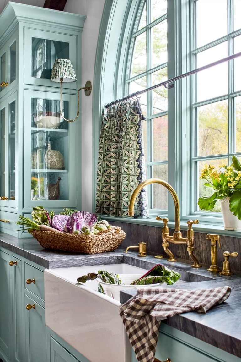
Pale sky blue and powder blue shades (like Sherwin-Williams Breathing Blue or Benjamin Moore Palladian Blue) add a soft, airy feel that makes kitchens feel open and spacious. These tones are ideal for galley kitchens or dim spaces, as they reflect light to brighten the room. Pair them with white appliances, wicker baskets, and blue-and-white ceramics for a classic coastal vibe. You can also read our guide on grey kitchen cabinets what colour walls.
 Image source: www.kylieminteriors.ca
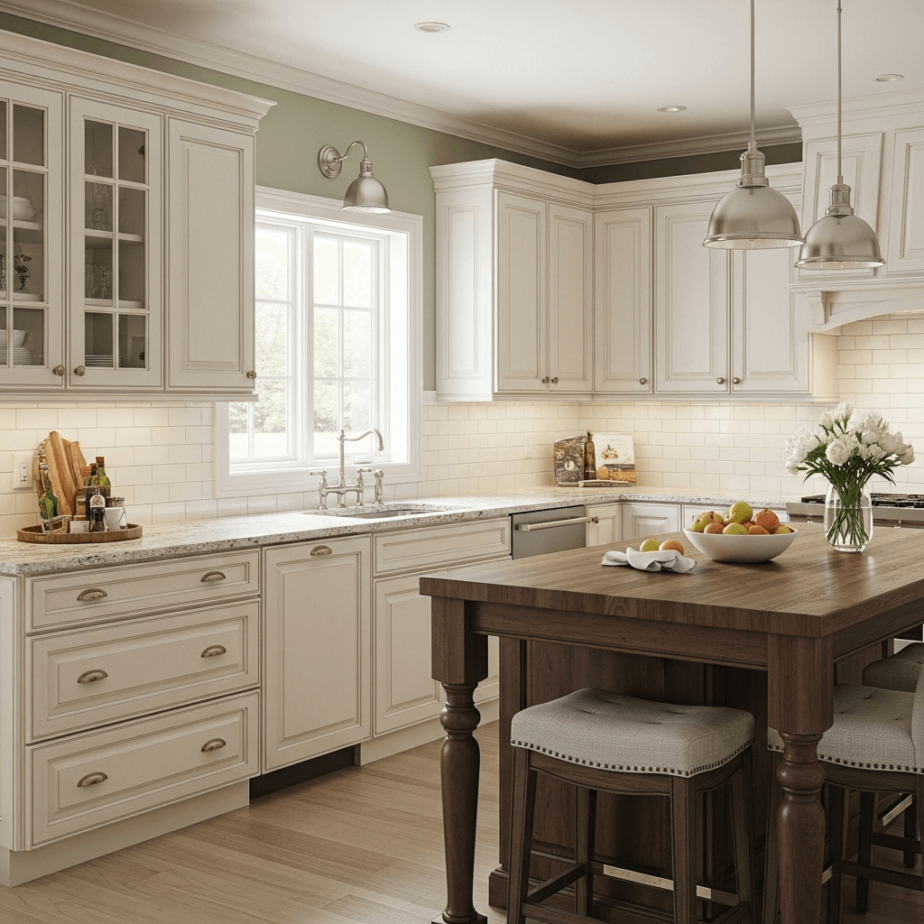
Warm gray walls like Benjamin Moore Edgecomb Gray balance the warm undertones of cream cabinets without creating a cold, sterile feel.
Image source: www.kylieminteriors.ca
Warm gray walls like Benjamin Moore Edgecomb Gray balance the warm undertones of cream cabinets without creating a cold, sterile feel.
Cozy Low-Contrast Pairings For Inviting Spaces
If you want a kitchen that feels soft, welcoming, and unobtrusive, low-contrast pairings that sit close to your cream cabinet shade on the color wheel are the perfect choice. These palettes feel calm and timeless, ideal for family homes or spaces used for daily cooking and gathering.
Muted Pastels
Muted pastels like soft blush, pale lavender, and muted mint add a touch of subtle color without overwhelming your cream cabinets. Shades like Sherwin-Williams Poised, Benjamin Moore Lavender Mist, and Valspar Mint Condition bring gentle personality to the space, while keeping the overall vibe calm and airy. These work especially well in kitchens with young kids, as they feel playful but not overstimulating. You can also read our guide on what color to paint kitchen walls with gray cabinets.
Monochromatic Cream And Beige
For a truly seamless, cozy look, choose a wall shade 1-2 tones lighter or darker than your cream cabinets for a monochromatic palette. This creates subtle depth without introducing competing colors, making the space feel larger and more cohesive. Add texture with a wood backsplash, woven rug, or ceramic accessories to avoid a flat, one-note look.
Modern Chic Pairings For Sleek, Contemporary Kitchens
Cream cabinets are a popular choice for modern kitchens, as their warm tone softens the sharp edges of sleek, minimalist design. Pair them with these wall colors to achieve a high-end, contemporary look. You can also read our guide on cream kitchen black worktop what colour walls.
Dark Gray And Charcoal
Dark gray and charcoal walls provide a sleek, moody backdrop that makes cream cabinets pop, creating a balanced contrast that feels both modern and inviting. This pairing is perfect for minimalist or industrial kitchens, and pairs beautifully with concrete countertops, brushed nickel hardware, and warm under-cabinet LED lighting to soften the contrast. If your kitchen is north-facing with low light, add a few warm-toned decor pieces (like amber glass vases or wooden cutting boards) to balance the cool dark walls.
Full Black Walls And Accents
Full black walls or a single black accent wall behind your range or sink make a bold, sophisticated statement that feels both dramatic and elegant. This pairing works best in kitchens with ample natural light from large windows, as it prevents the space from feeling heavy or cramped. Tie the look together with black pendant lights, faucets, and cabinet handles for a cohesive, polished finish. You can also read our guide on how to stop kitchen cabinet door from hitting wall.
 Image source: www.kylieminteriors.ca
Taupe walls add subtle depth to cream cabinets in a rustic Tuscan kitchen, pairing seamlessly with natural stone countertops and warm wood accents.
Image source: www.kylieminteriors.ca
Taupe walls add subtle depth to cream cabinets in a rustic Tuscan kitchen, pairing seamlessly with natural stone countertops and warm wood accents.
Light Airy Pairings To Open Up Small Or Dim Kitchens
If you have a small galley kitchen, a dim north-facing space, or just want a bright, uplifting vibe, light wall colors will maximize natural light and make your space feel larger and more open.
Warm Crisp Whites
Warm crisp whites (like Sherwin-Williams Alabaster or Benjamin Moore White Dove) are the perfect pairing for cream cabinets, as they reflect maximum natural light to brighten the space without creating a cold, sterile feel. Unlike stark cool whites (which have blue undertones that make cream cabinets look yellow), warm whites have subtle yellow or beige undertones that align with cream’s base for a seamless, timeless look. This pairing works with every hardware finish, from brass to matte black, and will never go out of style. You can also read our guide on light gray kitchen cabinets what color walls.
Pale Cool Blues
Pale cool blues (like Sherwin-Williams Breath of Fresh Air or Benjamin Moore Breath of Fresh Air) add a soft, airy vibe that makes even tiny galley kitchens feel open and spacious. These shades work especially well in south-facing kitchens, as their cool undertones balance the warm afternoon sun to keep the space feeling calm, not overheated. Pair them with white subway tile, light wood floors, and coastal-inspired decor for a fresh, uplifting feel.
Practical Tips To Nail Your Color Choice
Choosing the right wall color for your cream cabinets requires more than just picking a shade you like online. These practical tips will help you avoid common mistakes and find a pairing that works for your space. You can also read our guide on what color to paint my kitchen walls with white cabinets.
Account For Natural Light
Natural light dramatically changes how wall colors appear throughout the day. North-facing kitchens get cool, dim light, so warm shades like soft peach, warm beige, or muted yellow will prevent the space from feeling cold. South-facing kitchens get harsh, warm light, so cool tones like soft blue, sage, or light gray will balance the warmth without feeling overwhelming. East-facing kitchens get cool morning light, so warm shades work well, while west-facing kitchens get warm afternoon light, so cool tones are a better fit.
Match Your Cabinet Finish
The finish of your cream cabinets also impacts which wall shades will work best. Glossy or semi-gloss cream cabinets (common in traditional kitchens) pair well with matte or flat wall paint, so the cabinets remain the focal point of the space. Matte cream cabinets (popular in modern kitchens) pair well with walls that have a slight satin sheen, to add subtle depth without clashing with the cabinet’s low-sheen finish. If your cabinets have a glazed or antiqued finish, avoid wall colors with similar undertones, as they can blend together and look muddy. You can also read our guide on cream kitchen what colour walls.
Balance For Room Size
Wall color can make your kitchen feel larger or cozier, so scale your shade choice to your space. For small kitchens under 100 sq ft, stick to light, monochromatic shades (warm white, light beige, pale blue) to open up the space and avoid feeling cramped. For large open-concept kitchens over 200 sq ft, don’t be afraid to use bold, saturated shades (navy, emerald, charcoal) — the extra space prevents dark walls from feeling overwhelming, and adds depth and warmth to the area.
Test Swatches Before Committing
The only way to know if a wall color works with your cream cabinets is to test it in your space. Paint 2×2 ft swatches on multiple walls, and view them at 8am, 12pm, 4pm, and 8pm to see how natural and artificial light changes the shade. Hold a cream cabinet door next to each swatch to check for undertone clashes, and wait a full week before making a final decision to let your eyes adjust to the new color. For a step-by-step guide to selecting a cohesive kitchen palette that accounts for your existing finishes, check out our full breakdown. You can also read our guide on how to paint wall tiles in kitchen.
Coordinating Wall Color With Existing Kitchen Finishes
Your wall color doesn’t exist in a vacuum — it needs to work with your existing countertops, backsplashes, and fixtures to create a cohesive, balanced look.
Countertop And Backsplash Pairing
If you have warm-toned countertops (like granite with brown/beige flecks, butcher block, or terrazzo with warm aggregates), pair them with warm wall shades (beige, taupe, soft yellow) for a unified, cozy feel. If you have cool-toned countertops (like quartz with gray/blue flecks, white marble with gray veins, or concrete), pair them with cool wall shades (soft blue, sage, light gray) to avoid clashing undertones. You can also read our guide on what colour walls with sage green kitchen units.
Hardware And Fixture Coordination
Your hardware and fixtures also impact your wall color choice. Brass or gold hardware pairs beautifully with warm wall shades, as the metal’s golden undertones are enhanced by the warm paint. Matte black or brushed nickel hardware works with both warm and cool wall shades, but avoid pairing warm yellow wall shades with matte black hardware, as the contrast can feel harsh. This pairing is just as versatile as pairing white cabinetry with walls, but with the added warmth of cream’s subtle undertones.
Low-Commitment Color Ideas If You Can’t Repaint
If you’re renting, not ready to commit to a full wall paint job, or just want to add color without the hassle, these low-commitment ideas let you experiment with color next to your cream cabinets. You can also read our guide on beige kitchen cabinets what color walls.
Colorful Backsplashes
A colorful backsplash is the easiest way to add a pop of color without painting your walls. Terracotta tile, blue zellige, green glass, or patterned ceramic tile add personality and tie your palette together, and can be swapped out easily if you update your decor later.
Textiles And Decor
Colorful rugs, dish towels, small artwork, vases, and even small appliances (like a stand mixer in sage green) add subtle color to your space without permanent changes. Woven jute rugs with colored borders, terracotta canisters, and green potted herbs are easy, affordable ways to add warmth and personality. You can also read our guide on apron style kitchen sink.
Accent Furniture And Open Shelving
Paint a small sideboard, kitchen island, or open shelving unit a bold or pastel shade to add depth without repainting your walls. This is a great option for renters, as the piece can be taken with you when you move. This high-contrast look works especially well if you’re planning a full kitchen refresh, including updating your faucet — learn how to remove a wall mounted kitchen faucet before installing a new matte black fixture to complete the look.
Frequently Asked Questions
What wall colors make cream kitchen cabinets look yellow?
Cool-toned wall shades with blue or gray undertones (like stark white, cool gray, or icy blue) can make warm cream cabinets appear more yellow by contrast. To avoid this, choose wall shades with matching warm undertones, and always test swatches next to your cabinet doors before painting. You can also read our guide on red kitchen walls what color cabinets.
Can I use the same color for walls and cream cabinets for a monochromatic look?
Yes, but select a wall shade 1-2 tones lighter or darker than your cabinets to create subtle depth. A monochromatic palette feels calm and timeless, but add texture (like a wood backsplash, woven rug, or ceramic accessories) to avoid a flat, one-note look.
Do cream cabinets work with dark wall colors in small kitchens?
Full dark walls can make small galley kitchens feel cramped, but a single dark accent wall behind your range or sink adds high contrast without closing in the space. If you want full dark walls, ensure your kitchen has at least 2 large windows to let in ample natural light.
What wall color goes with cream cabinets and gray countertops?
Warm neutrals like Sherwin-Williams Agreeable Gray, soft sage green, or warm off-white (like Benjamin Moore White Dove) complement both cream cabinets and cool gray countertops, creating a balanced, modern palette that doesn’t clash with the countertop’s cool undertones.
Should I match my wall color exactly to my cream cabinets?
Exact matches create a flat, monotonous look with no visual depth. Instead, choose a wall shade that’s 1-2 shades lighter or darker than your cabinets, or a complementary neutral, to highlight your cabinetry without overwhelming the space.
Conclusion
Your cream kitchen cabinets are a versatile foundation for almost any design aesthetic, and the right wall color can transform your space from ordinary to unforgettable. Soft neutrals like warm gray and taupe create a calm, timeless backdrop for everyday use, while bold shades like navy and emerald add high-impact drama for entertaining. For small or dim kitchens, light airy shades like warm white and pale blue open up the space, while warm earth tones bring cozy, rustic charm to family-focused homes. No matter your style, the most important step is to test 2-3 paint swatches on your walls, view them at different times of day, and hold them up to your cabinet doors to check for undertone clashes. Ready to find your perfect match? Grab a few sample pots today, and you’ll be on your way to a kitchen you’ll love spending time in for years to come.