What Colour Walls With Cream Kitchen Cabinets: Stunning Ideas Revealed
Cream kitchen cabinets are a perennially popular choice for 2026, offering a warmer, more forgiving alternative to stark white that hides wear and tear while feeling timeless and inviting. But their subtle undertones—ranging from warm yellow to cool beige—mean not every wall color will complement them. Pick the wrong hue, and your kitchen can feel dingy, mismatched, or overly yellow; choose the right shade, and you’ll amplify the cabinets’ natural warmth while creating a space that feels intentional, bright, and uniquely yours. In this guide, we break down tested, trend-aligned wall color pairings for every cream cabinet undertone, lighting scenario, and design style, plus step-by-step testing tips to avoid costly repaints.
First, Identify Your Cream Cabinet Undertones
Before browsing paint swatches, you need to know if your cream cabinets have warm or cool undertones—this is the single most important factor in picking a complementary wall color, and it’s a step most generic guides skip. Warm undertones lean yellow, golden, or peachy; cool undertones lean gray, beige, or slightly blue. To test, hold a plain white sheet of paper next to your cabinets in natural daylight: if the paper makes the cabinets look more yellow, they’re warm-toned; if it makes them look more gray or neutral, they’re cool-toned. Matching your wall color to this base ensures a harmonious, cohesive look instead of a clashing, unpolished finish. In practice, the most common homeowner mistake is skipping this step and choosing a wall color that looks perfect in a store swatch but clashes with their existing cabinetry at home. For more on this, see our guide on cream kitchen cabinets what colour walls.
Top Wall Color Families for Cream Kitchen Cabinets
Cream cabinets are incredibly versatile, but pairing them with a wall color that aligns with your design style, lighting, and cabinet undertones will make the space feel intentional rather than default. Below are the top tested color families, with 2026 trend picks and honest trade-offs for each.
Warm Neutrals for a Cohesive, Timeless Look
Warm neutrals are the safest, most versatile pick for cream cabinets, working with every undertone and design style from farmhouse to modern. Shades like warm greige, sandy beige, soft taupe, and creamy off-white create a seamless, monochromatic look that makes small kitchens feel larger and keeps the focus on your cabinetry and countertops. In 2026, warm greige (a blend of gray and warm beige) is the most popular neutral for kitchen walls, as it balances the warmth of cream without feeling yellow or dingy. Top picks include Benjamin Moore Edgecomb Gray and Sherwin-Williams Accessible Beige. The only trade-off? All-neutral palettes can feel flat if you don’t add texture: pair these walls with natural wood accents, matte cabinet hardware, or a textured backsplash to add depth. If your cream cabinets have warm yellow undertones, warm taupe or sandy beige will create a seamless, earthy look — for more specific pairings, check out our guide to matching wall hues to brown kitchen cabinets.
 Warm beige walls create a seamless, cohesive look that lets cream cabinets and natural stone countertops take center stage.
Credit: www.interiorcompany.com
Warm beige walls create a seamless, cohesive look that lets cream cabinets and natural stone countertops take center stage.
Credit: www.interiorcompany.com
Cool Tones for Fresh, High-Contrast Style
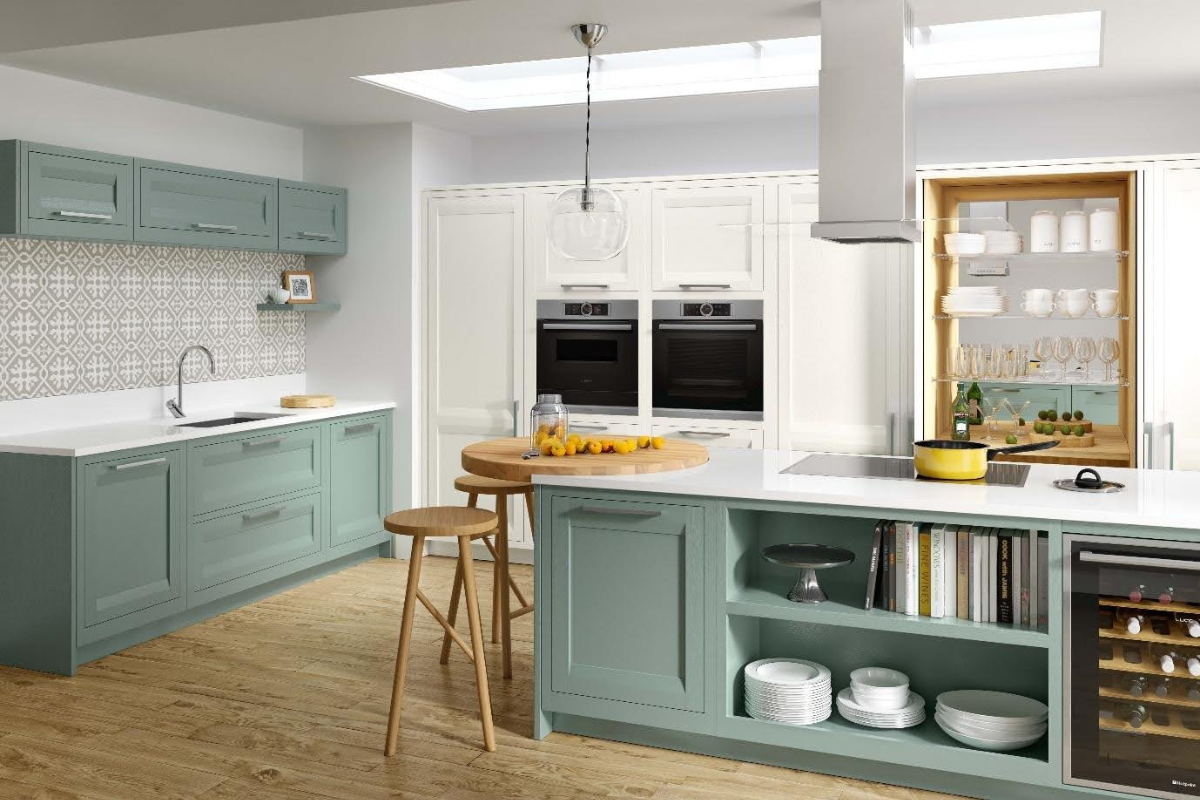
Cool wall colors create a striking, refreshing contrast that makes cream cabinets pop, perfect for modern, coastal, or cottage-style kitchens. Pale blues, soft sage green, and cool light grays balance the inherent warmth of cream cabinetry, preventing the space from feeling too yellow or stuffy. For a subtle, airy look, try Sherwin-Williams Sea Salt (a pale blue-green) or Benjamin Moore Palladian Blue, both of which work beautifully with cream cabinets that have cool beige undertones. If you’re drawn to green walls, muted sage or mossy green pairs especially well with cream, creating a soft, organic feel; for more inspiration, see our wall color pairings for green cabinetry. The trade-off with cool tones is that they can feel harsh in north-facing kitchens with limited natural light, so pair them with warm-toned lighting (2700K LED bulbs) to avoid a cold, clinical vibe.
 This soft cool gray wall color makes cream shaker cabinets pop while keeping the space feeling bright and airy.
Credit: www.goodhousekeeping.com
This soft cool gray wall color makes cream shaker cabinets pop while keeping the space feeling bright and airy.
Credit: www.goodhousekeeping.com
Warm, Earthy Tones for an Inviting, Organic Vibe
Earthy shades bring a cozy, grounded feel to kitchens with cream cabinets, ideal for rustic, farmhouse, or boho design styles. Muted terracotta, olive green, warm sand, and soft brown echo natural materials like wood and stone, creating a space that feels warm and welcoming. 2026 design trends show muted olive and soft terracotta replacing brighter, saturated shades as the top earthy picks, as they add personality without overwhelming the neutral cabinetry. Try a muted terracotta accent wall behind your range for a subtle pop of warmth, or paint all walls a soft olive green for a calming, nature-inspired retreat. The trade-off? Darker earthy tones can make small kitchens feel cramped, so opt for lighter, muted shades or reserve darker hues for a single accent wall.
Bold, Deep Shades for Dramatic, Sophisticated Spaces
If you love high-contrast, high-end design, deep navy, forest green, charcoal, and burgundy wall colors create a stunning backdrop that makes cream cabinets the undeniable focal point of your kitchen. These shades add depth and drama while hiding scuffs, stains, and everyday wear—ideal for families with kids or pets. Benjamin Moore Hale Navy is a top-rated pick for cream cabinet pairings, as its deep blue undertones complement both warm and cool cream tones without clashing. Pair dark walls with brass or gold hardware and plenty of task lighting (under-cabinet lights, pendant lights over the island) to keep the space feeling bright and inviting. The trade-off? Dark walls require more lighting to avoid a cave-like feel, so plan for extra light fixtures if your kitchen has limited natural light.
Soft Pastels for a Light, Airy, Vintage Feel
Soft pastels add a cheerful, subtle pop of color to cream cabinet kitchens without overwhelming the space, perfect for cottage, shaker, or vintage-inspired designs. Blush pink, pale mint, lavender, and soft peach create a warm, inviting atmosphere that feels fresh but not childish. 2026 trends favor muted, desaturated pastels over bright, neon shades for a more sophisticated, calming vibe: try Sherwin-Williams "Momentous" (a soft blush) or "Sea Salt" (a pale mint) for a timeless look. Pastels pair especially well with cream cabinets that have warm undertones, as they amplify the cozy, sunny feel of the cabinetry. The trade-off? Very pale pastels can look washed out in bright, direct sunlight, so always test samples on your actual walls before committing.
Accent Walls and Patterned Options to Add Personality
If you’re hesitant to commit to a full wall of bold or colored paint, accent walls and patterned finishes are a low-risk way to add personality to your cream cabinet kitchen. An accent wall painted in a deeper shade of your chosen color family (e.g., a darker navy behind the stove, or a terracotta wall behind open shelving) creates a focal point without overwhelming the space. For extra texture, consider grasscloth wallpaper, subtle botanical prints, or limewash paint, which adds a soft, matte, lived-in feel that works beautifully with cream cabinetry. A common mistake is choosing a busy, high-contrast pattern that competes with your cabinets: opt for muted, low-saturation prints in shades that complement your wall color for a cohesive look.
 A pale blue accent wall behind open shelving adds subtle contrast without overwhelming warm cream cabinetry.
Credit: www.kylieminteriors.ca
A pale blue accent wall behind open shelving adds subtle contrast without overwhelming warm cream cabinetry.
Credit: www.kylieminteriors.ca
How Kitchen Lighting Changes Your Wall Color Appearance
Lighting is the make-or-break factor for wall color in a kitchen, and it’s one most homeowners overlook until after they’ve painted. Natural light direction drastically impacts how colors appear: north-facing kitchens get cool, bluish morning light, which can make warm wall colors look muted and cool wall colors feel harsh; south-facing kitchens get warm, golden afternoon light, which amplifies warm undertones in both walls and cabinets. East-facing spaces get cool morning light and warm afternoon light, while west-facing spaces have the opposite, so test samples in both conditions. For artificial lighting, opt for warm 2700K-3000K LED bulbs to enhance warm wall tones, or 3500K cool bulbs for cool-toned walls. Always test paint samples on your actual walls and view them at 8am, 12pm, 4pm, and 8pm under your kitchen’s existing lights to see how the color shifts throughout the day. For evidence-based guidance on selecting durable, low-VOC paint for high-traffic, high-moisture kitchen spaces, the University of Minnesota Extension recommends prioritizing stain-resistant finishes and testing for moisture resistance before application University of Minnesota Extension interior paint guide.
Step-by-Step Testing Process to Avoid Costly Mistakes
Skipping paint testing is the most common cause of disappointing kitchen paint jobs, and it’s easy to avoid with a simple 4-step process:
- Purchase 2-3 small sample pots of your top 2-3 color choices, rather than relying on tiny paper swatches that don’t show how the color looks on a large surface.
- Paint 2ft x 2ft swatches on at least two different walls in your kitchen, including one wall near your cream cabinets and one near your backsplash.
- Let the swatches cure fully for 24 hours—paint often dries lighter or darker than it appears when wet.
- View the swatches at multiple times of day, under both natural and artificial light, and hold them next to your cabinets, countertops, and flooring to check for clashing. If you’re planning a full kitchen refresh alongside your paint project, swapping out an outdated faucet is a quick way to elevate the space — our guide to upgrading your kitchen fixtures walks you through the process step by step.
Common Mistakes to Avoid
Even with careful planning, a few common errors can ruin your cream cabinet and wall color pairing:
- Pairing warm yellow-based cream cabinets with cool-toned blue or gray walls: this clash makes the cabinets look orange and dingy, rather than creating intentional contrast. If you love cool walls, opt for cream cabinets with cool gray undertones first.
- Using very dark walls in a small, north-facing kitchen: dark shades absorb light, making the space feel cramped and cold. If you want a dramatic look, use dark paint on a single accent wall instead of all four surfaces, or add extra warm lighting.
- Testing swatches on a white poster board instead of your actual wall: the color of your existing wall, cabinets, and flooring will drastically change how the new paint looks, so always test on your kitchen’s surfaces.
- Ignoring your backsplash and countertop tones: your wall color should complement both your cream cabinets and your hard surfaces, not clash with granite, quartz, or tile.
2026 Trend-Alert: Popular Cream Cabinet and Wall Pairings
The National Kitchen and Bath Association (NKBA) 2026 design trends highlight a shift toward calm, cohesive, low-saturation color palettes that prioritize longevity over trendy, bold shades. Top pairings this year include:
- Cream cabinets with warm greige walls and natural wood accents
- Cream cabinets with pale sage green walls and brass hardware
- Cream cabinets with soft navy accent walls and white marble countertops
- Cream cabinets with muted terracotta accent walls and matte black fixtures These pairings work for every kitchen size and style, and they’re designed to feel fresh for 10+ years, rather than looking dated after 2-3. If you’re tackling other small kitchen updates this year, our guide to simple DIY fixture swaps makes replacing outdated hardware and faucets quick and mess-free.
Frequently Asked Questions
What wall colors complement cream kitchen cabinets with warm undertones?
Warm neutrals (sandy beige, warm greige, soft taupe), earthy tones (terracotta, olive), and soft pastels (blush, pale peach) all complement warm yellow-based cream cabinets by amplifying their cozy, inviting vibe. Avoid cool-toned blue or gray walls with warm cream, as they will make the cabinets look orange and dingy.
Can dark walls work with cream kitchen cabinets?
Yes, dark navy, charcoal, and forest green walls create striking, sophisticated contrast with cream cabinets, making the cabinetry the focal point of the space. This pairing works best in large kitchens with ample natural light; for small or dim kitchens, use the dark shade on a single accent wall instead of all four surfaces to avoid feeling cramped.
Should I paint my walls the same color as my cream cabinets?
Painting walls a slightly lighter or darker shade of the same cream tone as your cabinets creates a seamless, monochromatic look that makes small kitchens feel larger. Just be sure to pick a shade with the same undertone as your cabinets to avoid a mismatched, muddy appearance.
Do cream walls work with cream cabinets?
Yes, but only if the wall paint is a noticeably lighter or darker shade than your cabinets, and shares the same undertone. For example, pair warm cream cabinets with a pale warm off-white wall, or cool cream cabinets with a soft cool beige wall. Avoid identical shades, as they will blend together and make the space feel flat.
Conclusion
Choosing the right wall color for your cream kitchen cabinets comes down to three key factors: matching the color to your cabinet undertones, accounting for your kitchen’s natural and artificial lighting, and testing samples fully before committing to a full paint job. Warm neutrals offer a timeless, low-risk pick for any space, while cool tones, earthy shades, bold darks, and soft pastels let you add personality to match your design style. By avoiding common mistakes like skipping undertone checks or testing swatches on poster board, you’ll create a kitchen that feels bright, cohesive, and perfectly aligned with your vision for years to come.