What Color Walls Go With Taupe Kitchen Cabinets: Stunning Ideas
Taupe has surged in popularity as a kitchen cabinet choice in recent years, prized for its ability to blend warm, earthy comfort with subtle modern sophistication—but its mixed brown-gray undertones make wall color pairing one of the most common pain points for homeowners and renters alike. You’ve likely stood in the paint aisle holding up swatches that look perfect in the store, only to hate how they look on your wall at 7 PM under artificial light. Or maybe you’ve tried a color that clashed with your taupe’s hidden purple or green undertones, leaving your kitchen feeling dull instead of inviting.
The right wall color will make your taupe cabinets feel intentional, brighten your space, and tie your entire kitchen design together—no matter your style, layout, or lighting conditions. In this guide, we’ll break down how to identify your cabinet’s undertones, share no-fail neutral and bold color pairings, outline common mistakes to avoid, and offer low-commitment accent wall ideas for renters and homeowners alike. For more on this, see our guide on what color walls go with green kitchen cabinets.
Understanding Taupe Kitchen Cabinets First
You can’t pick the perfect wall color if you don’t know what undertones your taupe cabinets carry. Unlike stark white or warm beige, taupe is not a single, standardized shade: it falls somewhere between brown and gray, often with subtle hints of purple, green, or red that shift depending on lighting and finish.
What Makes Taupe Unique?
Taupe’s flexibility is its greatest strength: it works in every design style, from modern farmhouse to industrial, and acts as a neutral base that lets you swap out decor, backsplashes, and wall colors without full renovations. But that same flexibility makes it tricky to pair with walls, as a taupe with warm red undertones will look completely different next to a wall color than a cool, gray-leaning taupe. Matte paint-finished taupe cabinets often read as cooler than glossy thermofoil taupe cabinets, which tend to have warmer, more yellow undertones due to the finish’s reflective properties. For more on this, see our guide on what color walls go with brown kitchen cabinets.
Identifying Your Cabinet Undertones
The fastest, most reliable way to identify your taupe’s undertones is to hold a sheet of plain, bright white printer paper next to the cabinet in natural daylight (avoid fluorescent or incandescent light, which skews color perception):
- If the taupe looks more brown, beige, or warm next to the white paper, it has warm undertones.
- If it looks more gray, cool, or muted, it has cool undertones.
- If you see a faint purplish or greenish tint, it is a neutral taupe with no strong warm or cool lean.
If you have the cabinet manufacturer’s paint code or product information, you can also look up the undertone specification online for a definitive read. A common mistake homeowners make is judging undertones under only artificial light, which can make warm taupe look cool and vice versa—always test in natural light for the most accurate result.
Core Principles for Pairing Wall Colors With Taupe Cabinets
Before diving into specific color picks, these two foundational rules will help you make confident, cohesive choices that work for your space. For more on this, see our guide on what color to paint my kitchen walls with.
Match or Contrast Undertones for Your Desired Vibe
You have two core approaches to pairing wall colors with taupe cabinets:
- Harmonious pairings: Choose wall colors with the same undertone family as your cabinets for a seamless, cozy, cohesive look. Warm taupe pairs beautifully with warm creams, soft beiges, and muted terracotta, while cool taupe works with pale grays, soft blues, and muted sage green.
- Contrasting pairings: Choose wall colors with opposite undertones for a bold, eye-catching look. For example, a warm taupe with red undertones pairs stunningly with soft sage green (its complementary color on the color wheel), making both hues feel more vibrant without clashing. As the leading kitchen and bath design trade association notes, matching undertones between cabinetry and wall finishes is one of the most reliable ways to create a cohesive, timeless kitchen design.
Account for Your Kitchen’s Lighting and Layout
A color that looks perfect in a showroom can look completely different in your kitchen, depending on how light moves through the space:
- North-facing kitchens get cool, dim indirect light: Opt for warm wall tones (soft cream, warm beige, pale peach) to prevent the space from feeling cold or gloomy.
- South-facing kitchens get bright, warm direct light: Cool or neutral wall tones (pale gray, soft blue, greige) will stop the space from feeling yellowed or stuffy in the afternoon.
- Small galley or low-ceiling kitchens: Stick to light, reflective wall colors to make the space feel larger. Avoid dark accent walls on the wall adjacent to the ceiling, as this will visually lower the ceiling height.
- Kitchens with minimal natural light: Skip dark wall colors entirely unless you add ample layered artificial lighting to compensate.
If you’re also considering bolder cabinet colors for other spaces in your home, our guide to wall pairings for green kitchen cabinets outlines similar undertone matching rules for a more vibrant neutral.
Top Neutral Wall Colors for Taupe Kitchen Cabinets
Neutral wall colors are the most versatile, low-risk option for taupe cabinets, as they work with every decor style and won’t clash with future updates. These are the most popular, high-performing neutral picks for 2026:
Warm Off-White and Cream
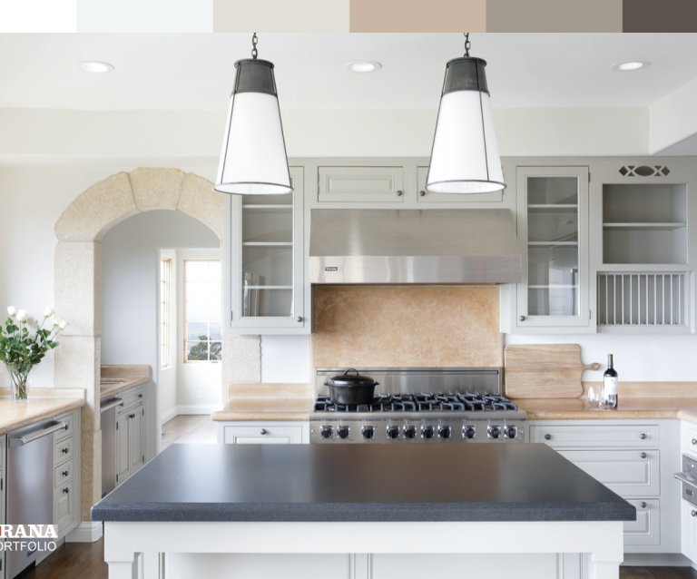
The all-time most popular choice for taupe cabinets, warm off-white and cream walls brighten the space, make taupe’s warm undertones feel richer, and create a clean, timeless backdrop that never goes out of style. Avoid stark, cool bright white, which will make warm taupe look muddy and dull. For a foolproof shade, look for warm off-whites with subtle yellow or beige undertones, like Benjamin Moore White Dove or Sherwin-Williams Alabaster. A satin finish is ideal for kitchens, as it is highly wipeable without the harsh glare of high-gloss paint. For more on this, see our guide on what color to paint kitchen walls with light.
Soft Greige (Gray-Beige)
Greige is the perfect middle ground for transitional or modern kitchens, bridging the gap between taupe’s brown and gray undertones for a layered, monochromatic look that feels intentional, not flat. Opt for a greige with a touch of warmth (like Sherwin-Williams Agreeable Gray) to avoid clashing with warm taupe cabinets. This shade is especially low-maintenance, as it hides scuffs and marks better than pure white or light gray, making it ideal for family kitchens.
Warm Light Gray
For cool-leaning taupe cabinets, a warm light gray (not a cool, blue-toned gray) adds subtle, sophisticated contrast without feeling harsh. This pairing works beautifully with stainless steel appliances and marble countertops for a sleek, contemporary vibe. Always test a 2×2 foot sample on your wall before purchasing, as gray can appear cooler or warmer next to taupe than it does on a paint chip. For more on this, see our guide on what color walls go with white kitchen cabinets.
Soft Sage Green
A muted, gray-based sage green is the perfect natural complement to taupe, bringing a calming, organic feel that works well for farmhouse, cottage, or coastal-style kitchens. Avoid bright, lime, or yellow-based greens, which will clash with taupe’s subtlety. This pairing looks especially elevated when paired with brass hardware and natural wood accents.
Bold Wall Colors to Make Taupe Cabinets Pop
If you want to add personality and drama to your kitchen, these bold wall colors pair beautifully with taupe cabinets for a high-impact, curated look:
Deep Navy Blue
Deep navy is a timeless, sophisticated choice that creates beautiful contrast with taupe’s warm undertones, adding depth without feeling oppressive. This pairing works especially well in kitchens with plenty of natural light, and looks stunning paired with white countertops, brass fixtures, and open wood shelving. If you have a small or dim kitchen, use navy on a single accent wall (behind the range or sink) instead of all four walls to avoid making the space feel cramped.
Charcoal Gray
Charcoal gray is the perfect choice for industrial or modern minimalist kitchens, creating a dramatic, moody backdrop that makes taupe cabinets feel like a warm, intentional focal point. To keep the space from feeling too dark, pair charcoal walls with light wood open shelves, white countertops, and plenty of under-cabinet task lighting.
Terracotta and Burnt Orange
For a warm, earthy, Mediterranean or Southwestern vibe, muted matte terracotta or burnt orange walls complement warm taupe cabinets perfectly, creating a cozy, inviting space that feels perfect for family gatherings. Avoid bright, saturated orange tones, which will overwhelm taupe’s subtlety. This pairing looks stunning with terracotta floor tiles and woven rattan decor.
Deep Forest Green
Rich, moody forest green is a luxurious option that pairs beautifully with both warm and cool taupe cabinets, bringing an organic, elevated feel to the space. This works especially well with natural stone countertops, wood accents, and brass hardware for a high-end, lived-in look. Use it on an accent wall or in a kitchen with ample light to avoid making the space feel dark.
For a richer, darker cabinet finish, our recommendations for wall colors with brown kitchen cabinets walk through complementary bold and neutral pairings for deep, warm cabinetry.
Accent Walls and Textured Finishes for Added Dimension
If you’re not ready to commit to painting all your walls, accent walls and textured finishes are a low-commitment way to add personality and depth to your taupe cabinet kitchen.
Statement Accent Walls
An accent wall behind your stove, sink, or breakfast nook draws the eye naturally and adds a focal point without overwhelming the space. For taupe cabinets, popular accent wall options include deep burgundy, patterned tile, grasscloth wallpaper, or even a limewash finish in a warm neutral. Pro tip: align your accent wall with the room’s natural focal point (usually the range or sink) for a balanced, intentional look.
Textured Paint and Finishes
Textured finishes add subtle dimension that makes taupe cabinets stand out without relying on bold color. For a soft, organic feel, opt for limewash paint, which creates a weathered, matte finish with subtle color variation. For a high-end, tactile look, Venetian plaster adds a subtle sheen and texture that catches light beautifully. If you want a more understated option, a matte finish with a slight orange peel texture adds depth without drawing attention away from your cabinets.
Subtle Wallpaper Options
Removable, water-resistant wallpaper is a great rental-friendly option for adding pattern to your kitchen. Look for designs with tonal, low-contrast patterns (small florals, thin stripes, abstract textures) in shades 2-3 shades lighter or darker than your taupe cabinets. Avoid high-contrast geometric or bold floral patterns, which will make the space feel busy and clash with taupe’s understated vibe. Stick to a single accent wall for the biggest impact.
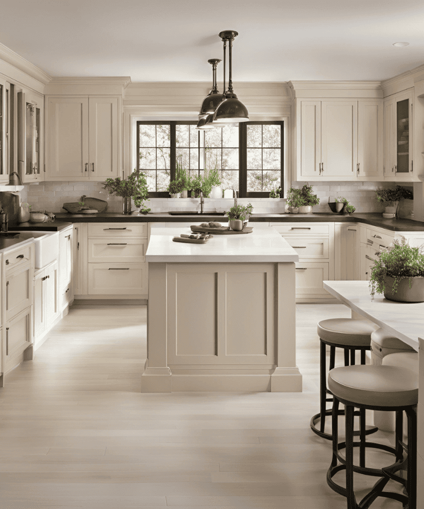 Soft cream walls and brushed brass hardware create a warm, timeless backdrop for medium-taupe cabinets, as seen in this contemporary kitchen design.
Credit: graceinmyspace.com
Soft cream walls and brushed brass hardware create a warm, timeless backdrop for medium-taupe cabinets, as seen in this contemporary kitchen design.
Credit: graceinmyspace.com
How Lighting Impacts Your Wall Color Choice
Even the most well-chosen wall color can look wrong in your kitchen if you don’t account for your space’s unique lighting. Taupe already shifts in different light, so your wall color will shift too—planning for this ahead of time will save you from costly repaints.
Natural Light Considerations by Window Direction
Natural light changes in temperature and intensity throughout the day, and your window direction will determine how your wall color reads:
- North-facing windows: Cast cool, dim indirect light all day. Warm wall tones (soft cream, warm beige, pale peach) will balance the cool light and prevent the space from feeling cold or gloomy.
- South-facing windows: Cast bright, warm direct light, especially in the afternoon. Cool or neutral wall tones (pale gray, soft blue, greige) will stop the space from feeling yellowed or stuffy.
- East-facing windows: Cast soft, warm light in the morning, with cool light in the afternoon. Most colors work well here, but avoid very dark walls if you frequently use your kitchen in the morning, as they can feel heavy in low evening light.
- West-facing windows: Cast harsh, warm golden light in the afternoon, with cool light in the morning. Muted pastels or cool neutrals will balance the intense afternoon glow and prevent the space from feeling overly warm.
Artificial Lighting Adjustments
Bulb color temperature, measured in Kelvins (K), drastically changes how your wall and cabinet colors read:
- 2700K-3000K bulbs emit warm, yellow light, perfect for enhancing warm taupe and cream walls for a cozy, inviting feel.
- 3500K-4000K bulbs emit cool, white light, ideal for modern kitchens with cool taupe and gray walls for a sleek, bright vibe.
For the most accurate read, bring your paint samples home and hold them up under your kitchen’s existing bulbs at night. If you notice an unflattering shift, swapping to a different bulb temperature is a low-cost fix that eliminates the need to repaint. For kitchen spaces, opt for low-VOC, scrubable finishes that meet EPA indoor air quality standards to resist moisture, food splatters, and everyday wear without releasing harmful chemicals.
 Large windows amplify natural light, making light gray walls feel bright and airy alongside warm taupe cabinetry.
Credit: www.brookfieldresidential.com
Large windows amplify natural light, making light gray walls feel bright and airy alongside warm taupe cabinetry.
Credit: www.brookfieldresidential.com
Common Wall Color Mistakes to Avoid With Taupe Cabinets
Even with the best guidelines, it’s easy to make small missteps that leave your kitchen feeling unbalanced. Avoid these common pitfalls for a flawless finish:
Picking a Wall Color Too Close to Your Taupe
If your wall color is only 1-2 shades lighter or darker than your taupe cabinets, the space will look flat, uncoordinated, and like you forgot to finish painting. Aim for at least a 3-shade difference between your cabinet and wall color for clear, intentional contrast.
Ignoring Undertones
A cool blue-gray wall will look muddy and dull next to warm taupe cabinets, while a warm beige wall will look lifeless next to cool taupe. Always match or intentionally contrast undertones, rather than picking a color you love in the store without testing it next to your cabinets first.
Skipping the Sample Test
Paint chips look drastically different on a wall than they do under store lighting. Always paint a 2×2 foot sample on multiple walls in your kitchen, live with it for 3 full days, and check it in morning, afternoon, and evening light before buying a full gallon of paint. This small step will eliminate 90% of paint regret.
Forgetting About Fixed Finishes
Your countertops, backsplash, and flooring are permanent elements you can’t change with a coat of paint. Make sure your wall color complements these finishes, not just your cabinets. For example, if you have warm granite countertops with brown undertones, a cool blue wall may clash with both the countertops and your taupe cabinets.
If you’re refreshing multiple elements of your kitchen at once, our step-by-step guide to removing a wall-mounted kitchen faucet makes fixture swaps quick and mess-free.
 A deep navy accent wall behind the range adds dramatic contrast to taupe cabinets, grounded by light marble countertops and brass fixtures.
Credit: www.bhg.com
A deep navy accent wall behind the range adds dramatic contrast to taupe cabinets, grounded by light marble countertops and brass fixtures.
Credit: www.bhg.com
Frequently Asked Questions
What wall colors complement taupe kitchen cabinets?
Soft off-whites, warm greiges, muted sage green, pale dusty blue, and warm beige are all top complementary choices. The best option depends on your cabinet’s undertones: warm taupe pairs best with warm neutrals or soft earthy tones, while cool taupe works with cool grays, soft blues, and muted greens. For a no-fail option that works with every taupe shade and design style, choose a warm off-white like Benjamin Moore White Dove.
Can dark walls work with taupe kitchen cabinets?
Yes, dark walls like charcoal, deep navy, or forest green work beautifully with taupe cabinets, but they perform best in kitchens with ample natural light or layered artificial lighting. To avoid the space feeling cramped, use dark walls on a single accent wall, or pair them with light countertops, open shelving, and plenty of metallic accents to reflect light.
Should I use warm or cool tones with taupe cabinets?
Choose based on your desired mood and your taupe’s undertones. Warm tones (cream, soft peach, terracotta) enhance taupe’s natural brown undertones for a cozy, inviting feel—ideal for family kitchens or cottage-style spaces. Cool tones (pale gray, soft blue, muted sage) highlight taupe’s gray undertones for a calm, modern vibe, perfect for minimalist or industrial designs. If you’re unsure, test both warm and cool samples in your kitchen’s lighting to see which feels more harmonious.
Are neutral wall colors best for taupe kitchen cabinets?
Neutral wall colors are often the most versatile choice for taupe cabinets, as they won’t clash with future decor updates or seasonal accents. Ideal neutral options include warm off-white, greige, soft warm gray, and warm beige. These shades create a calm, cohesive backdrop that lets your cabinets, backsplash, and accessories take center stage.
What paint finish works best for kitchen walls with taupe cabinets?
A satin or eggshell finish is ideal for most kitchens. Satin is highly scrubable and moisture-resistant, making it perfect for high-traffic areas behind stoves or sinks, while still having a soft, low-sheen look that doesn’t reflect too much glare next to taupe’s subtle matte or satin cabinet finishes. Avoid flat finishes, which stain easily, and high-gloss finishes, which can highlight wall imperfections.
Can I use wallpaper in a kitchen with taupe cabinets?
Yes, wallpaper is a great rental-friendly or low-commitment option for kitchens with taupe cabinets. Opt for removable, water-resistant wallpaper with subtle, tonal patterns (like small florals, thin stripes, or abstract textures) in shades that complement your taupe’s undertones. Avoid bold, high-contrast patterns, which can make the space feel busy and clash with taupe’s understated vibe. Use wallpaper on a single accent wall for the biggest impact without overwhelming the room.
Conclusion
Pairing the right wall color with your taupe kitchen cabinets doesn’t have to be overwhelming. Start by identifying your cabinet’s undertones using a simple white paper test in natural light, test 2-3 paint samples on your walls for 3 days to see how they look in different lighting, and choose a shade that either harmonizes for a cozy, seamless look or contrasts for a bold, personalized statement. Whether you opt for a timeless neutral, a soft pastel, or a dramatic bold hue, the right pairing will make your taupe cabinets feel intentional and elevate your entire kitchen space.
Ready to start your refresh? Pick 2-3 paint samples today, tape them to different walls, and live with them for 3 days to find your perfect match. If you’re tackling other kitchen updates alongside painting, our step-by-step guide to removing a wall-mounted kitchen faucet makes fixture swaps quick and mess-free.