Ivory Kitchen Cabinets: What Color Walls? Stunning, Designer-Approved Color Ideas
Ivory kitchen cabinets are a timeless, versatile choice for homeowners who want warmth without the starkness of pure white. Their soft, creamy undertones pair beautifully with nearly every design style, from cozy farmhouse to sleek modern, but the wrong wall color can make them look yellowed, flat, or disconnected from the rest of your space. Whether you’re renovating a forever home or refreshing a rental kitchen, this guide breaks down the core principles for pairing walls with ivory cabinetry, plus curated, tested color ideas to make your cabinets shine. We’ll also cover how lighting, finishes, and texture impact your final choice, so you can avoid costly repaints and create a space that feels cohesive and inviting for years to come.
Why Wall Color Choice Matters for Ivory Kitchen Cabinets
Unlike pure white cabinets, which have neutral undertones, ivory has subtle warm yellow or beige undertones that shift depending on the light and surrounding colors. A wall shade with clashing undertones (like a cool, blue-based white) can make ivory cabinets look dingy or outdated, while a well-matched shade enhances their natural warmth and makes your kitchen feel larger, brighter, or cozier depending on your goal. Many homeowners make the rookie mistake of picking a wall color that looks perfect in a store swatch, only to find it clashes with their cabinets once it’s painted on the wall — we’ll help you avoid that by covering the key factors to test before you buy paint.
Core Principles for Pairing Walls With Ivory Cabinets
Before diving into specific color ideas, use these three guidelines to narrow down your options and ensure a cohesive, long-lasting result:
Match Undertones for Harmony
Ivory’s warm undertones pair seamlessly with wall shades that have similar warm, yellow, or beige undertones for a seamless, blended look. If you want intentional contrast, opt for cool wall shades with soft blue or green undertones to make the ivory pop without clashing. Avoid stark, cool pure whites with blue or purple undertones, as these will make ivory cabinets look yellowed and disconnected from the rest of the room.
Account for Your Kitchen’s Lighting
Natural and artificial light drastically change how paint looks next to ivory. North-facing kitchens get cool, bluish light all day, so warm wall shades will balance the coolness and keep the space feeling cozy. South-facing kitchens get warm, golden light, so you can pull off cooler or bolder shades without the room feeling dark or drab.
Align With Your Desired Aesthetic
Think about the vibe you want: soft warm neutrals and pastels suit cozy cottage or farmhouse styles, cool grays and blues fit modern or coastal looks, and bold navy or emerald work for moody contemporary or luxury spaces. If you plan to sell your home soon, stick to neutral, widely appealing shades to avoid turning off potential buyers. If you love the warm, earthy vibe of ivory, you may also enjoy our guide to warm cabinet wall pairings for rich brown kitchen cabinetry.
Stunning Wall Color Ideas for Ivory Kitchen Cabinets
Now, let’s dive into curated, designer-approved color ideas, organized by vibe to match your style:
Warm Neutrals for Cozy, Timeless Appeal
Warm neutrals are the most popular, low-risk choice for ivory cabinets, as they enhance the cabinetry’s natural creaminess without overwhelming the space. Look for shades with an LRV (light reflectance value) between 45 and 65 to keep the room bright, even in small or dim kitchens.
- Soft taupe: A warm, earthy neutral with subtle beige undertones, soft taupe adds depth without feeling heavy. It pairs perfectly with brass or oil-rubbed bronze hardware, and works for traditional, farmhouse, and transitional kitchens. Avoid taupe shades with cool purple undertones, which will clash with ivory’s warmth.
- Warm beige: A gentle, inviting shade that highlights ivory’s creamy tone without competing for attention. Warm beige works with natural wood accents and stone countertops for a classic, welcoming look that never goes out of style.
- Greige (grey-beige blend): The perfect middle ground for homeowners who want a neutral with a hint of modern edge. Greige adds subtle depth without feeling too warm or too cool, and pairs with both stainless steel and matte black hardware for a versatile, updated look.
 Ivory shaker-style cabinets with a matching paneled range hood, set against soft taupe walls
Credit: www.decorpad.com
Ivory shaker-style cabinets with a matching paneled range hood, set against soft taupe walls
Credit: www.decorpad.com
Cool Tones for a Fresh, Airy Vibe
Cool wall shades create gentle, intentional contrast with ivory’s warmth, making the cabinets pop while keeping the overall feel light and breezy. These shades are ideal for modern, coastal, or minimalist kitchens, and work especially well in south-facing spaces that get plenty of warm sun.
- Pale dusty blue: A muted, soft blue with gray undertones that feels calm and inviting, not cold. Dusty blue pairs beautifully with white subway tile backsplashes and brass hardware for a timeless farmhouse or coastal look.
- Soft sage green: A muted, earthy green that brings a touch of nature indoors without feeling too vibrant. Sage works with wooden accents and potted plants for a rustic or organic modern vibe, and its soft undertones won’t clash with ivory’s warmth.
- Warm light gray: Look for gray shades with warm beige undertones (avoid cool blue-based grays) to keep the space feeling cozy. Light warm gray is a sleek, modern choice that pairs with stainless steel appliances and quartz countertops for a clean, uncluttered look.
 Soft dusty blue accent wall behind a kitchen sink, complementing ivory shaker cabinets and white subway tile backsplash
Credit: www.pakitchen.com
Soft dusty blue accent wall behind a kitchen sink, complementing ivory shaker cabinets and white subway tile backsplash
Credit: www.pakitchen.com
Bold Statement Shades for Drama
If you want to make a statement, bold dark shades create striking contrast with ivory’s softness, adding depth and personality to your kitchen. These shades work best in larger kitchens with plenty of natural or artificial light, or as a single accent wall behind your range or sink to avoid overwhelming small spaces.
- Deep navy: A timeless, sophisticated choice that feels both classic and modern. Navy makes ivory cabinets pop dramatically, and pairs with polished brass or gold hardware for a luxe, high-end look.
- Charcoal gray: A softer alternative to black that adds drama without feeling harsh. Charcoal works with matte black hardware and concrete countertops for a sleek, industrial-inspired modern kitchen.
- Deep emerald green: A rich, vibrant shade that adds energy and personality without feeling overwhelming. Emerald pairs with natural wood accents and warm lighting for a cozy, moody, luxury vibe.
Soft Pastels for a Light, Playful Feel
If you want to add subtle color without committing to a bold shade, soft pastels are the perfect choice. These light, warm hues add brightness to small or dim kitchens, and feel cheerful without being overwhelming.
- Buttery yellow: A pale, warm yellow that enhances ivory’s creaminess and makes the kitchen feel sunny and welcoming, even on overcast days. Buttery yellow pairs with white countertops and natural wood floors for a bright, cottage-style space.
- Muted peach: A soft, warm peachy shade that adds a touch of warmth without feeling too pink. Peach works with brass hardware and marble backsplashes for a romantic, vintage-inspired kitchen.
- Soft mint green: A pale, cool green with subtle yellow undertones that feels fresh and calming. Mint pairs with white subway tile and light wood accents for a light, airy coastal or cottage look.
How Kitchen Lighting Changes Your Wall Color Choice
Even the most perfectly curated wall shade will look completely different depending on the light in your kitchen. Testing your paint choices under all lighting conditions is non-negotiable to avoid surprises.
Natural Light Considerations
The direction your kitchen windows face drastically changes how paint appears:
- North-facing kitchens: Receive cool, bluish light with no direct sun, so warm wall shades (taupe, warm beige, soft peach) will balance the coolness and keep the space feeling cozy. Avoid cool blue-grays or stark whites, which will make the space feel cold and uninviting.
- South-facing kitchens: Get warm, golden light all day, so you can pull off cooler shades (pale blue, sage, light greige) or even bold dark shades (navy, charcoal) without the room feeling dark. Cool shades will feel balanced and fresh, not cold, in this light.
- East-facing kitchens: Get soft, cool morning light, so warm pastels (buttery yellow, muted peach) look bright and cheerful, while cool shades may look dull early in the day.
- West-facing kitchens: Get warm, golden afternoon light, so cool shades (pale blue, sage) balance the warmth, while warm shades may feel overly saturated late in the day.
As a core best practice for interior paint selection, testing swatches in your actual space is non-negotiable — paint appears drastically different depending on light source, and guidelines from University of Minnesota Extension recommend evaluating samples at three different times of day under both natural and artificial light interior paint selection best practices.
Artificial Lighting Tips
The color temperature of your light bulbs (measured in Kelvin, or K) will also impact how your wall color looks next to ivory cabinets:
- Warm bulbs (2700K-3000K) enhance ivory’s creamy tone and work best with warm wall shades (taupe, beige, pastels). They create a cozy, inviting feel perfect for family kitchens.
- Cool bulbs (3500K-4000K) give a crisp, modern look that pairs well with cool wall shades (pale blue, light gray, sage). They’re ideal for kitchens used for work or meal prep, as they mimic natural daylight.
The National Kitchen and Bath Association recommends layering three types of lighting — overhead, task, and accent — to ensure your wall color looks consistent across all times of day NKBA kitchen lighting guidelines. Avoid relying on a single harsh overhead light, which can flatten colors and make your space feel uninviting.
Coordinating Your Wall Color With Other Kitchen Finishes
Your wall color doesn’t exist in a vacuum — it needs to work with your countertops, backsplash, hardware, and flooring to create a cohesive space. Use the 60-30-10 rule as a guide: 60% of your color palette should be your wall color, 30% your ivory cabinets, and 10% accent finishes (backsplash, hardware, decor).
For quick reference, use this table to match your wall color family to complementary finishes:
| Wall Color Family | Complementary Countertop | Backsplash Option | Hardware Finish | Ideal Kitchen Style |
|---|---|---|---|---|
| Warm Neutrals (taupe, beige, greige) | Warm-toned quartz with beige veining, soapstone | Off-white subway tile, natural stone mosaic | Brass, oil-rubbed bronze, polished nickel | Farmhouse, traditional, transitional |
| Cool Tones (pale blue, soft sage, light gray) | White or gray quartz, white marble | Glass tile, white ceramic subway | Matte black, stainless steel, brushed nickel | Modern, coastal, minimalist |
| Bold Statement (navy, charcoal, emerald) | Black granite, dark quartz, honed marble | Dark herringbone tile, metallic mosaic | Polished brass, gold, chrome | Contemporary, moody, luxury |
| Soft Pastels (peach, butter yellow, muted mint) | White quartz, light wood-look laminate | Coordinating pastel penny tile, shiplap | Brushed gold, white ceramic hardware | Cottage, eclectic, retro |
A common mistake is pairing a backsplash with clashing undertones: for example, a cool pink-tinged marble backsplash will look jarring next to warm ivory cabinets and warm beige walls. Always test backsplash and countertop samples against your cabinet and wall swatches in your kitchen’s lighting before purchasing.
Accent Walls and Textures to Elevate Your Space
If you’re hesitant to paint your entire kitchen a bold or colorful shade, an accent wall or textured finish is a low-commitment way to add personality without overwhelming the space.
Accent Wall Ideas
The most popular spot for an accent wall in a kitchen with ivory cabinets is the wall behind your range or sink, as these are natural focal points. Try a deep navy or emerald accent wall behind a brass range hood for a luxe, moody look, or a soft dusty blue accent wall behind the sink for a calming, coastal vibe. For small kitchens, an accent wall can add depth without making the space feel cluttered.
Texture Ideas
If you prefer to keep your wall color neutral, add texture to keep the space from feeling flat:
- Grasscloth or linen wallpaper: Adds subtle, tactile texture without bold patterns, perfect for neutral palettes. It also helps absorb sound in busy kitchens.
- Reclaimed wood paneling: Adds rustic warmth and visual interest, and pairs beautifully with ivory cabinets for a cozy cottage or industrial look.
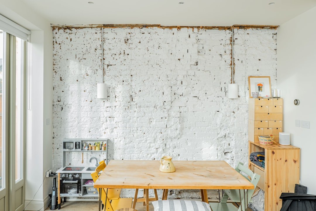
- Exposed brick: Painted white or light gray brick adds industrial edge and contrast against smooth ivory cabinets, perfect for modern or loft-style kitchens.
A common mistake is choosing an accent wall color that’s only a shade or two darker or lighter than your main wall color — it will read as a bad paint job rather than an intentional accent. Pick a shade that’s at least two LRV points away from your main wall color for a clear, intentional contrast.
 Warm greige walls and unlacquered brass hardware elevate ivory kitchen cabinets in a farmhouse-style space
Credit: www.southernliving.com
Warm greige walls and unlacquered brass hardware elevate ivory kitchen cabinets in a farmhouse-style space
Credit: www.southernliving.com
Frequently Asked Questions
What wall colors complement ivory kitchen cabinets best?
The best wall colors for ivory cabinets depend on your kitchen’s lighting, style, and desired mood, but universally flattering options include soft taupe, warm greige, pale dusty blue, and soft sage. These shades balance ivory’s warm undertones without clashing, and work in nearly every kitchen layout.
Can warm wall tones work with ivory cabinets?
Yes, warm tones are actually the most cohesive choice for ivory cabinets, as they match the cabinetry’s natural warm undertones for a seamless, inviting look. Look for warm beige, soft taupe, buttery yellow, and muted peach shades, and avoid cool, blue-based neutrals that will make ivory look yellowed.
Should I use bold colors with ivory kitchen cabinets?
Bold colors work beautifully with ivory cabinets, especially if you use them as an accent wall rather than painting the entire room. Deep navy, charcoal, and emerald green add drama and make ivory cabinets pop, but avoid using bold shades on all four walls of a small, dim kitchen, as they can make the space feel cave-like.
How do cool wall colors affect ivory cabinets?
Cool wall shades like pale blue, soft sage, and warm light gray create gentle contrast with ivory’s warmth, making the cabinets stand out while keeping the overall feel light and airy. They work best in south-facing kitchens with plenty of natural light, as cool shades can feel cold in dim, north-facing spaces.
Do I need to match my wall color to my backsplash?
No, but you should coordinate undertones to avoid clashing. Use the 60-30-10 rule as a guide: let your wall color make up 60% of your palette, ivory cabinets 30%, and your backsplash and accents 10%. For example, if you have warm beige walls and ivory cabinets, choose a white backsplash with warm veining (not cool pink veining) to keep the palette cohesive.
What’s the biggest mistake to avoid when picking wall colors for ivory cabinets?
The most common mistake is choosing a stark, cool pure white with blue or purple undertones for your walls, which will make ivory cabinets look yellowed and dated. Always test paint swatches on your wall and observe them at different times of day under both natural and artificial light before making a final decision.
Conclusion
Ivory kitchen cabinets are one of the most versatile cabinetry choices on the market, but the right wall color is the key to unlocking their full potential. Whether you opt for a warm neutral for a cozy, timeless look, a cool tone for a fresh, airy vibe, or a bold shade for drama, the most important step is to test paint swatches in your actual kitchen lighting before committing to a color. Account for your window direction, artificial light temperature, and desired aesthetic to ensure a cohesive, long-lasting result that you’ll love for years to come.
If you’re planning a full kitchen refresh before painting, make sure to remove any wall-mounted fixtures carefully to avoid damage — our guide to removing a wall-mounted faucet walks you through the process step by step. Once your new kitchen is complete, host dinner parties with custom homemade wine from at-home winemaking kits, and if you’re new to crafting your own vintages, you can source everything you need with online winemaking supplies to get started right away. If you ever decide to swap your ivory cabinets for a bolder green finish down the line, our guide to green cabinet color pairings has matching wall ideas to match your new look.