What Color Walls Go With Navy Kitchen Cabinets: Stunning Ideas
Navy kitchen cabinets have been a top design trend for years, and for good reason: their deep, rich tone adds timeless elegance to everything from modern farmhouses to sleek contemporary spaces. But the wrong wall color can turn this bold, stylish choice into a dark, cramped, or clashing mess. Whether you’re working with a tiny galley kitchen or a large open-concept space, this guide breaks down the best wall color pairings for navy cabinets, including 2026’s most popular shades, lighting considerations, and common pitfalls to avoid, so you can create a kitchen that feels balanced, bright, and uniquely yours.
Why Wall Color Choice Matters for Navy Cabinets
Navy is a cool, deep tone that absorbs more light than lighter cabinet finishes, so your wall color will directly impact how spacious and inviting your kitchen feels. A mismatched shade can make the space feel cave-like, clash with your cabinet undertones, or wash out the rich blue tone you chose for your cabinetry. In 2026, design trends have shifted away from the all-white palettes popular in the 2010s, with more homeowners embracing warm, lived-in wall tones that balance navy’s boldness without sacrificing brightness. For guidance on coordinating wall colors with other popular cabinet finishes, our tips for coordinating shades with brown kitchen cabinets offer additional inspiration. For more on this, see our guide on what color walls go with green kitchen cabinets.
Classic Neutral Pairings (Timeless, Low-Risk Options)
Neutrals are the safest, most versatile choice for navy cabinets, as they let your cabinetry be the focal point without overwhelming the space. The right neutral will brighten your kitchen, highlight navy’s rich tone, and work with any design style from traditional to modern.
Crisp, High-LRV Whites
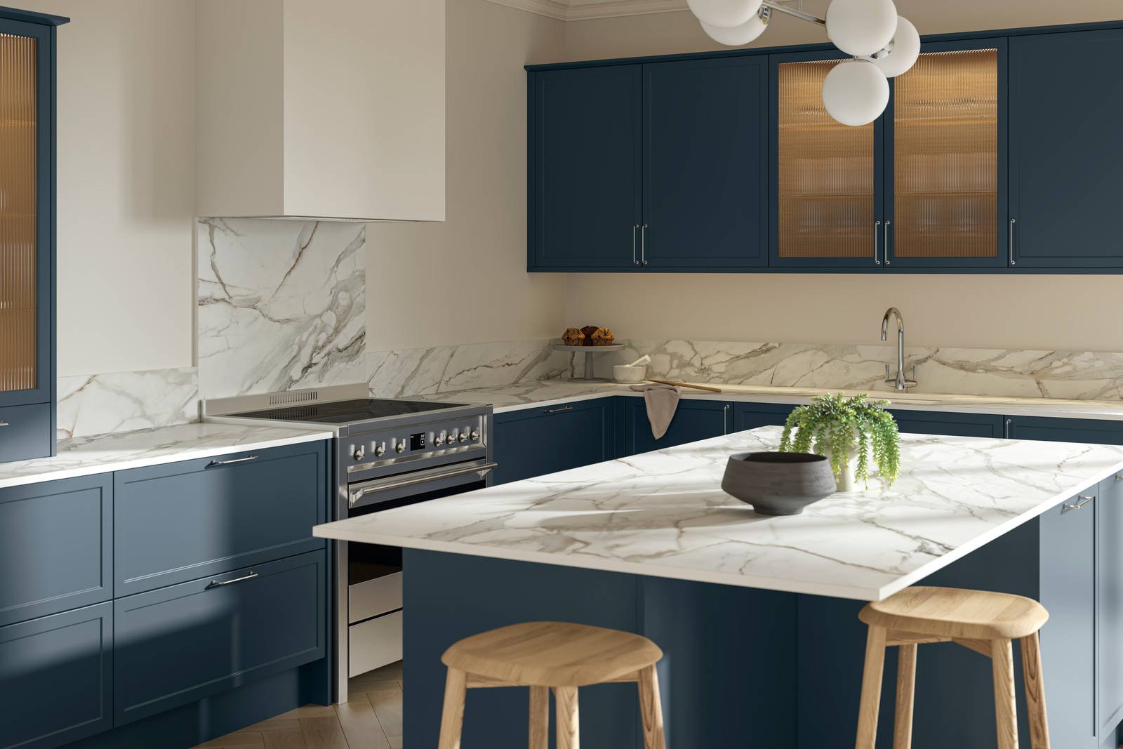
Crisp white walls with a light reflectance value (LRV) of 90 or higher are ideal for small, north-facing, or low-light kitchens, as they bounce up to 70% of available light around the room to counteract navy’s light-absorbing properties. This pairing creates a clean, airy feel that makes navy cabinets pop, and works perfectly with stainless steel appliances and marble countertops for a modern coastal or minimalist look. A common mistake is choosing a white with cool blue undertones, which can make navy cabinets look dull and the space feel cold—always hold a paint sample next to your cabinet door in natural light to check for undertone clashes. For more on this, see our guide on what color walls go with brown kitchen cabinets.
Warm Cream & Off-Whites
For a cozier, more traditional vibe, opt for warm cream or off-white shades with an LRV of 80 to 90 and subtle beige undertones. These soft neutrals reduce the starkness of pure white, creating a gentle, inviting glow that pairs beautifully with brass hardware and natural wood accents. This combination is a top pick for farmhouse, cottage, and rustic kitchen styles, as it feels warm and welcoming without distracting from your bold cabinetry.
Greige & Soft Taupe
Greige, a blend of gray and beige, offers modern warmth that works seamlessly with transitional and mid-century modern kitchen designs. Choose a shade with an LRV of 70 to 80 to keep the space feeling open, and pair it with matte black or brushed nickel hardware for a balanced, sophisticated look. Greige adds subtle depth to the room without clashing with navy’s cool tone, making it a great choice for homeowners who want a neutral that feels more interesting than plain white or gray. For more on this, see our guide on what color to paint my kitchen walls with.

Warm & Earth-Toned Wall Colors (2026’s Top Trend)
Warm, earthy tones have surged in popularity in 2026 for navy cabinet kitchens, as they soften navy’s cool, bold energy to create a cozy, lived-in feel. These shades work best in kitchens with ample natural light, as darker warm tones can feel muted in low-light spaces.
Muted Blush & Pale Pink
Soft, desaturated blush pink with an LRV of 75 to 85 adds a subtle romantic touch to navy cabinets without feeling overly feminine or clashing. This pairing creates a warm, uplifting backdrop that feels perfect for casual family kitchens or cozy breakfast nooks. Pair it with matte black hardware for contrast, or add brass light fixtures to amplify the warm glow. For more on this, see our guide on what color to paint kitchen walls with light.
Warm Terracotta & Rust
Terracotta and rust shades with red (not orange) undertones and an LRV of 50 to 60 bring rustic, Mediterranean charm to navy cabinet kitchens. These warm earth tones balance navy’s cool depth beautifully, and pair perfectly with natural wood accents, terracotta tile backsplashes, and woven decor. This combination is ideal for homeowners who want a cozy, globally inspired kitchen feel.
Soft Mustard & Golden Yellow
Muted, desaturated mustard (avoid bright sunflower yellow) with an LRV of 60 to 70 adds a cheerful, sunny pop to navy cabinets without overwhelming the space. This pairing feels friendly and energetic, making it perfect for family-friendly kitchens used for frequent entertaining. For a cohesive look, pair mustard walls with brass light fixtures and natural wood open shelving. If you love hosting dinner parties in your kitchen, our guide to pasta making and wine tasting in Rome shares tips for curating a cozy, functional kitchen for guests. For more on this, see our guide on what color walls go with white kitchen cabinets.
Cool & Calm Complementary Hues
If you prefer a cooler, more serene kitchen vibe, these shades complement navy’s cool undertones for a cohesive, calming space.
Pale Sage & Muted Green
Pale sage and soft mint greens with an LRV of 70 to 80 are perfect for organic, coastal, or cottage-style kitchens. These cool, muted greens complement navy’s depth without making the space feel dark, and pair beautifully with white subway tile, potted herbs, and natural wood accents. If you’re also exploring pairing walls with green cabinetry, our full guide has tailored recommendations for coordinating bold cabinet and wall shades.
Soft Slate & Charcoal Gray
Soft slate and charcoal grays with subtle blue undertones and an LRV of 40 to 50 create a sophisticated, monochromatic look that feels sleek and modern. This pairing works best in large, well-lit kitchens, as the dark walls can make small spaces feel cramped. It highlights metallic hardware and fixtures beautifully, making it a top choice for industrial or luxury kitchen designs.
Deep Forest Green & Black
For a dramatic, moody vibe, opt for deep forest green or matte black walls with an LRV below 20, but only in large, sunlit kitchens with ample artificial lighting. This bold pairing creates a high-end, moody atmosphere that feels perfect for luxury or industrial-style spaces. To avoid feeling cramped, add under-cabinet lighting, metallic accents, and plenty of open shelving to reflect light around the room.

Finishes & Textures to Elevate Your Palette
The right finish or texture can add depth and personality to your wall color without clashing with your navy cabinets.
Metallic Wall Accents
A subtle metallic glaze on a single accent wall adds a touch of luxury to navy cabinet kitchens, but avoid full metallic walls or chunky metallic wallpaper, which can feel overwhelming. Champagne gold metallic pairs beautifully with warm wall tones like terracotta or cream, while brushed nickel works with cool tones like pale gray or sage.
Textured Paint Finishes
Limewash, suede, or linen-textured paint adds subtle dimension to walls without bold patterns, and hides minor wall imperfections for a polished, lived-in look. These finishes work with all the color palettes outlined above, and are especially popular in 2026 for their organic, tactile feel. For indoor air quality, opt for low-VOC paint formulas approved by the EPA for kitchen use, as these reduce harmful fumes in a space where you prepare food EPA guidance on low-VOC interior paints.
Accent Wall Strategies
If you’re nervous about committing to a full bold wall color, paint only the wall behind your stove or sink in a bolder shade (like terracotta or deep green) and keep the rest of the walls a neutral. This adds visual interest without overwhelming the space, and is a great way to test a bolder shade before committing to the full room. To add personal, functional decor to your newly painted kitchen, our roundup of home wine making tools includes unique, practical accessories for culinary hobbyists.
How Kitchen Lighting Impacts Your Wall Color Choice
The same wall color can look completely different depending on your kitchen’s lighting, so it’s critical to test samples in your space before making a final decision.
Natural Light Considerations
South-facing kitchens get warm, golden natural light that makes warm wall tones (cream, terracotta, blush) feel cozy and balanced. North-facing kitchens have cool, blue-tinted natural light that can make warm tones look muted or dull, so opt for cooler neutrals (soft gray, pale sage) or add warm LED bulbs to compensate. Always test 2×2 foot paint samples on multiple walls and observe them at morning, midday, and evening to account for light shifts throughout the day.
Artificial Lighting Tips
LED bulbs are the standard for 2026 kitchen designs: use 2700K warm white bulbs for warm wall tones, 3000K neutral white for neutral shades, and 3500K cool white for cool tones. Layer your lighting with a mix of overhead, task, and under-cabinet lights to eliminate dark corners and make your wall color look true to its sample. For evidence-based guidance on selecting paint shades that work with your kitchen’s unique lighting, the National Kitchen and Bath Association recommends prioritizing light reflectance value (LRV) to maximize brightness in spaces with dark cabinetry National Kitchen and Bath Association’s guide to kitchen color and lighting.
Common Mistakes to Avoid
- Ignoring undertones: Navy has cool blue undertones, so avoid wall colors with clashing orange or purple undertones, which will look muddy next to the cabinets. Always hold a paint sample next to your cabinet door in natural light to check for clashes.
- Overlooking LRV: Choosing a dark wall color with low LRV in a small or low-light kitchen will make the space feel cramped and cave-like. Stick to LRV 80 or higher for small spaces.
- Skipping paint samples: Paint always looks different in a store’s lighting than in your kitchen, so test samples for at least 24 hours to see how they look at different times of day.
- Choosing the wrong finish: Glossy paint finishes reflect more light but show wall imperfections, while matte finishes hide flaws but can make a space feel dull. Opt for a satin or eggshell finish for kitchen walls for the best balance of durability and light reflection. If you’re planning DIY upgrades to complement your new paint, our step-by-step guide to removing a wall-mounted faucet can help you refresh fixtures without professional help.
Frequently Asked Questions
What Wall Colors Complement Navy Kitchen Cabinets Best?
Light neutrals with a light reflectance value (LRV) of 80 or higher are the most versatile pairing for navy cabinets, as they bounce light around the room to balance the dark, light-absorbing cabinetry. Crisp white, warm cream, soft greige, and pale gray are top choices, as they create a balanced, timeless look that works with any kitchen style. For a subtle pop of color, muted sage, soft blush, and pale yellow also pair beautifully without clashing.
Can Warm Wall Colors Work With Navy Cabinets?
Absolutely—warm tones are a top 2026 trend for navy cabinet kitchens, as they soften the cool, bold tone of the navy for a more inviting, lived-in feel. Muted terracotta, soft mustard, warm beige, and pale blush all work well, as long as they have subtle (not overpowering) undertones that don’t clash with navy’s cool blue base. Avoid bright orange or yellow warm tones, which can look muddy next to navy.
Should I Use Bold Or Neutral Walls With Navy Cabinets?
Neutral walls are the safest, most timeless choice for navy cabinets, as they let the cabinetry be the focal point of the space without overwhelming the room. That said, bold wall colors can work if you choose muted, desaturated shades (like deep forest green, soft charcoal, or muted terracotta) and have ample natural light to prevent the space from feeling cramped. For small or low-light kitchens, stick to light neutrals with an LRV of 75 or higher.
How Does Wall Color Affect Kitchen Lighting With Navy Cabinets?
Light-colored walls with a high LRV (80+) reflect up to 70% of light in the room, brightening the space and reducing the dark, cave-like feel that can come with navy cabinets. Dark walls with an LRV below 40 absorb most light, making the kitchen feel smaller and moodier, which works only in large, sunlit spaces. Always test paint samples in your kitchen at different times of day, as natural and artificial light will drastically change how the color looks next to navy.
What LRV is best for wall colors paired with navy kitchen cabinets?
For small, north-facing, or low-light kitchens, choose wall colors with an LRV of 80 or higher to maximize light reflection and keep the space feeling open. For large, south-facing kitchens with lots of natural light, you can safely use shades with an LRV as low as 50 for a moody, dramatic look. Always test 2×2 foot paint samples on multiple walls and observe them at morning, midday, and evening to confirm the shade works with your space’s unique lighting.
Can I use wallpaper with navy kitchen cabinets?
Yes, as long as you choose subtle, small-scale patterns on a light background. Delicate florals, thin stripes, or muted geometric patterns in white, cream, or soft gray add visual interest without clashing with the bold navy cabinets. Avoid large, bold prints or dark wallpapers, which will make the space feel busy and cramped. For a durable, kitchen-friendly option, opt for washable, vinyl wallpaper that can stand up to splatters and steam.
Conclusion
Navy kitchen cabinets are a timeless, versatile choice that works with nearly any design style, but the right wall color is the key to unlocking their full potential. For small or low-light spaces, stick to high-LRV neutrals like crisp white, warm cream, or soft greige to brighten the room and keep it feeling open. If you have ample natural light, don’t be afraid to experiment with warm earth tones, soft pastels, or even muted bold shades to add personality. Always test paint samples in your space before committing, and pair your chosen palette with complementary hardware and lighting to tie the look together. Ready to start your kitchen refresh? Browse our guide to home wine making tools for unique, functional decor ideas to complete your new space, or explore our beginner’s guide to wine making for fun, interactive hosting ideas to make the most of your updated kitchen.