What Color for Kitchen Walls: Top Trending Shades to Transform Your Space
Your kitchen is the busiest room in your home: the space where you brew morning coffee, cook weeknight dinners, and host weekend gatherings with friends. Unlike a full cabinet or countertop replacement, a fresh coat of wall paint is a low-cost, high-impact upgrade that can completely transform the space in a single weekend. In 2026, kitchen design trends are shifting away from the cool, sterile all-gray palettes of the 2010s toward warm, personalized shades that balance style, functionality, and wellness. This guide breaks down the top trending wall colors, how to pair them with your existing fixtures, and pro tips to avoid costly mistakes, so you can pick a shade you’ll love for years to come.
2026 Top Trending Kitchen Wall Shades
The right wall color sets the tone for your entire kitchen, influencing everything from how large the space feels to how inviting it is for guests. Below are the most popular 2026 shade families, along with their ideal use cases and trade-offs to help you narrow down your options.
Warm Neutrals
Warm neutrals remain the top pick for 2026, favored for their versatility, ability to boost resale value, and compatibility with almost any cabinet or countertop style. Top shades include creamy off-whites like White Dove OC-17, soft greige (gray-beige blends) like Agreeable Gray SW 7029, and warm taupes like Accessible Beige SW 7036. These shades reflect natural light to make small galley kitchens feel larger, and they pair seamlessly with both light and dark cabinetry. The only trade-off is that they can feel flat if not paired with accent decor like open shelving, colorful dishware, or a statement light fixture.
Bold, Moody Statements
For homeowners looking to add personality, 2026’s top bold shades move beyond generic bright red or primary blue to richer, more nuanced tones: deep forest green, burnt sienna, muted navy, and terracotta. These shades work best as accent walls in open-concept kitchens with plenty of natural light, or as full-wall colors in large, window-filled spaces. A common mistake is painting a small, dim kitchen a dark bold shade without testing it first—most deep blues read as near-black after dark, making the space feel cave-like. When used correctly, these shades add depth and create a cozy, intimate vibe for evening meals.
Soft Pastels
Muted, earthy pastels are a fast-growing 2026 trend, favored for biophilic and cottage-style kitchen designs. Top picks include dusty lavender, muted sage, and soft blush pink, all with warm undertones to avoid feeling dated. These shades work beautifully with vintage hardware, shiplap walls, and light wood cabinets to create a calm, welcoming atmosphere. The key to pulling them off is avoiding cool, bright pastels (like neon baby blue) which can clash with warm cabinet finishes and feel harsh in artificial light.
Earthy, Grounded Tones
Earthy shades like warm terracotta, olive green, and sand taupe are a top 2026 pick for wellness-focused and farmhouse-style kitchens, as they connect the space to nature and create a grounding, relaxed vibe. These shades pair perfectly with stone countertops, wooden cutting boards, and potted herbs for a cohesive organic look. For north-facing kitchens that get cool, dim natural light, opt for a lighter terracotta or sand shade rather than a deep olive, which can feel drab without enough sunlight.
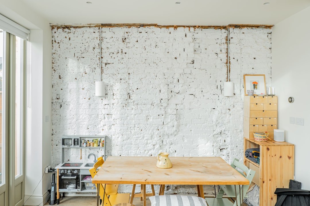
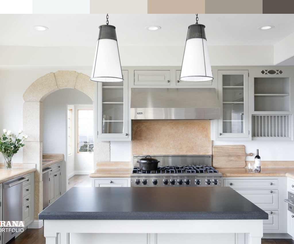
 This warm neutral palette works for both small galley kitchens and open-concept layouts, per 2026 design industry guidance.
Credit: www.goodhousekeeping.com
This warm neutral palette works for both small galley kitchens and open-concept layouts, per 2026 design industry guidance.
Credit: www.goodhousekeeping.com
Match Wall Colors to Your Existing Kitchen Fixtures
You don’t need to replace your cabinets or countertops to refresh your kitchen—pairing the right wall color with your existing fixtures is the easiest way to create a cohesive, updated look. Below are pro tips for matching paint to the most common kitchen finishes.
Pairing With Dark Wood Cabinets
Rich cherry, mahogany, or espresso cabinets make a bold statement, so your wall color should balance their intensity rather than compete with it. Light warm neutrals like soft cream, pale taupe, and warm off-white provide enough contrast to keep the space feeling open, while avoiding the cold, sterile feel of stark white. For more tailored guidance on matching paint to deep wood tones, check out our tips for pairing paint with warm wood cabinets.
Pairing With Light Wood and Green Cabinets
Light oak, maple, and birch cabinets have warm, golden undertones that pair beautifully with soft greens, warm beiges, and creamy whites. For muted sage or forest green cabinets, soft cream and warm white walls create a balanced, organic look that avoids clashing with cool undertones. To explore full color palettes for green cabinetry, dive into our guide to coordinating shades for green cabinetry.
Pairing With White Cabinets
White cabinets are a blank canvas, but pairing them with stark white walls can make your kitchen feel clinical and cold. Opt for warm off-white walls with subtle yellow or cream undertones to keep the space inviting, or add a pop of color with a soft pastel or muted bold shade on an accent wall. If you have a granite countertop with warm flecks, avoid cool blue or gray undertones in your wall paint, which will clash with the stone’s natural warmth.
Pairing With Stainless Steel Appliances
Stainless steel appliances have warm metallic undertones that can clash with cool, blue-based gray wall paints. Stick to warm neutrals, earthy tones, or soft pastels with warm undertones to complement the metal finish and create a cohesive, modern look.
How Lighting Transforms Your Paint Choice
The same paint swatch can look like two completely different colors depending on the light in your kitchen, making testing non-negotiable before you buy a full gallon. Both natural and artificial light shift the undertone of paint, so understanding how they interact with your space will save you from a costly, frustrating mistake.
Natural Light Considerations
Natural light shifts in temperature and intensity throughout the day, so your kitchen’s window orientation is one of the biggest factors in paint selection:
- North-facing kitchens get cool, soft, dim light that can make cool pastels and blue-based grays look dull and washed out. Opt for warm neutrals or soft bold shades to add warmth.
- South-facing kitchens get bright, warm golden light all day, which can make pale yellows and warm reds look oversaturated. Cool shades like soft blue and muted gray work beautifully here.
- East-facing kitchens get cool blue-toned light in the morning and warm golden light in the afternoon, so test swatches at both times to see how they shift.
- West-facing kitchens get warm, golden light in the late afternoon, which can make cool shades look muddy. Test bold shades here to ensure they don’t shift to an unwanted undertone in evening light.
As the University of Minnesota Extension emphasizes, paint swatches can shift drastically under different light temperatures, so testing in your actual space at multiple times of day is the only way to avoid a mismatched finish. University of Minnesota Extension Interior Paint Guide
Artificial Lighting Tips
2026 kitchen lighting trends lean toward warm LED bulbs (2700K-3000K) for general use, which make wall colors feel cozy and inviting, rather than the cool white bulbs (4000K+) common in older homes that can make even warm shades feel sterile. If you have a mix of lighting types (pendants over the island, under-cabinet task lights, overhead recessed lights), test your paint swatches under all of them after dark to ensure the color looks consistent across the space. A common mistake is picking paint under hardware store fluorescent lights, which are cool (5000K) and make warm shades look dull and cool shades look brighter than they will in your home.
Accent Walls and Color Blocking That Work in 2026
Accent walls and color blocking are perfect for adding personality to your kitchen without committing to a bold shade on every wall. 2026 trends lean toward subtle, intentional color blocking rather than loud, clashing patterns.
Best Spots for an Accent Wall
The most high-impact accent wall spots are the wall behind your range, the wall behind your kitchen sink, or the narrow wall between your upper and lower cabinets. These areas are natural focal points, so a darker or bolder shade will draw the eye without overwhelming the rest of the space. Avoid accent walls in tiny, windowless galley kitchens, as they will make the already small space feel even more cramped.
Color Blocking for Open-Concept Kitchens
If your kitchen flows into a dining or living area, use color blocking to define zones without physical walls. For example, paint the wall behind the dining nook a warm terracotta shade to separate the eating area from the cooking zone, while keeping the rest of the kitchen walls a neutral shade. Stick to 2-3 shades max to avoid visual clutter.
Adding Texture to Accent Walls
2026 trends pair accent walls with subtle textures like shiplap, thin brick veneer, or textured tile to add extra depth. A deep green accent wall with vertical shiplap, for example, adds coziness without feeling heavy, while a terracotta accent wall with hand-painted tile adds a playful, personalized touch.
 A single navy accent wall adds depth without overwhelming a small, light-filled kitchen, a top 2026 trend for personality-driven spaces.
Credit: www.reddit.com
A single navy accent wall adds depth without overwhelming a small, light-filled kitchen, a top 2026 trend for personality-driven spaces.
Credit: www.reddit.com
 Soft gray walls balance warm oak cabinets and granite countertops for a cohesive, timeless look that works with traditional and modern farmhouse styles.
Credit: www.kylieminteriors.ca
Soft gray walls balance warm oak cabinets and granite countertops for a cohesive, timeless look that works with traditional and modern farmhouse styles.
Credit: www.kylieminteriors.ca
2026 Paint Finish Recommendations for High-Traffic Kitchens
Kitchens are high-moisture, high-traffic spaces, so the right paint finish is just as important as the color. 2026 trends prioritize durability and health alongside style.
Best Finishes for Everyday Use
The biggest 2026 finish trend is washable matte, a low-sheen, non-reflective option that hides smudges, fingerprints, and water spots far better than the flat matte finishes of the past. For families with young kids or frequent cooking, satin finish is still a reliable pick: it has a subtle sheen that wipes clean easily and resists moisture and stains, making it ideal for walls near the stove or sink. Avoid high-gloss finishes for full walls, as they show every imperfection and can feel harsh in bright light.
Health-Focused, Low-Emission Finishes
Zero-VOC and low-VOC paints are now standard in 2026, as they emit far fewer harmful volatile organic compounds into your home’s air than traditional paints. This is especially important in kitchens, where food is prepped and eaten daily. The EPA notes that long-term exposure to VOCs can cause respiratory irritation and other health issues, so opting for zero-VOC formulas is a simple, low-cost way to improve your home’s indoor air quality. EPA Indoor Air Quality VOCs Guide
Step-by-Step Testing Guide to Avoid Costly Mistakes
Skipping the testing step is the most common cause of kitchen paint regret. Follow this simple process to ensure your chosen shade looks perfect in your space:
- Order 12×12 peel-and-stick swatches of your top 3 shades, rather than tiny 2×2 cards from the hardware store, which don’t show how the color will look across an entire wall.
- Paint swatches on 3 different walls: one near a window, one in the middle of the room, and one near a door, to account for differences in lighting across the space.
- Observe the swatches at 9am, 2pm, and 8pm (under your kitchen’s artificial lights) over 2 full days, as color shifts dramatically in evening light.
- Hold up a sample of your cabinet and countertop next to each swatch to ensure they complement each other, not clash.
- If you’re debating between two shades, paint a 2ft x 2ft section of the wall and live with it for 3 full days before committing to a full gallon.
Frequently Asked Questions
What color makes kitchen walls look bigger?
Light, cool shades like soft white, pale blue, and muted sage reflect the most light and create an optical illusion of more space, making them ideal for small galley kitchens or rooms with limited natural light. Avoid warm light shades like pale yellow, which can make walls feel like they are advancing toward you, shrinking the room. For the most open feel, stick to a single light shade across all walls rather than splitting the space with multiple colors.
Which kitchen wall colors boost appetite?
Warm, saturated shades like burnt orange, deep red, and golden yellow stimulate appetite and create a welcoming, energetic atmosphere for meals. For a more subtle approach, use a warm terracotta accent wall behind the dining nook instead of painting the entire kitchen a bright shade, which can feel overwhelming over time.
What color suits modern kitchen walls best?
Warm neutrals like greige, soft white, and muted taupe are the top 2026 picks for modern kitchens, as they complement stainless steel appliances and minimalist cabinet hardware without feeling sterile. Avoid cool, stark whites, which can clash with the warm wood accents common in modern farmhouse and industrial modern designs.
How do I choose a wall color for a small, dark kitchen?
Opt for light, warm neutrals like creamy white or soft beige, which reflect what little natural light you have. Add a small accent wall in a muted bold shade like deep green to add depth without overwhelming the space. Avoid dark, moody shades on all walls, as they will absorb light and make the room feel even smaller.
Are dark kitchen walls still trendy in 2026?
Yes, but only in kitchens with ample natural light (at least 2 large windows) or strong layered artificial lighting. Dark shades like forest green, navy, and charcoal work best as accent walls or in open-concept kitchens connected to a light-filled living space. Full dark walls in small, dim kitchens are falling out of favor in 2026, as they can feel oppressive over time.
Conclusion
Choosing the right kitchen wall color doesn’t have to be overwhelming. Prioritize testing your top shades in your actual lighting, pair your paint with your existing cabinets and countertops for a cohesive look, and opt for washable, low-VOC finishes for long-lasting, healthy results. Don’t be afraid to lean into bold or personalized shades if you have enough natural light to support them—your kitchen should feel like a space that reflects your style, not just generic design trends.
Once you’ve locked in your perfect wall color, level up your kitchen setup with our guide to upgrading your kitchen fixtures, or explore our top-rated entertaining essentials for dinner parties to host your first gathering in your refreshed space. If you’re planning a menu to match your new aesthetic, our guide to homemade wine pairings for your space will help you craft the perfect drink to complement your decor. For more kitchen design and DIY inspiration, browse our full library of home improvement guides.