What Color Should I Paint My Kitchen Walls: Stunning Ideas Revealed
As the most frequently used room in most homes, your kitchen’s wall color does far more than set an aesthetic—it impacts how spacious the room feels, your mood while cooking, how appetizing food looks, and even your home’s resale value if you plan to sell in the next few years. With hundreds of paint shades on the market and constantly shifting design trends, it’s easy to feel overwhelmed by choice, and a bad pick can leave you stuck with a color that feels cold, clashing, or dated within months. This guide breaks down the core factors to weigh, 2026’s most stunning (and practical) kitchen wall color ideas, pro testing tips to avoid costly mistakes, and maintenance hacks to keep your walls looking fresh for years. By the end, you’ll have a clear shortlist of shades tailored to your kitchen’s unique layout, cabinetry, and lifestyle.
Core Factors to Consider Before Choosing a Kitchen Wall Color
Your kitchen’s permanent features, lighting, and how you use the space will make or break your color choice. Skipping these considerations is the most common reason homeowners end up hating their kitchen paint job within a year.
Account for Your Kitchen’s Layout and Natural Light
Light exposure changes how paint reads drastically, so start by mapping your kitchen’s light patterns:
- North-facing kitchens get cool, dim natural light all day, which can make cool grays look dull and blue-toned. Warm whites, soft yellows, or muted terracotta will balance that coolness without feeling dark.
- South-facing kitchens get warm, bright sunlight that can make bold shades feel overwhelming by midday. Cool neutrals, soft blues, or muted greens will keep the space feeling balanced without washing out.
- East-facing kitchens get soft golden morning light that warms up cool tones, so pale blues or soft grays work beautifully here.
- West-facing kitchens get intense golden afternoon light that can make warm shades feel overly bright; cool neutrals or muted sage will temper that warmth.
If your kitchen has no windows, lean toward light, reflective shades to compensate for the lack of natural light, and prioritize artificial lighting with a 2700K-3000K warm temperature to avoid making the space feel clinical.
Match Colors to Your Cabinets and Countertops
Your wall color should complement, not clash with, your permanent kitchen fixtures. Start by identifying the undertone of your countertops: warm undertones (yellow, red, brown) pair best with warm wall shades like cream, terracotta, or soft yellow, while cool undertones (blue, gray, green) work with cool neutrals, soft blue, or muted sage. For cabinets, aim for a 2-3 shade difference between your cabinet and wall color to create visual depth—matching them exactly will flatten the space, while a harsh contrast can feel jarring. Always test paint samples next to your cabinets and countertops, as permanent fixtures will skew how the wall color reads in the space.
Factor in Your Lifestyle and Long-Term Plans
If you have young kids, pets, or cook frequently, prioritize durable, washable finishes in light or mid-tone shades that hide smudges, grease splatters, and scuffs. If you plan to sell your home in the next 3-5 years, stick to timeless, neutral shades that appeal to the widest range of buyers, rather than overly trendy or personal hues. If you’re staying in your home long-term, feel free to experiment with bold or个性化 shades that match your personal style.
Matching Wall Colors to Common Cabinet Styles
Cabinet style is one of the biggest drivers of kitchen wall color success. Below are tailored pairings for the most common cabinet finishes:
Pairings for White and Light Wood Cabinets
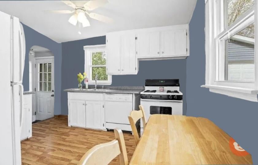
White, cream, or natural light wood cabinets are incredibly versatile, and work with nearly every wall color. For a bright, airy feel, pair them with warm off-white or soft gray walls to keep the space feeling open. To add personality, choose a muted earthy tone like sage green, soft terracotta, or pale blue for a cozy, farmhouse-inspired look. For a modern, high-contrast vibe, deep navy or forest green walls will make light cabinets pop.
Pairings for Dark Brown Cabinets
Dark brown cabinets (from warm walnut to espresso) add warmth and sophistication to a kitchen, but can feel heavy if paired with dark walls. Light warm whites, soft beige, or muted sage walls will brighten the space and create a balanced contrast. If you want to lean into the cozy, rustic vibe of dark wood cabinets, try a soft terracotta or muted mustard wall for a warm, inviting feel.
Pairings for Green Cabinets
Green cabinets (from pale sage to deep forest green) are a top 2026 trend, and pair beautifully with a range of wall shades. Light warm whites or soft creams will make light green cabinets feel fresh and airy, while deep green cabinets look stunning with warm terracotta, soft gold, or muted beige walls for a moody, earthy vibe. For exact shade recommendations tailored to every green undertone, see our green cabinet wall guide.
Pairings for Bold-Colored Cabinets
If you have navy, black, or bright red cabinets, stick to neutral wall shades to avoid clashing. Warm off-white, soft gray, or light beige will let your cabinets be the focal point of the space, while adding small pops of color through decor and accessories.
Top Kitchen Wall Color Ideas for 2026
As of 2026, kitchen wall trends have shifted away from the cool, stark grays that dominated the early 2020s, leaning instead into warm, earthy, and calming tones that prioritize comfort and everyday usability. Below are the most stunning, practical options for every style preference:
Timeless Neutrals for Lasting Appeal
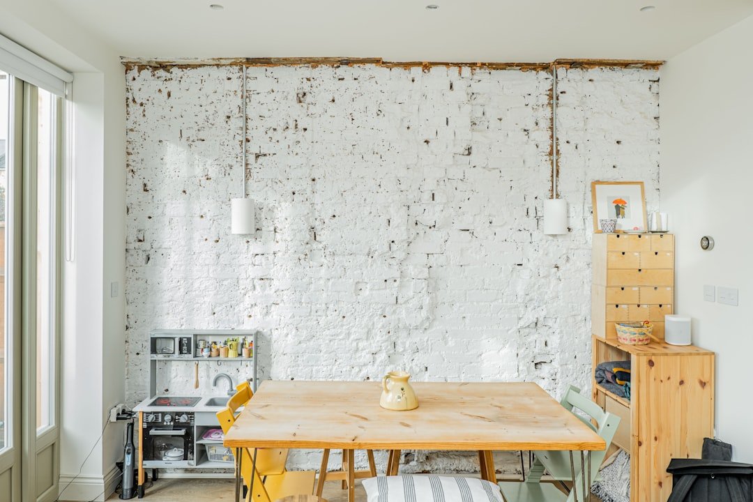
Warm off-white (like Benjamin Moore White Dove or Sherwin-Williams Alabaster) is the most popular kitchen wall color as of 2026, per the National Kitchen & Bath Association. Unlike stark cool whites, warm off-whites feel cozy and inviting, reflect light to make small spaces feel larger, and pair with every cabinet and countertop style. Soft beige, light taupe, and warm gray are also top neutral picks that add subtle depth without overwhelming the space.
Warm, Earthy Tones for Cozy Energy
Muted terracotta, soft olive green, warm mustard, and dusty rose are huge in 2026, as homeowners prioritize warm, inviting spaces for daily cooking and entertaining. These shades work especially well in kitchens with natural wood cabinets or countertops, and add a subtle pop of color without feeling overly loud. For a bold take, use earthy tones on a single accent wall behind the stove or open shelves to anchor the space.
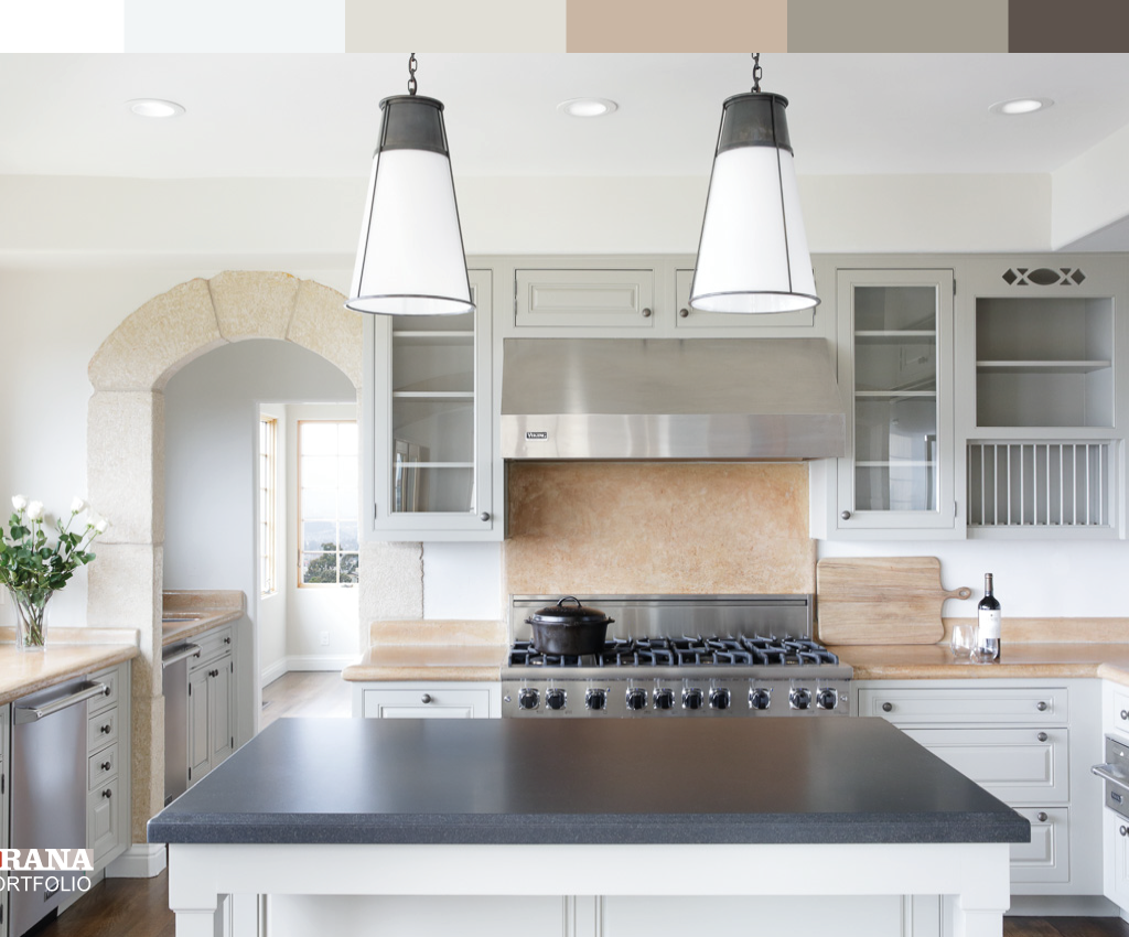 Credit: www.craftsmanpainters.com
Warm accent walls behind cooking zones add cozy energy without overwhelming the whole kitchen space.
Credit: www.craftsmanpainters.com
Warm accent walls behind cooking zones add cozy energy without overwhelming the whole kitchen space.
Soft Pastels for Calm, Airy Spaces
Muted sage, dusty blue, soft lavender, and pale terracotta are perfect for homeowners who want to add color without committing to a bold shade. These low-saturation hues create a calming, relaxing atmosphere ideal for family-focused kitchens, and pair beautifully with white or light wood cabinets. They’re also a great pick for small kitchens, as their soft tone won’t make the space feel cramped.
Bold Statement Shades for Personality
If you love high-impact design, deep navy, forest green, burnt orange, and emerald are the top bold kitchen wall picks for 2026. These shades work best in large, open-concept kitchens with plenty of natural light, or as accent walls in smaller spaces. Pair bold walls with simple, light-colored cabinets and minimal decor to keep the space from feeling overwhelming.
Color Psychology: Pick a Hue That Fits Your Daily Routine
Colors have a measurable impact on mood and behavior, so choose a shade that aligns with how you use your kitchen:
Energizing Shades for Busy Households
Warm tones like soft yellow, terracotta, and pale orange inject energy into your kitchen, making them ideal for households with young kids or people who host frequent gatherings. In practice, I’ve found that a soft yellow wall makes morning meal prep feel less tedious, and adds a cheerful vibe to after-school snack time. Just avoid high-gloss bright red or orange, which can feel overstimulating for daily use.
Calming Tones for Relaxed Cooking
Soft blues, greens, and warm grays reduce stress and create a peaceful atmosphere, perfect if your kitchen doubles as a space for morning coffee, remote work, or quiet meals. A pale green wall, for example, can make a busy kitchen feel like a retreat, helping you slow down during chaotic weeknights.
Balancing Appetite Appeal With Personal Preference
Warm tones like red, orange, and yellow are often used in restaurants to stimulate appetite and make food look more appealing. While this effect is subtle in residential kitchens, these shades can be a great pick if you host frequent dinner parties. That said, prioritize your daily mood over this minor effect—if you find red overwhelming, you won’t enjoy cooking in a red kitchen even if it makes your pasta look better.
Color Combos for Every Kitchen Layout
The best color palette for your kitchen depends heavily on its size and layout. Below are tailored ideas for the most common kitchen designs:
Small Galley Kitchen Ideas
Galley kitchens are narrow and often low on natural light, so lean toward light, reflective shades to make the space feel larger. Warm off-white, soft gray, or pale blue walls will brighten the space, while a single bold accent wall on the far end can add depth without making the kitchen feel cramped. Avoid dark shades on all walls, as they will make the narrow space feel even tighter.
Open Concept Kitchen Pairings
If your kitchen flows into your living or dining area, choose a wall color that complements the adjacent rooms for a cohesive feel. Warm neutrals like soft beige or warm white work with nearly every living room palette, while muted sage or soft blue adds a subtle pop of color that ties the spaces together without clashing. For a bold look, use a deep navy or forest green accent wall behind the kitchen island to define the cooking zone without separating it from the rest of the space.
Kitchen Nook and Breakfast Area Shades
Kitchen nooks are casual, low-stakes spaces, so feel free to experiment with bolder or more playful shades here. Soft terracotta, muted mustard, or pale pink add warmth and personality to breakfast nooks, and pair beautifully with natural wood tables and decor. If you love hosting intimate dinner parties or wine tasting evenings, warm, inviting shades will make guests feel welcome and highlight your culinary creations.
 Credit: www.jswpaints.in
Two-tone walls are a top 2026 design trend that adds depth without making small galley kitchens feel cramped.
Credit: www.jswpaints.in
Two-tone walls are a top 2026 design trend that adds depth without making small galley kitchens feel cramped.
 Credit: www.goodhousekeeping.com
Muted pastel wall colors create a calming, family-friendly atmosphere ideal for daily cooking and meals.
Credit: www.goodhousekeeping.com
Muted pastel wall colors create a calming, family-friendly atmosphere ideal for daily cooking and meals.
Paint Finishes and Textures That Hold Up to Kitchen Messes
The right finish will make your wall color look its best and stand up to daily kitchen messes for years. As of 2026, paint technology has improved drastically, giving you more durable options than ever before.
Matte, Satin, and Semi-Gloss: Which Is Right for You?
- Matte finish: Has a soft, non-reflective surface that hides minor wall imperfections beautifully. Modern washable matte paints (rated for up to 10,000 scrubs) are a great pick for low-traffic kitchen walls or homes without kids/pets. Avoid non-washable matte paints in busy kitchens, as they will stain easily.
- Satin finish: Has a subtle sheen that’s easy to clean and resists grease and moisture. This is the most versatile, popular finish for kitchens, as it works for both walls and trim, and holds up to daily messes without harsh glare.
- Semi-gloss finish: Has a high-shine surface that’s extremely durable and easy to wipe down. It’s ideal for high-traffic areas near the stove, sink, or prep station, but can highlight wall imperfections, so it’s best used on smooth, well-prepped walls.
Textured and Patterned Options for Added Dimension
If you want to add visual interest to plain walls, textured paints like sand texture, knockdown, or subtle stucco add depth and hide minor wall imperfections. For a more personalized look, use stencils to add geometric or floral patterns to a single accent wall. Light-colored textures work best for small kitchens, as dark textures can make the space feel cramped.
Low-VOC Paints for Healthier Indoor Air
The U.S. Environmental Protection Agency recommends choosing zero-VOC or low-VOC paint formulas for kitchens, as these emit minimal volatile organic compounds that can cause respiratory irritation, especially for kids, allergy sufferers, and pets. As of 2026, most major paint brands offer low-VOC options at no extra cost, so there’s no need to pay a premium for a healthier, safer paint choice.
Pro Tips for Testing Paint Colors the Right Way
Testing paint properly is the single best way to avoid a costly, regrettable color choice. Follow these steps to get an accurate read on how a shade will look in your space:
Test Swatches on Actual Walls, Not Just Chips
Small 1×1 inch paint chips don’t show how a color looks across an entire wall, especially in different lighting. Paint 2×2 foot swatches directly on the walls you plan to paint, in both sunlit and shadowed areas, to get an accurate read. You can also paint swatches on large poster boards to move around the kitchen and test against different cabinets and countertops.
Observe Colors at Multiple Times of Day
Paint colors shift drastically as natural light changes throughout the day. Look at your test swatches in the morning, midday, and evening, as well as under your kitchen’s artificial lighting at night. A shade that looks perfect in bright midday sun may look dull and blue-toned in the evening, so live with the swatches for 3-5 days before making a final decision.
Use Virtual Tools as a Starting Point
Many leading paint brands offer free augmented reality tools that let you visualize swatches on your actual walls via your smartphone. While these tools aren’t 100% accurate, they’re a helpful first step to narrow down your shortlist before ordering physical samples, saving you time and money.
Common Kitchen Wall Color Mistakes to Avoid
Even with careful planning, it’s easy to make avoidable color mistakes. Steer clear of these common errors:
- Ignoring undertones: A gray with warm yellow undertones will clash with cool-toned blue-gray cabinets, creating a muddy, unpolished look. Always hold swatches up to your permanent fixtures to check for undertone matches.
- Testing only in artificial light: Small paint chips often look very different in natural daylight than under overhead kitchen lights. Always test swatches on your actual walls to see how they read in all lighting conditions.
- Following trends blindly: While 2026’s earthy terracotta and deep navy are popular, if you hate warm tones or dark shades, you’ll grow tired of them within a year. Prioritize your personal preference over fleeting trends if you don’t plan to repaint every 2-3 years.
- Forgetting about trim and ceilings: If you have bright white trim, a stark cool white wall will make the trim look dingy and yellowed; a warm white will make the trim pop. If you have a low ceiling, painting it the same color as your walls will make the ceiling feel higher.
- Skipping the finish test: A matte finish looks soft and cozy in the store, but in a kitchen with lots of grease and spills, non-washable matte will stain easily. Always test the finish you plan to use on a sample wall to see how it holds up to messes.
Maintaining Your Painted Kitchen Walls for Years to Come
Kitchen walls face constant exposure to moisture, grease, food splatters, and scuffs, so proper maintenance will keep your paint looking fresh for 5-10 years, depending on the finish you choose.
Daily and Weekly Cleaning Best Practices
Dust walls weekly with a microfiber cloth or soft duster to prevent grime buildup. For regular cleaning, mix mild dish soap with warm water, and wipe walls with a soft sponge or cloth, starting at the top and working your way down to avoid drips. Avoid harsh abrasive cleaners, bleach, or ammonia-based products, as these can dull paint finishes and cause discoloration. Dry walls with a clean, dry cloth after cleaning to prevent water spots.
Easy Touch-Up Strategies for Scuffs and Stains
Keep a small, labeled jar of leftover paint stored in a cool, dark place (it will last 2-5 years) for quick touch-ups. For small scuffs, use a small, angled paint brush to dab paint over the mark, then feather the edges with a dry brush to blend it with the surrounding wall. Let touch-ups dry fully for 2-4 hours before assessing coverage—most touch-ups will blend in completely once cured.
Tackling Grease and Food Splatters
For fresh grease splatters, wipe the area immediately with a mixture of warm water and grease-cutting dish soap. For set-in grease stains, make a paste of baking soda and warm water, scrub gently with a soft sponge, then wipe clean. If you notice peeling or chipping paint, sand the area lightly with fine-grit sandpaper, prime the spot, and repaint with a small amount of your leftover paint for a seamless fix. If you’re tackling a full kitchen refresh alongside painting, swapping out an outdated wall-mounted faucet can instantly modernize the space; our faucet removal guide walks you through the process step-by-step.
Frequently Asked Questions
What colors make kitchens look bigger and brighter?
Light, high-contrast shades like warm white, pale yellow, soft blue, and light gray reflect the most natural light, making small galley or low-light kitchens feel larger and more open. Avoid dark, matte shades on all walls, as they absorb light and make spaces feel cramped.
How do I choose kitchen wall colors with cabinet styles?
Match wall colors to your cabinet undertones and finish: dark espresso or warm walnut cabinets pair best with light neutral or soft warm walls for contrast, while light shaker or natural wood cabinets work with bold, rich shades like deep navy or forest green to add depth. For a full breakdown of pairings for every cabinet style, check our green cabinet wall pairings and brown cabinet wall pairings.
What wall color suits small kitchens best?
Soft neutrals like warm white, light gray, or pale sage work best for small kitchens, as they reflect light and create the illusion of more space. If you want to add personality, use a bold shade on a single accent wall instead of painting all four walls dark, which will make the room feel cramped.
Can I use bold colors for kitchen walls?
Absolutely—bold shades like deep navy, forest green, burnt orange, and emerald add personality and energy to kitchens of any size. For small spaces, use bold shades on a single accent wall behind the stove or open shelves, and keep the remaining walls neutral to avoid overwhelming the room. For large, open-concept kitchens, you can paint all walls a bold shade if you balance it with light cabinetry and plenty of natural light.
Do I need to prime kitchen walls before painting?
If you’re painting over a light, existing paint color with a similar shade, you can often skip priming if you use a paint-and-primer combo. If you’re switching from a dark color to a light shade, or painting over a glossy finish, priming is non-negotiable to ensure even coverage and prevent the old color from bleeding through.
What’s the most popular kitchen wall color in 2026?
As of 2026, warm off-white (like Benjamin Moore White Dove or Sherwin-Williams Alabaster) is the most popular kitchen wall color, followed by muted sage green and soft terracotta. These shades feel cozy and timeless, work with nearly every cabinet and countertop style, and appeal to potential homebuyers if you plan to sell.
Can I paint kitchen walls over existing wallpaper?
Yes, as long as the wallpaper is fully adhered (no peeling edges) and you sand it lightly to create a rough surface for the paint to grip. Use a stain-blocking primer first to prevent any old wallpaper glue from bleeding through your new paint, especially if the wallpaper is dark or patterned.
Final Thoughts
Choosing the right kitchen wall color comes down to balancing your personal style with the practical needs of your space. Warm neutrals offer timeless, versatile appeal for long-term satisfaction, while earthy tones and soft pastels add cozy personality without feeling overwhelming. If you love bold design, lean into accent walls to add impact without committing to a full room of dark paint. No matter what shade you choose, test swatches on your actual walls over 3-5 days, pair them with your cabinet style for a cohesive look, and opt for a washable, low-VOC finish to keep your kitchen looking fresh for years.
If you’re planning a full kitchen refresh alongside painting, our home wine making supplies guide has top-tested picks for hosting casual gatherings with homemade wine, perfect for showing off your newly painted kitchen space. Ready to start painting? Grab 3-4 sample swatches of your top contenders, test them on your walls, and pick the shade that makes you feel most at home.