What Wall Colour Goes With Cream Kitchen Units: Stunning Ideas
Cream kitchen units are a perennially popular choice for 2026 kitchen refreshes, prized for their versatility, warm neutral base, and ability to bridge traditional, modern, farmhouse, and industrial design styles. But this same neutrality is a double-edged sword: pick the wrong wall shade, and your cream cabinets can look washed out, overly yellow, or clashing with your decor, rather than the warm, inviting focal point you envisioned. In this guide, we break down exactly how to match wall colors to your specific cream cabinet undertones, kitchen layout, and lighting conditions, with curated, practical ideas for every aesthetic.
First: Assess Your Cream Cabinet Undertones
Cream is not a one-size-fits-all shade, and most cream cabinets fall into one of three undertone categories that will make or break your color pairing:
- Warm undertones: Yellow, peach, or golden base, common in vintage, cottage, and traditional shaker-style cabinets
- Cool undertones: Grey, blue, or purple base, common in modern, minimalist, and Scandinavian-style cabinets
- Neutral undertones: Balanced beige base with no obvious warm or cool cast, common in transitional and contemporary cabinets
To test your cabinet undertones at home, hold a plain white sheet of paper next to the cabinets in mid-morning natural light. If the cream looks slightly yellow next to the white, it has warm undertones; if it looks slightly grey, it has cool undertones; if it reads as a balanced beige, it’s neutral. As outlined by the American Society of Interior Designers, matching color undertones is the foundation of a cohesive residential color scheme American Society of Interior Designers' color guidance, which prevents spaces from feeling disjointed even when individual shades look appealing in-store. This is the most common mistake DIYers make: choosing a wall shade that looks great in a swatch but clashes with their cabinet base tone. For more on this, see our guide on what wall colour goes with ivory kitchen units.
Neutral Wall Colours For Timeless Cohesion
Neutral wall colors are the low-commitment, foolproof choice for cream kitchens, creating a calm, balanced backdrop that lets your cabinetry shine without overwhelming the space. They work with every design style, transition seamlessly as you update decor, and avoid the risk of a shade feeling dated in a few years. The right neutral will depend on your cabinet undertones and desired aesthetic:
Soft Greys
Cool-toned soft greys (with subtle blue undertones) pair perfectly with warm cream cabinets to create a gentle, modern contrast that feels fresh rather than harsh. Warm soft greys (with beige undertones) work beautifully with cool cream cabinets to add coziness without feeling yellow. Matte soft grey is ideal for modern farmhouse and Scandinavian kitchens, while high-gloss soft grey leans into contemporary, high-glanz finishes. Pair with stainless steel appliances and chrome fixtures for a sleek, cohesive look that reflects natural light to keep small galley kitchens feeling bright.
Warm Beiges
Warm beiges with terracotta or peach undertones complement warm cream cabinets to create an inviting, earthy vibe perfect for cottage, Mediterranean, and rustic-style kitchens. These shades blend seamlessly with natural wood countertops, terracotta tile backsplashes, and woven decor for a cozy, lived-in feel. For cool cream cabinets, choose a beige with subtle grey undertones to avoid a clashing yellow cast. Warm beiges also make large open-plan kitchens feel defined and welcoming without feeling closed-off. For more on this, see our guide on what wall colour goes with grey kitchen units.
Subtle Taupes
Subtle taupes, which balance grey and brown undertones, are the most versatile neutral option, working with both warm and cool cream cabinets for transitional and contemporary spaces. Taupe with purple undertones adds a touch of understated sophistication, while taupe with green undertones leans into organic, biophilic design trends popular in 2026. Pair taupe walls with matte black hardware and natural wood accents for a polished, timeless look that works for years.

Bold Wall Colours For A Statement Look
If you want to move beyond neutrals, bold wall colors create a striking contrast that makes cream cabinets pop, adding personality and depth to your space. The key to pulling off bold shades is to match the undertone to your cream cabinets and adjust the coverage based on your kitchen size:
Deep Blues
Deep navy and midnight blue add calm, sophisticated contrast to cream cabinets, making the space feel both cozy and elevated. Navy with green undertones pairs best with warm cream cabinets, while midnight blue with purple undertones works with cool cream. For small galley kitchens, use deep blue on a single accent wall to add depth without making the space feel cramped; for large open-plan kitchens, paint all four walls for a dramatic, immersive cooking zone. Pair with brass or oil-rubbed bronze hardware to add warmth and avoid a cold, harsh feel.
Forest Greens
Forest green brings a natural, grounded contrast to cream cabinets, perfect for biophilic, rustic, and moody modern kitchens. Muted sage forest green works well in small, light-filled kitchens, while rich hunter green is ideal for large, dim spaces that need a cozy, enveloping feel. Pair with potted herbs, natural wood accents, and brushed gold hardware to lean into the organic vibe. Avoid bright lime greens, which can clash with the soft neutrality of cream cabinets.
Charcoal Blacks
Charcoal (a soft black with warm brown undertones, not harsh pure black) adds sleek, contemporary drama to cream kitchens, highlighting the warmth of the cabinets for a chic, polished look. This shade is ideal for industrial, minimalist, and modern farmhouse kitchens. Pair with matte black fixtures, light oak accents, and metallic decor to balance the dark tone and prevent the space from feeling too heavy. For small kitchens, use charcoal on a single accent wall behind the stove or sink to create a focal point without overwhelming the room.

Soft Pastel Wall Colours For A Calm, Airy Feel
Pastel shades add just enough personality to a cream kitchen without overwhelming its soft, neutral base, creating a bright, serene space perfect for morning coffee routines and family gatherings. The right pastel will complement your cabinet undertones and desired aesthetic:
Mint Greens
Seafoam or sage mint greens (avoid neon or bright lime shades) pair beautifully with both warm and cool cream cabinets for a fresh, coastal or Scandinavian-inspired feel. This shade works especially well in kitchens with limited natural light, as its soft green base reflects light to make the space feel larger. Pair with white subway tile, silver fixtures, and small potted succulents for a cohesive, airy look.
Blush Pinks
Dusty blush pinks (avoid bright bubblegum shades) add warm, romantic softness to cream cabinets, perfect for vintage, shaker-style, and cottage kitchens. This shade works best with warm cream cabinets, as its peachy base enhances the cabinet's golden undertones. Pair with brushed gold hardware, marble countertops, and soft linen textiles for a luxe, inviting vibe that feels both cozy and elegant.
Pale Blues
Powder or sky pale blues create a calm, serene backdrop for cream cabinets, ideal for coastal, traditional, and farmhouse kitchens. Pale blue with grey undertones pairs best with warm cream cabinets to balance yellow tones, while sky blue with white undertones works with cool cream cabinets for a crisp, fresh feel. Pair with white or silver hardware, blue glass accessories, and light wood accents for a timeless, peaceful space.
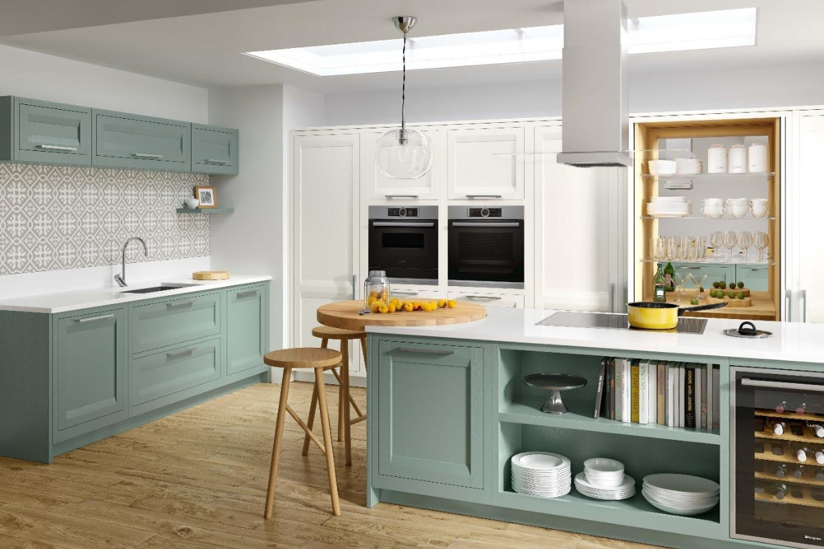
 Irish cream kitchen units with quartz countertops and pale blue walls for a bright, airy feel
Earthy Wall Colours For A Warm, Organic Vibe
Earthy wall colors bring a natural, grounded feel to cream kitchens, creating a cozy, inviting space that feels connected to the outdoors. These shades pair especially well with natural wood, stone, and biophilic decor:
Terracotta Hues
Warm terracotta with orange or red undertones complement warm cream cabinets for a rustic, Mediterranean, or southwestern-inspired kitchen. This rich, earthy shade creates a cozy, welcoming vibe that pairs perfectly with terracotta tile backsplashes, clay pottery, and natural stone countertops. For cool cream cabinets, choose a muted, grey-based terracotta to avoid a clashing warm cast. Use on a single accent wall in small kitchens to add warmth without overwhelming the space.
Olive Greens
Muted olive greens (avoid bright lime shades) bring a soft, organic contrast to cream cabinets, perfect for mid-century modern, rustic, and biophilic kitchens. This shade works with both warm and cool cream cabinets, and pairs beautifully with natural wood accents, woven jute rugs, and potted herbs. Olive green walls make large open-plan kitchens feel defined and cozy, while still feeling bright enough for small, light-filled spaces.
Burnt Oranges
Burnt orange (avoid bright tangerine shades) adds a warm, energetic pop of color to cream cabinets, ideal for mid-century modern, vintage, and eclectic kitchens. This shade complements warm cream cabinets perfectly, and pairs well with walnut accents, brass hardware, and retro-inspired decor for a playful, curated look. Use on a single accent wall in small kitchens to add personality without making the space feel cramped.
Accent Wall Ideas To Add Personality Without Overwhelm
If you’re hesitant to paint all four walls a bold or colorful shade, an accent wall is a low-commitment way to add depth and personality to your cream kitchen. These ideas work for renters and homeowners alike:
Peel-and-Stick Wallpaper
Removable peel-and-stick wallpaper is a renter-friendly option that lets you experiment with bold patterns and textures without permanent paint. For cream kitchens, choose muted botanical prints, subtle geometric patterns, or textured linen designs in shades that complement your cabinet undertones. Avoid busy, high-contrast patterns that clash with cabinet hardware or backsplash details. Peel-and-stick wallpaper is also easy to swap out seasonally if you want to update your decor without a full refresh.
Textured Paints
Textured paints, such as lime-based sand finishes or stone effect paints, add tactile depth to an accent wall, creating a cozy, rustic vibe that pairs perfectly with cream cabinetry. Textured paint also hides minor wall imperfections, making it a great option for older homes with uneven walls. Choose soft greys, warm taupes, or deep charcoal textured paints for a subtle, high-impact look that feels more intentional than flat paint.
Wood Paneling
Wood paneling adds natural warmth and texture to a cream kitchen, creating a timeless, inviting atmosphere. Whitewashed oak or maple shiplap pairs perfectly with cool cream cabinets for a bright, Scandinavian feel, while reclaimed walnut or cedar paneling complements warm cream cabinets for a rustic, organic vibe. Vertical shiplap is especially effective for low-ceilinged kitchens, as it draws the eye upward to make the space feel taller. For a modern twist, choose narrow, vertical wood slats instead of traditional horizontal shiplap.
How Lighting Impacts Your Wall Colour Choice
Lighting is one of the most overlooked factors in choosing a wall color for cream kitchens, as it dramatically shifts how both the wall paint and cabinet finish appear throughout the day. Ignoring your kitchen's lighting can lead to a shade that looks perfect in the store but muddy, too bright, or too dark in your space.
Natural Light Considerations
North-facing kitchens receive cool, blue-tinted natural light all day, which can make cool-toned wall colors feel cold and clinical. To balance this, choose warm wall shades like soft beige, terracotta, or warm taupe to add coziness. South-facing kitchens receive warm, yellow-tinted natural light, which can make warm wall colors feel stuffy and overly yellow. To balance this, choose cool wall shades like soft grey, pale blue, or muted green to keep the space feeling bright and fresh. East-facing kitchens get gentle, warm morning light and cool afternoon light, so neutral shades like soft taupe or muted grey work well for all-day consistency. West-facing kitchens get cool morning light and warm, golden afternoon light, so test swatches carefully to ensure the shade looks good at both times of day.
Artificial Lighting Tips
The color temperature of your light bulbs also impacts how wall colors appear. Warm white bulbs (2700K-3000K) enhance the warmth of cream cabinets and make warm wall shades feel cozy, while cool white bulbs (3500K-4100K) make cool wall shades feel crisp and bright, but can make warm shades look muddy. Layer your lighting with a combination of ceiling recessed lights, under-cabinet task lighting, and pendant lights over work areas to eliminate dark corners and show the true color of your walls and cabinets. Avoid harsh fluorescent lighting, which can distort color tones and make your cream cabinets look dull.
Testing Paint Swatches Correctly
Never rely on a small paint chip to choose your wall color — paint looks drastically different when wet, dry, and under different lighting conditions. To test a shade correctly:
- Paint 2×2 foot swatches on at least two different walls in your kitchen, next to your cream cabinets
- Wait 24 hours for the paint to fully cure (wet paint appears darker and more saturated)
- View the swatches at 8am, 2pm, and 8pm to see how they look in morning, afternoon, and evening light
- Live with the swatches for 2-3 days to ensure you don’t get tired of the shade
This simple step eliminates the risk of a costly, time-consuming repaint down the line.
Pro Colour Pairing Tips For A Polished Finish
Once you’ve narrowed down your color choices, these pro tips will help you create a cohesive, polished look that feels intentional rather than mismatched:
Match Undertones First
The single most important rule of color pairing is matching undertones across all surfaces in your kitchen. If your cream cabinets have warm undertones, choose wall shades with warm undertones (beige, terracotta, soft yellow) to create a harmonious, unified space. If your cream cabinets have cool undertones, choose wall shades with cool undertones (soft grey, pale blue, muted green) to avoid a clashing, "off" feel. Mismatched undertones are the most common cause of kitchens that feel disjointed even when all the individual colors look good in isolation.
Balance Warm And Cool Tones
If you want to add contrast without clashing, balance warm and cool tones across your kitchen. For warm cream cabinets, pair with cool-toned walls (soft grey, pale blue) to prevent the space from feeling too yellow and stuffy. For cool cream cabinets, pair with warm-toned walls (warm beige, soft terracotta) to prevent the space from feeling cold and clinical. Add warm metallic hardware (brass, oil-rubbed bronze) to tie the two tones together for a cohesive look.
Use Contrast To Define Space
Contrast is a powerful tool for making your kitchen feel intentional and well-designed. For small galley kitchens, use light walls with a single dark accent wall (deep blue, charcoal, forest green) to add depth and make the space feel larger, rather than painting all walls a dark shade that can feel cramped. For large open-plan kitchens, use darker walls to define the cooking zone and create a cozy, intimate feel that contrasts with adjacent dining or living areas. For low-ceilinged kitchens, use light, cool-toned walls to draw the eye upward and make the ceiling feel higher.
If you’re also exploring wall colors for other cabinet finishes, our guide to wall pairings for green kitchen cabinets breaks down complementary shades for that bold cabinetry choice. For warmer, rustic cabinetry, our wall color ideas for brown kitchen cabinets offers tailored recommendations for earthy, cozy spaces.
Frequently Asked Questions
What wall colours complement cream kitchen units best?
The best wall colors for cream kitchen units depend on your cabinet undertones, kitchen size, and design style. For warm cream cabinets, soft greys, warm beiges, pale blues, and terracotta hues work best to balance yellow undertones. For cool cream cabinets, warm taupes, dusty blush pinks, olive greens, and warm beiges work best to add coziness. For neutral cream cabinets, almost any shade works, so choose based on your preferred aesthetic. If you want a low-commitment, timeless look, soft greys, warm beiges, and pale blues are foolproof options that work with every style.
Can bold colours work with cream kitchen units?
Yes, bold colors work beautifully with cream kitchen units when paired correctly. Deep blues, forest greens, and charcoal blacks create striking contrast that makes cream cabinets pop, adding personality and depth to your space. For small kitchens, use bold colors on a single accent wall to avoid making the space feel cramped; for large open-plan kitchens, paint all four walls for a dramatic, immersive cooking zone. Always match the bold shade's undertone to your cream cabinets to avoid a clashing look.
Are neutral wall colours suitable for cream kitchens?
Neutral wall colours are ideal for cream kitchens if you want a low-commitment, timeless look that works with seasonal decor changes. Soft greys, warm beiges, subtle taupes, and even crisp whites (if your cream has cool undertones) create a calm, balanced backdrop that lets your cabinetry shine. Avoid stark pure white if your cream cabinets have warm undertones, as the harsh contrast can make the cabinets look yellow and dated. Neutral walls also make it easy to update your decor with colorful accessories, rugs, and artwork without repainting.
How does lighting affect wall colour choice with cream units?
Lighting dramatically impacts how wall colors appear next to cream cabinets, so it’s critical to test swatches in your specific space. North-facing kitchens get cool, blue-tinted natural light, so warm wall shades balance the coolness and prevent the space from feeling cold. South-facing kitchens get warm, yellow-tinted natural light, so cool wall shades prevent the space from feeling stuffy and overly yellow. Artificial lighting also matters: warm white bulbs enhance warm wall and cabinet tones, while cool white bulbs make cool shades look crisp. Always test swatches at different times of day to ensure the shade looks good in all lighting conditions.
Final Thoughts
Choosing the right wall color for your cream kitchen units doesn’t have to be overwhelming. Start by identifying your cabinet undertones, assess your kitchen’s natural light and size, and test 2-3 paint swatches in your space before committing to a full paint job. Whether you opt for a soft neutral, bold statement shade, or calming pastel, the right wall color will make your cream cabinets feel intentional, warm, and cohesive, rather than washed out or mismatched. If you’re planning a full kitchen refresh, our guide to removing a wall-mounted kitchen faucet walks you through a quick, high-impact hardware swap to complete your new look.