What’s a Good Color for Kitchen Walls: Top Trending 2026 Shades Revealed
Choosing a kitchen wall color feels high-stakes: after all, this is the room where you’ll make your morning coffee, host holiday feasts, and help kids with homework after school. The right shade doesn’t just look good — it boosts your home’s resale value, improves your daily mood, and even makes fresh produce look more vibrant when you’re prepping meals. 2026 kitchen design trends have moved far beyond the all-white, sterile kitchens of the 2010s, prioritizing warm, personalized shades that feel inviting without sacrificing timelessness. Below, we break down the top trending kitchen wall colors, plus expert-backed guidance on matching shades to your kitchen’s lighting, cabinet style, and layout, so you can pick a hue you’ll love for years to come.
2026 Top Trending Kitchen Wall Shades
The most popular 2026 kitchen wall colors balance personality and versatility, working with a wide range of cabinet styles, lighting conditions, and personal aesthetics. Unlike short-lived fads, these shades have staying power for homeowners who want a look that feels current without feeling dated in a few years. For more on this, see our guide on what is a good color for kitchen walls.
Warm Neutral Foundations
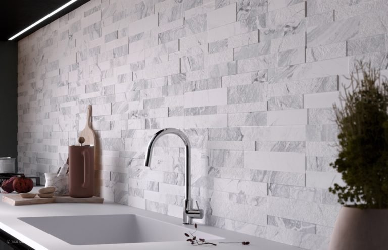
Warm neutrals are the top trending category for 2026, overtaking cool blue-based grays that peaked in popularity in the early 2020s. Top shades in this family include soft warm whites (with subtle beige or yellow undertones, no cool blue bases), warm taupe, and soft beige. These shades are beloved for their incredible versatility: they pair seamlessly with every cabinet style from warm natural wood to dark navy, work in both small galley kitchens and large open-concept layouts, and are highly appealing to home buyers if you ever sell your property. A common first-time mistake is picking a neutral that looks bright white in the store but reads as cold and icy on your kitchen walls, especially if you have warm wood cabinets or south-facing sunlight. The fix? Always test warm neutral samples against your cabinet finish and under your kitchen’s natural light before buying. For more on this, see our guide on what color walls go with green kitchen cabinets.
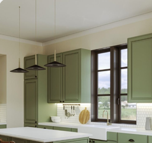 Warm neutrals are the most versatile 2026 trend, working with every cabinet and countertop style.
Image source: www.jswpaints.in
Warm neutrals are the most versatile 2026 trend, working with every cabinet and countertop style.
Image source: www.jswpaints.in
Earthy Muted Tones
Driven by the continued rise of biophilic design (the trend of connecting indoor spaces to nature), earthy muted tones are the second most popular 2026 kitchen wall category. Top shades include soft sage green, muted terracotta, warm ochre, and dusty olive. Each shade brings unique benefits: sage green pairs perfectly with brass hardware and natural wood countertops for a calming, nature-inspired feel; muted terracotta adds cozy warmth to north-facing kitchens that get little direct sun; and warm ochre brings a cheerful, sunlit vibe to windowless kitchen layouts. These shades feel far more personalized than stark neutrals, while still being subtle enough to avoid overwhelming small spaces. The key mistake to avoid here is picking a saturated, bright terracotta that looks dull in low light — opt for gray-based muted terracotta for the most versatility across lighting conditions. For more on this, see our guide on what color walls go with brown kitchen cabinets.
Soft Bold Accent Shades
For homeowners who want personality without committing to a full room of bold color, soft bold accent shades are the 2026 go-to. Top picks include muted navy, deep forest green, soft plum, and warm terracotta (used as an accent, not a full-wall color). These shades are almost always used on a single accent wall, typically behind the range, sink, or breakfast nook, to create a focal point without making the space feel closed in. A muted navy accent wall paired with white shaker cabinets and brass hardware is one of the most requested looks by residential clients in 2026, striking the perfect balance between drama and approachability. The most common error here is painting all four walls a bold shade in a small kitchen, which shrinks the visual footprint of the space — stick to one accent wall for maximum impact. For more on this, see our guide on what color to paint my kitchen walls with.
Match Wall Colors to Your Kitchen’s Layout and Lighting
Lighting is the single biggest factor that changes how a paint color looks in your kitchen, and ignoring it is the top cause of paint regret. A shade that looks soft and warm in the store can read as cold and dull in your north-facing kitchen, or overly bright in your west-facing space with afternoon sun.
How Natural Light Transforms Paint Colors
Natural light shifts in temperature and intensity throughout the day, and your kitchen’s orientation will drastically change how your chosen shade reads:
- North-facing kitchens get cool, bluish indirect sunlight all day, so warm shades (cream, soft yellow, warm taupe, muted terracotta) counteract the coolness and make the space feel cozy. Avoid cool blues or grays here, which will look drab and cold.
- South-facing kitchens get warm, golden direct sunlight for most of the day, so cool shades (pale blue, soft sage, light warm gray) balance the warmth and prevent the space from feeling yellow or overwhelming in the afternoon.
- East-facing kitchens get soft, warm golden light in the morning and cool, bluish light in the afternoon, so most shades work, but test samples in the late afternoon to make sure they don’t look too cool when the sun goes down.
- West-facing kitchens get harsh, warm golden light in the late afternoon, so avoid bright yellows, oranges, or reds, which will look overly saturated and glare-inducing. Opt for muted, low-saturation shades instead. From years of residential design work, the single most useful testing tip is this: paint a 2×2 foot sample of your chosen shade on the wall opposite your main light source, and live with it for 3 full days, checking it at 8am, 12pm, and 6pm to see how it looks at every light level. This simple step eliminates 90% of paint regret. For more on this, see our guide on how to choose paint color for kitchen walls.
 Soft pastel blue is a top pick for north-facing kitchens that need a brightness boost.
Image source: www.goodhousekeeping.com
Soft pastel blue is a top pick for north-facing kitchens that need a brightness boost.
Image source: www.goodhousekeeping.com
Artificial Lighting Adjustments for Perfect Color Match
Most kitchens use a mix of ambient lighting (ceiling lights, recessed lights) and task lighting (under-cabinet lights, pendant lights over the island), each of which impacts how wall colors read:
- Warm 2700K bulbs (common in pendant lights and under-cabinet lighting) make warm shades look richer and cool shades look muted. If you have warm lighting, avoid cool blues or grays which can look dull.
- Cool 3000K+ bulbs (common in recessed lighting) make cool shades pop and warm shades look yellow. If you have cool lighting, avoid bright yellows or warm reds which can look orange and unflattering.
- Fluorescent bulbs (still common in rental and older kitchens) cast a greenish tint, so test samples under these lights before committing to a shade. Pro tip: install dimmer switches for all your kitchen lighting, so you can adjust the tone to match the time of day and task, keeping your wall color looking balanced from breakfast prep to late-night snacks.
Coordinate Wall Colors With Your Cabinets and Fixtures
Your cabinets and permanent fixtures are the biggest fixed elements in your kitchen, so your wall color needs to complement them, not clash. The right pairing will make your space feel cohesive and intentional, while the wrong pairing can make even expensive cabinets look dated.
Pairings for Light and White Cabinets
Light and white cabinets are the most common kitchen cabinet style, so they work with nearly every wall shade, but a few 2026 pairings stand out:
- For a bright, airy, farmhouse feel: pair white shaker cabinets with soft sage green walls and warm brass hardware. This combination feels fresh without being stark, and works with both light and dark countertops.
- For a cozy, traditional feel: pair cream cabinets with warm taupe walls and a terracotta accent wall behind the range. This adds depth without feeling dark, even in small kitchens.
- For a modern, minimalist feel: pair white flat-panel cabinets with pale warm gray walls and black hardware. This keeps the space feeling open and sleek, while adding subtle contrast. If you’re working with warm wood cabinetry, our full guide to coordinating shades for warm wood cabinets walks through exact pairings for every undertone, from light oak to dark walnut. For bold green cabinetry, these pairing options for green cabinetry cover complementary and contrasting wall shades that won’t clash with your statement cabinets.
Pairings for Dark and Bold Cabinets
Dark navy, black, and forest green cabinets are a huge 2026 trend, but they require wall colors that prevent the space from feeling cave-like:
- The safest, most versatile pairing is warm white or soft beige walls, which reflect light and balance the darkness of the cabinets, making the space feel open and welcoming even in small layouts.
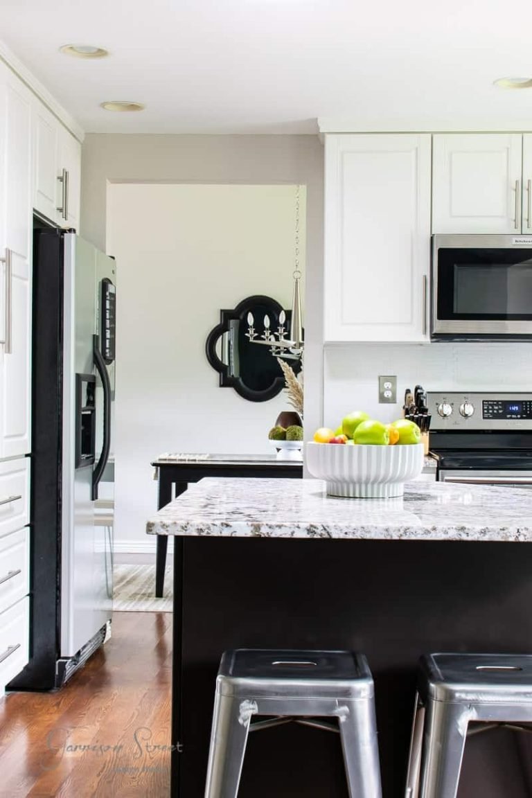
- For a more dramatic look, pair dark cabinets with a soft muted yellow or pale sage accent wall, which adds a pop of color without overwhelming the space. A common mistake to avoid: pairing dark cabinets with dark wall colors, which shrinks the visual footprint of the kitchen and feels heavy, especially in rooms with little natural light.
 A deep navy accent wall adds drama to modern farmhouse kitchens without overwhelming the space.
Image source: www.housebeautiful.com
A deep navy accent wall adds drama to modern farmhouse kitchens without overwhelming the space.
Image source: www.housebeautiful.com
Pairings for Natural Wood Cabinets
For natural wood cabinets (oak, maple, walnut), the key is to match the wall color’s undertone to the opposite of your wood’s undertone for gentle contrast:
- Warm-toned woods (oak, cherry, hickory) pair beautifully with cool muted shades like soft sage, pale blue, or warm taupe, which create gentle contrast without clashing with the wood’s golden undertones.
- Cool-toned woods (maple, ash, birch) work best with warm shades like cream, soft yellow, or muted terracotta, which add warmth to the space and prevent the wood from feeling too cool or sterile. Avoid matching your wall color exactly to your cabinet wood tone, which makes the space feel flat and one-dimensional.
Practical Tips to Avoid Costly Paint Mistakes
Kitchen paint projects have unique challenges, from grease splatters to high moisture, so a little extra prep goes a long way to making your result last for years.
Test Paint Samples the Right Way
Relying on tiny store paint chips is the fastest way to end up with a color you hate. Instead:
- Buy 2×2 foot sample pots of your top 2-3 shade choices, and paint them on multiple walls, especially the wall opposite your main light source and the wall behind your sink or range (high-traffic areas where you’ll see the color most often).
- Let the paint cure for 24-48 hours before judging it, as wet paint dries 1-2 shades lighter or darker than its wet appearance.
- Live with the samples for at least 3 full days, checking them at different times of day and with all your kitchen lights on, to get a full picture of how the color performs in your space. A common mistake we see in DIY kitchen refreshes is judging a paint color at 10am on a sunny day and committing to it, only to find it looks dull and gray at 6pm in the evening. This simple testing step eliminates that regret entirely.
Choose the Right Paint Finish for Durability
The finish you choose is just as important as the color for a high-use space like a kitchen, as it determines how well the paint resists grease, moisture, and daily wear:
- Matte finish: Great for hiding minor wall imperfections, but it’s not washable, so it’s only best for low-traffic kitchens or homes without young kids.
- Eggshell or satin finish: The sweet spot for most kitchens. These have a soft, low sheen that’s highly wipeable, resists moisture and grease splatters, and doesn’t show minor wall flaws. They’re ideal for walls away from direct water exposure.
- Semi-gloss or high-gloss finish: Best for high-moisture areas like the wall behind your sink, stove, or backsplash, as they’re extremely washable and resist mold and mildew. They’re also easy to wipe down after cooking splatters. Pro tip: if you’re pairing a fresh wall color with a swapped-out wall fixture, test paint samples near the fixture to make sure the colors coordinate with your chosen hardware finish (brass, nickel, black), and our step-by-step guide to removing an existing wall-mounted model makes the upgrade straightforward for DIYers.
Prioritize Low-VOC Paint for Food Prep Spaces
Kitchens are where you prep and store food, so choosing a non-toxic paint is non-negotiable for your family’s health. Traditional paints release volatile organic compounds (VOCs) into the air as they dry, which can cause headaches, respiratory irritation, and other health issues, especially in poorly ventilated spaces. The EPA’s indoor air quality guidelines recommend low- or zero-VOC paints for all indoor spaces, especially kitchens and children’s rooms, to minimize exposure to harmful chemicals. Most major paint brands now label their low-VOC options clearly, so it’s easy to find a trending shade that’s also safe for your home. Avoid vague "no-VOC" claims that aren’t third-party certified, as some brands use the term loosely.
On-Trend Accent Wall Ideas for 2026
If you’re not ready to paint your entire kitchen, an accent wall is a low-commitment way to add personality and on-trend style to your space.
Textured Finishes Beyond Standard Paint
2026 accent walls move far beyond standard brick or wood panels, with textured paint finishes leading the trend:
- Limewash: A breathable, matte finish made from natural lime and water, limewash has a soft, uneven texture that adds subtle depth to walls. It’s perfect for farmhouse and traditional kitchens, and it naturally resists mold and mildew, making it ideal for humid kitchen spaces.
- Roman clay: A smooth, matte plaster finish that can be tinted to any shade, Roman clay adds a soft, luxurious texture to accent walls. It works well in modern and minimalist kitchens, and it hides minor wall imperfections better than standard paint.
- Micro-cement: A durable, seamless finish that’s perfect for modern kitchens, micro-cement accent walls can be tinted to match your wall color or contrasted for a bold look. It’s highly wipeable, making it ideal for walls behind ranges or sinks. Pro tip: textured finishes work best on accent walls behind open shelving, breakfast nooks, or your kitchen’s range, where they can be admired up close without overwhelming the rest of the space.
Wallpaper and Decals for Renters and DIYers
For renters or homeowners who love switching up their space regularly, peel-and-stick wallpaper and decals are a low-commitment way to add personality to your kitchen:
- 2026 trends lean toward subtle, nature-inspired patterns: botanical prints, watercolor washes, and thin metallic stripes (gold, brass, or black) are the most popular, as they add visual interest without feeling dated in a few years.
- Avoid loud, high-contrast geometric patterns, which can feel overwhelming in a small kitchen and quickly go out of style.
- For a quick, budget-friendly update, add a thin metallic decal stripe along the top of an existing accent wall, or use a small botanical peel-and-stick mural behind your sink for a subtle pop of personality.
Frequently Asked Questions
What colors make kitchen walls look bigger?
Light, cool shades with high light reflectance are the best choice for making small kitchens feel larger. Soft white, pale blue, light warm gray, and soft sage all reflect more light than dark shades, creating the illusion of more space. Avoid dark bold shades on all four walls of a small kitchen, as they absorb light and make the room feel cramped. If you love bold colors, use them on a single accent wall to add personality without shrinking the space.
Which kitchen wall colors boost appetite?
Warm, saturated shades are proven to stimulate appetite and encourage socializing, making them ideal for kitchens where you host guests. Soft red, muted orange, warm yellow, and terracotta all increase appetite and create a cozy, energetic atmosphere. For a more subtle take, use these shades on a single accent wall, or pair them with neutral walls to avoid overwhelming the space.
Are neutral colors good for kitchen walls?
Absolutely. Neutral shades like warm white, soft beige, warm taupe, and light gray are some of the most popular kitchen wall colors for good reason: they’re incredibly versatile, pair with every cabinet and countertop style, and appeal to a wide range of home buyers if you ever sell your home. Neutrals also make it easy to swap out decor and hardware without repainting, making them a low-maintenance, long-lasting choice.
How do I choose kitchen wall colors with natural light?
Match your wall shade’s undertone to the opposite of your kitchen’s natural light undertone for the most balanced look: use warm shades (cream, soft yellow, warm taupe) in cool north-facing kitchens to add warmth, and cool shades (pale blue, soft sage, light gray) in warm south-facing kitchens to balance golden sunlight. Always test samples in your space at different times of day before committing, as natural light can drastically change how a paint color reads.
Should I paint my kitchen walls the same color as adjacent rooms?
It’s not necessary, but it can create a cohesive flow if you prefer a seamless look throughout your home. If you want to define the kitchen as its own space, pick a shade 1-2 tones darker or lighter than the adjacent room’s wall color, or use a complementary accent wall to create a subtle boundary between spaces.
How often do kitchen walls need to be repainted?
Kitchen walls typically need repainting every 5-7 years, depending on traffic and wear. High-traffic areas behind the stove, sink, or breakfast nook may need spot repairs or a full repaint every 3-4 years, as grease splatters, moisture, and daily wear can cause paint to fade or peel faster. Using a satin or semi-gloss finish in these high-wear zones will extend the life of your paint job significantly.
Final Thoughts
There’s no one-size-fits-all “perfect” kitchen wall color, but the best shade for your space will align with your kitchen’s lighting, cabinet style, layout, and personal lifestyle. 2026’s trending shades prioritize warmth, personality, and versatility, making it easier than ever to find a hue that feels both current and timeless. The most important step in the process is testing samples in your actual space, living with them for a few days, and choosing a color that makes you feel happy every time you walk into the room. A well-chosen kitchen wall color is one of the easiest, highest-impact updates you can make to your home, turning your kitchen from a purely functional space into the heart of your home.

Ethan Cole is a kitchen innovation enthusiast and food technology writer at DiningGadgets.com. With over 8 years of experience reviewing cookware, smart kitchen tools, and design trends, he helps readers discover gadgets that make cooking easier and dining more enjoyable. When he’s not testing the latest kitchen appliances, Ethan enjoys experimenting with recipes and sharing practical tips for modern homes.