Cashmere Kitchen What Colour Walls: Stunning Shades to Transform Your Space
Cashmere kitchen cabinets are one of 2026’s most sought-after design trends, prized for their warm, creamy undertones, matte low-sheen finish, and ability to hide fingerprints and grease splatters in busy family spaces. But while the cabinetry sets a soft, luxurious foundation, your wall color will make or break the overall feel of the room: the wrong shade can wash out cashmere’s subtle warmth or make a small kitchen feel cramped, while the right pick amplifies the space’s cozy, inviting vibe. This guide breaks down stunning, designer-recommended wall shades for cashmere kitchens, with practical tips for testing, lighting considerations, and avoidable mistakes to ensure your renovation turns out exactly as you imagined.
Why Cashmere Kitchen Cabinets Demand Thoughtful Wall Pairings
Cashmere’s defining feature is its muted, warm undertone and soft matte finish, which absorbs more light than glossy or high-gloss cabinet styles. This means your wall color will interact with your cabinetry differently than it would with, say, a bright white high-gloss finish: shades with clashing undertones will make cashmere cabinets look dull or ashy, while complementary shades will amplify their cozy, luxurious feel. Unlike bolder cabinet colors (like emerald green or navy) that can anchor a space on their own, cashmere’s subtlety means your walls need to work in tandem with the cabinetry to create a balanced, cohesive look, rather than competing for attention. Pro tip from kitchen design specialists: Always hold paint samples directly up to your cashmere cabinet finish (rather than a generic white wall) to see how the undertones interact in your specific space.
Top Wall Colour Families For Cashmere Kitchens (2026 Designer Picks)
The best wall shades for cashmere kitchens fall into four core families, each suited to different space sizes, lighting conditions, and style preferences. Below are the most popular, high-impact options recommended by interior designers for 2026:
Warm Neutrals
Warm neutrals are the most versatile, foolproof pairing for cashmere cabinets, as their yellow, red, or brown undertones amplify cashmere’s cozy, inviting feel without overwhelming its softness. Top picks include:
- Soft greige: Shades like PPG Warm Stone 108-5 or Benjamin Moore Edgecomb Gray strike the perfect balance between warm and cool, making them ideal for every kitchen style from farmhouse to modern. They pair seamlessly with stainless steel appliances, white marble countertops, and brushed brass hardware.
- Warm taupe: Deeper than greige, shades like Sherwin-Williams Accessible Beige or Farrow & Ball Elephant’s Breath add subtle depth to large, sunlit kitchens without feeling dark. They work beautifully with natural wood accents and matte black fixtures for a warm, industrial vibe.
- Creamy off-white: Shades like Benjamin Moore White Dove or Valspar Swiss Coffee brighten small or windowless kitchens by reflecting natural light, while still feeling warmer than stark pure white. They’re a top pick for cottage or coastal-style kitchens, paired with light wood floors and pastel accents.
Warm neutrals are especially well-suited for rental properties, as their neutral base will appeal to a wide range of buyers if you decide to sell later. In practice, they also hide minor scuffs and marks better than light cool shades, making them a low-maintenance pick for family homes.
Cool Neutrals
If you prefer a more modern, airy feel, cool neutral shades with soft gray or blue undertones create gentle contrast against cashmere’s warmth without clashing. Top options include:
- Soft sage: Muted, gray-based sage shades like Farrow & Ball French Gray or Behr Silver Sage add a touch of organic calm that pairs beautifully with natural wood countertops and greenery. They’re perfect for kitchens that open onto a garden or patio, as they blur the line between indoor and outdoor space.
- Pale blue-grey: Shades like Benjamin Moore Stonington Gray or Sherwin-Williams Repose Gray bring a crisp, spa-like tranquility to busy kitchens, especially when paired with white subway tile and chrome fixtures. They work exceptionally well in south-facing kitchens, where warm natural light prevents them from feeling too cold.
- Warm greige with cool undertones: For a balanced pick that works with both warm and cool accents, opt for a greige with a subtle gray base, like Sherwin-Williams Agreeable Gray, which pairs with both warm brass and cool stainless steel.
Cool neutrals are a great choice for modern or minimalist kitchens, as they keep the space feeling open and uncluttered while still complementing cashmere’s softness.
Bold Statement Shades
For homeowners who want to inject personality into their kitchen, bold shades create high-impact contrast against cashmere’s soft matte finish. The key to making bold shades work is to use them intentionally, either as a full wall color in large, sunlit spaces or as a single accent wall. Top 2026 picks include:
- Deep navy: Shades like Farrow & Ball Hague Blue or Sherwin-Williams Naval add rich, sophisticated depth that pairs seamlessly with stainless steel appliances, white marble, and gold hardware. They’re ideal for open-concept kitchens that flow into living or dining spaces, as they create a natural zone boundary without feeling closed off.
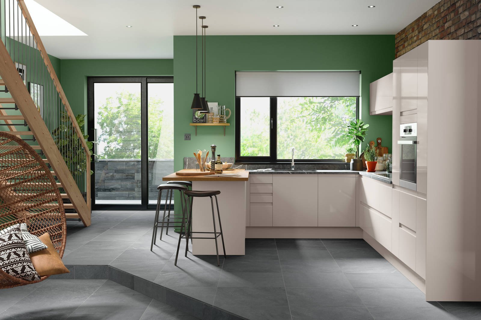
- Forest green: Earthy, muted forest greens like Farrow & Ball Bancha or Behr Back to Nature bring a fresh, organic feel to kitchens with lots of natural light, especially when paired with cream-colored backsplashes and terracotta accessories. They work beautifully in farmhouse or rustic-style kitchens with natural wood accents.
- Burnt terracotta: Warm, earthy terracotta shades like Farrow & Ball Red Earth or Benjamin Moore Terracotta add a cozy, Mediterranean vibe to kitchens, especially when paired with white tile, natural wood, and woven textiles. They’re a great pick for kitchens with south or west-facing windows, as warm golden light amplifies their rich undertones.
A common mistake when using bold shades is choosing a tone with cool blue undertones, which can clash with cashmere’s warm base. Always test samples next to your cabinet finish before committing to a full wall.
Soft Pastels
For dark, north-facing kitchens that need a brightness boost without feeling stark, soft pastel shades add a gentle pop of color that amplifies natural light. Top 2026 picks include:
- Pale blush: Soft pink shades like Sherwin-Williams Delicate Rosebud or Farrow & Ball Setting Plaster add a warm, welcoming glow that enhances cashmere’s creamy undertones, making the space feel cozy without feeling overly feminine. They pair beautifully with white marble and gold hardware for a luxurious, subtle look.
- Mint green: Crisp, muted mint shades like Benjamin Moore Mint Condition or Behr Fresh Cut Grass bring a fresh, lively contrast that pairs perfectly with natural wood accents and white subway tile. They’re ideal for cottage or farmhouse-style kitchens, especially those with outdoor access.
- Butter yellow: Soft, warm butter shades like Farrow & Ball Sudbury Yellow or Valspar Butter Cream add a sunny, cheerful vibe to dark kitchens, reflecting natural light to make the space feel larger and more open. They pair seamlessly with natural wood floors and cream-colored backsplashes for a warm, inviting feel.
Pastels work best when paired with neutral main walls or used on a single accent wall, to avoid overwhelming the space.

Accent Wall Strategies For Cashmere Kitchens
If you’re not ready to commit to painting all your walls a new shade, an accent wall is a low-lift, high-impact way to add personality to your cashmere kitchen. The most high-impact spot for an accent wall is directly behind your kitchen range, sink, or open shelving unit, as these are natural focal points that draw the eye immediately.
When choosing an accent shade, select one that is 2-3 shades darker or more saturated than your main wall color for cohesive contrast: for example, pair soft greige main walls with a deep terracotta accent, or creamy white main walls with a muted navy accent. Avoid clashing undertones at all costs: a cool blue accent will look disjointed against warm cashmere cabinets, so always test samples next to your cabinetry before painting. For small kitchens, limit the accent wall to one surface to avoid overwhelming the room; for larger open-concept spaces, you can extend the accent shade to the ceiling for a dramatic, enveloping effect.

How Lighting And Finish Impact Your Wall Colour Choice
A shade that looks perfect in a paint store can look completely different in your kitchen, thanks to shifting natural and artificial light. Understanding how lighting interacts with your wall and cabinet finishes will help you pick a shade that looks beautiful at every hour of the day.
Natural Vs Artificial Light
Natural light shifts dramatically depending on your window direction: north-facing kitchens receive cool, bluish light most of the day, which can make warm shades look dull and cool shades look even colder; south-facing kitchens get warm, golden light that amplifies warm undertones, making even cool shades feel inviting; east-facing light has soft pink undertones that pair beautifully with warm neutrals and pastels; west-facing golden afternoon light makes even deep bold shades feel warm and cozy.
Artificial light also plays a major role: 2700K warm LED bulbs enhance warm undertones in both walls and cashmere cabinets, creating a cozy, inviting vibe for evening cooking; 3000K neutral LED bulbs are the most versatile, as they show true color without shifting undertones; 4000K cool LED bulbs can make warm shades look muddy and cool shades look sterile, so test samples under your kitchen’s existing bulb temperature before committing.
If you’re working with a north-facing kitchen with limited natural light, research from the University of Minnesota Extension confirms that wall shades with warm undertones will compensate for cool bluish light and keep your cashmere cabinets looking bright and warm; their north-facing kitchen color guidance breaks down how to adjust undertones for every window direction.
Paint Finish Selection
The finish you choose for your walls will change how both the paint and your cashmere cabinets look under light. While matte paint offers a soft, cohesive look that matches cashmere’s low-sheen finish, it is prone to scuffs, grease splatters, and moisture damage in high-traffic kitchens, making it a poor choice for most family homes. For most spaces, a wipeable eggshell or satin finish is the best compromise: it has a subtle low-sheen that complements cashmere’s matte texture, while being durable enough to wipe down spills and splatters with a damp cloth. Use semi-gloss paint on trim and ceilings to create subtle contrast against your wall and cabinet finishes, and to bounce light around dark spaces.
For kitchens used for frequent cooking and food prep, opt for low-VOC, moisture-resistant paint formulas rated for high-humidity spaces; the U.S. Environmental Protection Agency maintains a curated list of certified low-VOC kitchen paints to help you select safe, durable options.

Step-By-Step Testing Process To Avoid Costly Mistakes
Small paint swatches often fail to capture how a shade will look across an entire wall, especially in a kitchen with varied lighting and large cabinet surfaces. Follow this expert-recommended process to test colors accurately before committing to a full paint job:
- Order sample pots: Pick 2-3 of your top shade contenders and buy 8oz sample pots from your paint supplier, rather than relying on tiny paper swatches that don’t show true color coverage.
- Paint large patches: Apply 2×2 foot patches of each shade to at least 3 different walls in your kitchen, including one wall near your cashmere cabinets and one in a dimly lit corner.
- Wait for full cure: Let the paint dry completely for 24 hours, as most shades dry 1-2 shades darker than their wet appearance—judging wet paint is one of the most common mistakes homeowners make when selecting wall colors.
- Observe at multiple times: Check the patches at 8am, 12pm, 4pm, and 8pm with both natural light and your kitchen’s overhead lights on to see how the shade shifts throughout the day.
- Test against cabinet finishes: Hold a scrap of your cashmere cabinet door (or a matching paint chip) next to each sample to ensure the shade complements, rather than clashes with, your cabinet undertones.
- Live with the samples: Leave the patches up for 3 days before making a final decision, as your initial impression may shift as you get used to the shade in the space.
If your kitchen already features deep forest green cabinetry, our guide to green cabinet wall pairings offers tailored shade recommendations to balance bold tones with warm neutrals. For kitchens with warm brown wood-tone cabinets, our brown cabinet wall matches breaks down which shades will highlight natural grain without clashing.
Frequently Asked Questions
What wall colors complement a cashmere kitchen?
Soft neutrals—including warm greige, soft taupe, creamy off-white, and pale sage—are the most versatile pairings for cashmere cabinets, as their subtle undertones complement the warm, creamy base of cashmere without competing for attention. For small or dark kitchens, opt for lighter neutral shades to maximize brightness, while larger, sunlit spaces can handle deeper neutral tones like warm taupe or mushroom.
Can bold colors work with cashmere kitchen walls?
Yes, bold shades like deep navy, forest green, terracotta, and even muted plum create striking, sophisticated contrast against cashmere’s soft matte finish. For the best results, use bold shades on a single accent wall, or as the full wall color only in large, open-concept kitchens with ample natural light to avoid making the space feel cramped.
Should I choose warm or cool tones for cashmere kitchens?
Warm tones (with yellow, red, or orange undertones) enhance cashmere’s cozy, inviting feel and are ideal for north-facing or dark kitchens that need a brightness boost. Cool tones (with blue or gray undertones) create a fresh, modern contrast that works well in south-facing, sunlit kitchens, as long as the shade has enough warmth to avoid clashing with cashmere’s undertones.
How do lighting conditions affect wall color choice?
Natural light shifts throughout the day: north-facing light is cool and bluish, so warm wall undertones are required to prevent cashmere cabinets from looking ashy; south-facing light is warm and golden, so cool or neutral shades work well to balance the space; east-facing light has soft pink undertones that pair beautifully with warm neutrals and pastels; west-facing golden afternoon light makes even cool shades feel warm, so you can experiment with bolder palettes. Artificial light also shifts color perception: 2700K warm LED bulbs enhance warm undertones, while 4000K cool LED bulbs can make warm shades look muddy, so test samples under your kitchen’s existing bulb temperature before committing.
What paint finish works best for cashmere kitchen walls?
While matte paint offers a soft, cohesive look that matches cashmere’s low-sheen cabinet finish, it is prone to scuffs, grease splatters, and moisture damage in high-traffic kitchens. For most homes, a wipeable eggshell or satin finish is the best compromise: it has a subtle low-sheen that complements cashmere’s matte texture, while being durable enough to wipe down spills and splatters with a damp cloth. Use semi-gloss paint on trim and ceilings to create subtle contrast against your wall and cabinet finishes.
Can I use dark wall colors in a small cashmere kitchen?
Yes, but with intentional design choices. Dark shades like charcoal, navy, or forest green can make a small kitchen feel cozy and intimate, rather than cramped, if you balance them with bright, reflective accents: add under-cabinet LED lighting, white or light-colored countertops, and metallic hardware to bounce light around the space. Avoid dark shades on all four walls if your kitchen has limited natural light; instead, use a dark shade on a single accent wall, and pair it with light, neutral main walls to keep the space feeling open.
If you’re also updating your kitchen’s plumbing as part of your refresh, our step-by-step guide to removing a wall-mounted faucet makes fixture swaps straightforward for DIYers. For homeowners who love hosting, our top-rated home wine making kits let you craft custom, pair-ready drinks to serve alongside your renovated space, and our curated wine making supplies online include everything from durable bottles to alcohol meters for consistent batches.
Conclusion
Choosing the right wall color for your cashmere kitchen is about more than just aesthetics: it’s about creating a space that feels warm, functional, and true to your personal style, no matter the time of day or season. Soft neutrals offer timeless versatility that works for every home, while bold shades and pastels let you inject personality without clashing with cashmere’s subtle, elegant finish. No matter which palette you choose, always test large samples in your actual space, account for your kitchen’s lighting and traffic flow, and opt for a durable, low-maintenance paint finish to keep your walls looking fresh for years to come.