White Cabinets in Kitchen What Color Walls: Stunning Color Ideas
White kitchen cabinets are a perennially popular choice for a reason: they brighten cramped spaces, create a clean, timeless backdrop, and pair with nearly every design style from modern farmhouse to coastal minimalist. As the National Kitchen and Bath Association (NKBA) reports, white cabinetry has been the most requested finish for residential kitchen remodels for over a decade, valued for its ability to make small spaces feel larger and hide minor wear and tear. But the wall color you pair with your white cabinetry is the make-or-break detail that determines whether your kitchen feels fresh and inviting, or cold, sterile, and washed out.
Many homeowners default to safe neutral shades, but with the right palette, you can amplify your space’s style, complement your existing finishes, and even make your kitchen feel larger. In this guide, we’ll break down the most stunning, practical wall color ideas for white kitchen cabinets, including how to account for your cabinet’s undertones, coordinate with fixed finishes like countertops and flooring, and avoid common costly mistakes. By the end, you’ll have a clear, actionable plan to pick a wall color that elevates your entire kitchen design.
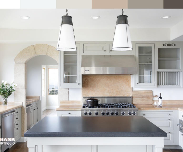
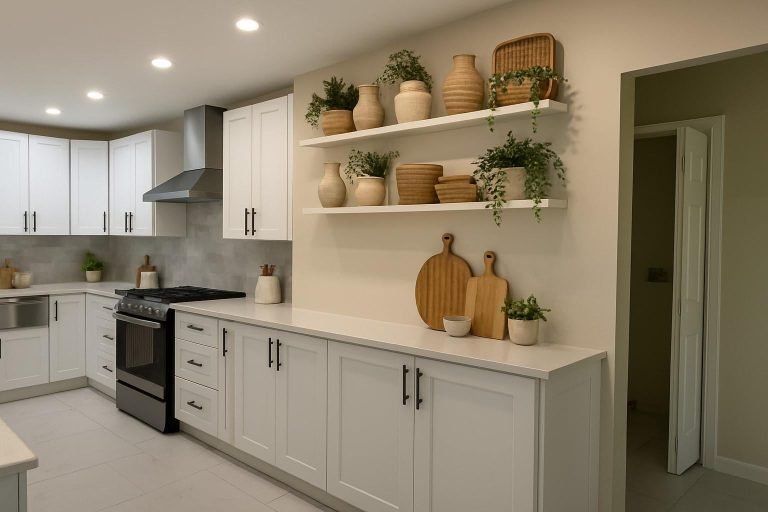
 Credit: www.countryliving.com
Light gray tile floors balance crisp white cabinetry for a clean, timeless kitchen look.
Credit: www.countryliving.com
Light gray tile floors balance crisp white cabinetry for a clean, timeless kitchen look.
Understand Your White Cabinet Undertones First
Before you browse wall color swatches, it’s critical to identify the undertone of your white cabinets, as this will make or break your color pairing. Most white cabinets fall into three categories:
- Warm white: Has subtle yellow, red, or brown undertones, common in traditional, farmhouse, and Mediterranean-style kitchens. These cabinets feel cozy and inviting, but pair poorly with cool-toned wall colors like bright blue or true gray, which can create a muddy, unbalanced look.
- Cool white: Has subtle blue, green, or purple undertones, common in modern, industrial, and coastal kitchens. These cabinets feel crisp and airy, but clash with warm earthy wall colors like terracotta or warm beige, which can make the space feel dull.
- Neutral white: Has no strong undertones, making it the most versatile option that pairs well with nearly any wall color family.
A quick, low-cost way to test your cabinet undertone: hold a plain white piece of paper next to your cabinet doors in natural daylight. If the cabinets look slightly yellow or cream next to the paper, they’re warm white; if they look slightly blue or gray, they’re cool white. If there’s no visible shift, they’re neutral white. A common mistake homeowners make is skipping this step, leading to clashing palettes that feel “off” even when individual colors look nice in isolation.
If you’re also exploring other cabinet finishes beyond white, our guide to complementary wall shades for green kitchen cabinets breaks down pairing rules for that bold, nature-inspired cabinet choice.
Top Stunning Wall Color Palettes for White Kitchen Cabinets
Once you’ve identified your cabinet undertone, you can narrow down wall color options that will create a cohesive, balanced look. Below are the most popular, design-vetted palettes, organized by style vibe:
Classic Neutral Hues
Neutral wall colors are the most popular choice for white kitchen cabinets for good reason: they create a calm, versatile backdrop that lets your cabinetry, backsplash, and decor take center stage, while working with every design style. The key to nailing neutral pairings is matching the undertone of your wall color to your cabinet undertone.
- Soft warm gray: Ideal for kitchens with warm white cabinets, soft warm grays (like Benjamin Moore Revere Pewter or Sherwin-Williams Agreeable Gray) add gentle depth without overwhelming the space. They hide smudges and dirt far better than cool grays, making them a top pick for families with kids or pets. Pair with natural wood open shelves and brass hardware for a cozy, timeless look.
- Warm beige: Creamy, earthy beiges (like Sherwin-Williams Accessible Beige or Benjamin Moore Sand Dune) balance the crispness of white cabinets with subtle warmth, making even cold north-facing kitchens feel sunny and inviting. They pair seamlessly with stone countertops, jute rugs, and wooden accents for a warm, lived-in feel.
- Crisp cool gray: For kitchens with cool white cabinets, soft cool grays (like Benjamin Moore Stonington Gray or Sherwin-Williams Repose Gray) add a sleek, modern contrast that makes stainless steel appliances pop. This shade works especially well in coastal or industrial-style kitchens.
- True white walls: Painting your walls the exact same white as your cabinets creates a seamless, minimalist, gallery-like look that makes small kitchens feel larger. The trade-off? True white-on-white requires intentional texture to avoid feeling flat or clinical: add shiplap walls, a textured subway tile backsplash, or matte and glossy cabinet finishes to create visual interest. Note that true white walls show scuffs, splatters, and grease stains far more than light neutrals, so they’re best for low-traffic kitchens or homeowners who don’t mind frequent touch-ups.
Bold, High-Contrast Shades
If you want to make a design statement, bold wall colors create dramatic, head-turning contrast with crisp white cabinets, turning your kitchen into the focal point of your home. These shades work best in kitchens with ample natural light, as dark walls can make small, dim spaces feel cramped.
- Navy blue: A timeless, sophisticated choice that pairs beautifully with both warm and cool white cabinets. Navy walls make white cabinetry pop while adding a calming, grounded vibe to the space. For a coastal-inspired kitchen, pair navy with white beadboard walls and brass fixtures; for a modern look, pair with matte black hardware and a marble countertop. If you’re nervous about committing to all four navy walls, paint just the wall behind your range or sink as an accent wall for a lower-risk pop of color.
- Emerald green: A vibrant, energetic choice that brings a fresh, organic feel to kitchens, especially those with warm white cabinets and natural wood accents. Emerald works beautifully in farmhouse or cottage-style kitchens, paired with open wooden shelves and potted herbs. For a more muted take, choose a softer sage green (covered in the earthy tones section below) for a low-key pop of color.
- Deep charcoal: A sleek, modern choice that adds urban sophistication to white cabinets, perfect for industrial or minimalist kitchens. Matte charcoal paint adds subtle texture without feeling harsh, and pairs seamlessly with stainless steel appliances and concrete countertops. Like navy, charcoal works well as an accent wall if you’re hesitant to paint all four walls.
Soft Pastel & Light Hues
Pastel and light wall colors are perfect for small kitchens, north-facing spaces with limited natural light, or homeowners who want a calm, airy feel without the starkness of true white. These shades reflect light to make your space feel larger, while adding just enough color to avoid a boring, all-white palette.
- Pale blue: Cool, calming pale blues (like Benjamin Moore Palladian Blue or Sherwin-Williams Open Air) evoke a coastal, serene vibe that pairs seamlessly with cool white cabinets. This shade works especially well in kitchens with white subway tile backsplashes and light wood floors, creating a fresh, beachy feel.
- Blush pink: Soft, warm blush tones (like Sherwin-Williams Pink Swan or Benjamin Moore Raspberry Ice) add subtle warmth and coziness to white cabinets, perfect for traditional or cottage-style kitchens. Blush pairs beautifully with brass fixtures, marble countertops, and pale wood accents for a soft, inviting look.
- Mint green: Fresh, lively mint greens (like Benjamin Moore Mint Condition or Sherwin-Williams Sea Salt) bring a touch of nature indoors, pairing perfectly with white cabinets and green plant accents. This shade works well in both traditional and modern kitchens, and hides dirt and smudges better than pale blue or blush.
Earthy, Organic Tones
Earthy wall colors bring warmth, texture, and a connection to nature to kitchens with white cabinets, making the space feel cozy and lived-in without feeling dark or heavy. These shades are especially popular in farmhouse, rustic, and Southwestern-style kitchens, and hide smudges and dirt far better than light pastels or cool grays.
- Terracotta: Rich, warm terracotta (like Sherwin-Williams Cavern Clay or Benjamin Moore Mexican Tile) adds a vibrant, rustic touch to white cabinets, perfect for Mediterranean or Southwestern-style kitchens. Pair with terracotta floor tiles, wooden open shelves, and potted succulents for a cohesive, warm look.
- Sage green: Soft, muted sage greens (like Benjamin Moore Sage Green or Sherwin-Williams Clary Sage) bring a calming, natural feel to white cabinets, ideal for cottage or farmhouse kitchens. Sage pairs beautifully with natural stone countertops, wooden accents, and linen curtains for a cozy, organic vibe.
- Soft taupe: Subtle, versatile soft taupes (like Benjamin Moore Revere Pewter or Sherwin-Williams Passive) add gentle depth without overwhelming white cabinets, making them a perfect pick for transitional-style kitchens that blend modern and traditional elements. Taupe works with nearly every countertop and backsplash material, from white quartz to dark granite.
For homeowners who prefer warmer, richer cabinet tones, our wall color pairing guide for brown kitchen cabinets offers tailored recommendations for earthy, sophisticated palettes.
Quick Reference: Wall Colors by Kitchen Style
| Kitchen Style | Best Wall Color Pairs for White Cabinets | Ideal Paint Finish |
|---|---|---|
| Modern/Industrial | Cool gray, pale blue, charcoal (accent wall) | Satin or semi-gloss (for high-splash areas) |
| Farmhouse/Traditional | Warm beige, sage green, blush pink | Eggshell or satin |
| Coastal | Pale blue, soft white, warm beige | Satin |
| Mediterranean/Southwestern | Terracotta, soft taupe, warm beige | Eggshell or satin |
| Small/Low-Light | Pale blue, soft warm gray, warm beige | Satin (to reflect light) |
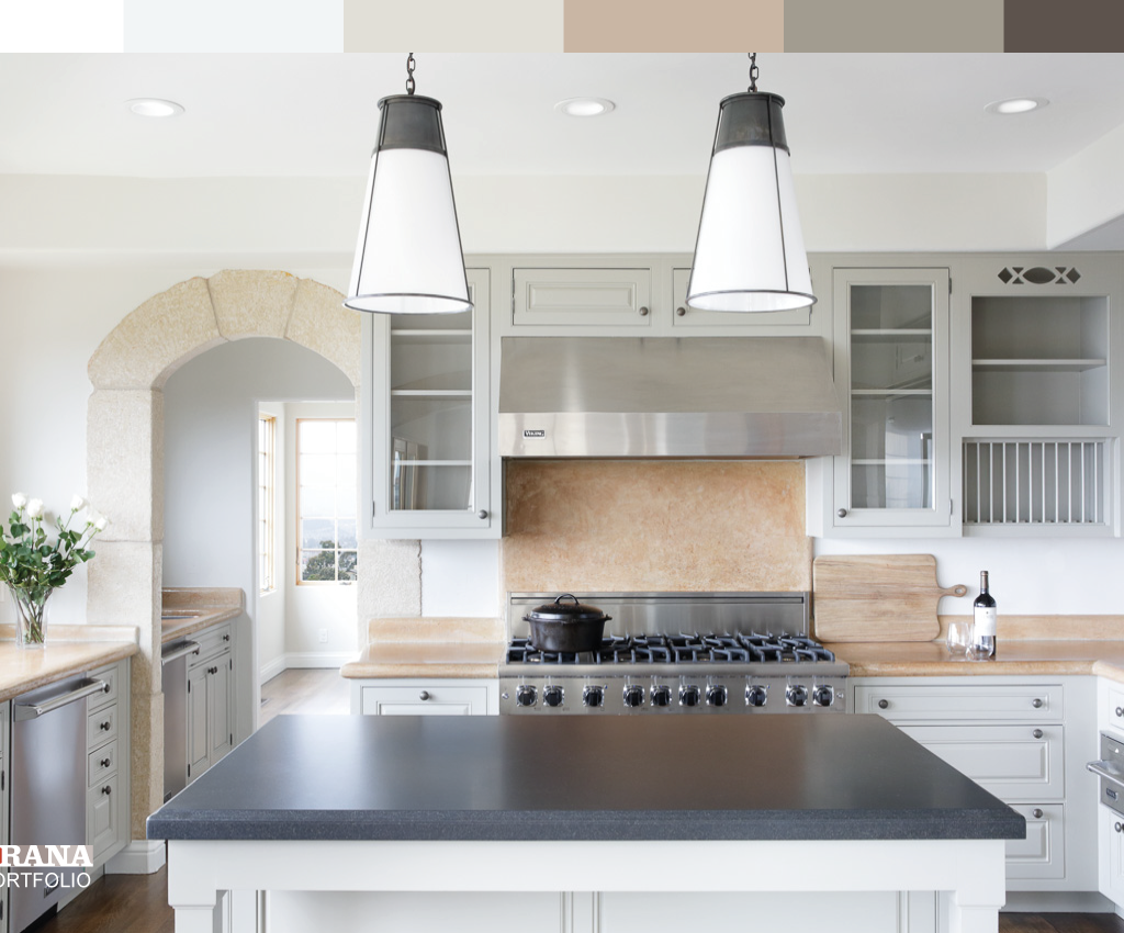
 Credit: www.kylieminteriors.ca
Soft Repose Gray walls create gentle contrast with white shaker cabinets and warm brown quartzite countertops.
Credit: www.kylieminteriors.ca
Soft Repose Gray walls create gentle contrast with white shaker cabinets and warm brown quartzite countertops.
Critical Factors to Consider When Choosing Your Wall Color
The "perfect" wall color for your white cabinets depends entirely on your kitchen’s unique layout, finishes, and lighting. Keep these key factors in mind to avoid a costly, avoidable mistake:
Coordinate With Your Fixed Finishes
Your countertops, backsplash, flooring, and cabinet hardware are all fixed elements you likely won’t change when you paint your walls, so your wall color needs to complement these existing finishes. As a general rule, match the undertone of your wall color to the dominant undertone of your fixed elements:
- If you have warm wood floors, warm stone countertops (like granite with brown or red veining), or brass hardware, opt for warm wall colors (beige, warm gray, terracotta, blush) to avoid a clashing, muddy look.
- If you have cool gray quartz countertops, cool gray flooring, or silver/chrome hardware, opt for cool wall colors (pale blue, soft green, cool gray) for a cohesive, balanced space.
- If you have a busy, patterned backsplash or colorful countertops, stick to a neutral wall color to avoid overwhelming the space.
Factor In Your Kitchen’s Natural and Artificial Light
Lighting dramatically changes how wall colors appear, so a shade that looks perfect in a hardware store swatch may look completely different in your kitchen. Follow these guidelines based on your kitchen’s light exposure:
- North-facing kitchens: Get cool, dim natural light all day, so opt for warm wall colors (warm beige, warm gray, blush) to brighten the space and counteract the cool blue cast of north-facing light.
- South-facing kitchens: Get bright, warm natural light all day, so cool wall colors (pale blue, soft green, cool gray) will prevent the space from feeling overly yellow or warm.
- East-facing kitchens: Get warm, golden morning light and cool afternoon light, so both warm and cool neutral shades work well; test samples to see which you prefer.
- West-facing kitchens: Get cool morning light and warm, golden afternoon light, so cool neutrals work well for all-day balance.
If your kitchen has limited natural light, stick to light, reflective shades (pale blue, soft gray, warm beige) rather than dark bold colors, which will make the space feel smaller and dimmer. For artificial light, note that warm LED bulbs (2700K) make warm wall colors pop, while cool LED bulbs (3000K+) make cool wall colors look brighter.
Choose the Right Paint Finish for Kitchen Walls
Kitchens are high-moisture, high-traffic spaces prone to grease splatters, water spills, and scuffs, so your paint finish is just as important as your color choice. The Painting and Decorating Contractors of America (PDCA) recommends the following finishes for kitchen walls:
- Eggshell or satin: The best all-around choice for most kitchens, these finishes have a subtle sheen that resists moisture, grease, and splatters, and can be wiped clean with a damp cloth without damaging the paint. They also hide minor wall imperfections better than higher-sheen finishes.
- Semi-gloss: Ideal for high-splash areas like the wall behind your stove, sink, or range hood, semi-gloss finishes are extremely durable and easy to clean, but they highlight every wall imperfection, so they’re not ideal for large, open wall spaces.
- Flat/matte: Not recommended for kitchens, as these finishes absorb moisture and grease, are impossible to clean without repainting, and show stains and scuffs immediately.
If you incorporate dedicated storage for hobbies like home winemaking into your kitchen layout, opting for a scratch-resistant, moisture-resistant wall finish will protect your walls and your supplies beginner-friendly winemaking kits. Built-in wine storage nooks are a popular addition for entertaining-focused kitchens, and pairing them with durable, easy-to-clean wall finishes ensures your space stays polished online winemaking and storage supplies.
Test Multiple Samples In Your Actual Space
Never rely on a tiny 1×1 inch swatch at the hardware store to make your final decision. Instead, buy 2×2 inch sample pots of your top 3-4 color choices, and paint 2ft x 2ft sections on multiple walls in your kitchen (light hits different walls differently, so testing just one wall can give you a false reading). Let the paint cure for 24 hours (some colors look lighter or darker as they dry), then view the samples at 8am, noon, 6pm, and under your kitchen’s artificial light at night. This simple step will save you from a costly, disappointing paint job.
Common Wall Color Mistakes to Avoid With White Cabinets
Even with the best research, it’s easy to make an avoidable error when pairing wall colors with white cabinets. Avoid these common pitfalls to get a flawless, professional-looking result:
- Ignoring cabinet undertones: Pairing a warm beige wall with cool white cabinets will create a dull, muddy look that feels off, even if you can’t put your finger on why. Always match undertones for a cohesive palette.
- Choosing dark colors in small, low-light kitchens: Deep navy, charcoal, or emerald walls can make a small, north-facing kitchen feel like a cave, no matter how bright your white cabinets are. If you love dark walls, limit them to a single accent wall, or use them only in kitchens with large windows and ample natural light.
- Forgetting to account for your backsplash and countertop: If you have white marble countertops and a white subway tile backsplash, pairing them with crisp white walls will create a flat, washed-out space with no visual interest. Opt for a soft neutral or pastel wall color to add subtle contrast.
- Using flat paint in high-splash areas: As mentioned earlier, flat paint will absorb grease and water stains from your stove or sink, leaving permanent marks that require full repainting to fix. Stick to satin or semi-gloss in these areas.
A well-coordinated wall and cabinet palette sets the stage for everything from casual weeknight meals to dinner parties, and for inspiration on creating a warm, entertaining-ready kitchen, check out Mediterranean culinary design ideas.
Frequently Asked Questions
What is the most popular wall color for white kitchen cabinets?
Soft warm gray and warm beige are the most popular wall colors for white kitchen cabinets, per 2024 NKBA design trend data. These neutral shades work with every design style, hide dirt and smudges well, and create a calm, inviting backdrop that lets your cabinetry and decor shine.
Do white cabinets make walls look darker?
Yes, white cabinets reflect light, which can make medium to dark wall colors appear slightly darker and more saturated than they do in a room with darker cabinetry. If you’re choosing a bold dark wall color, test a large sample in your space to make sure it’s not darker than you intended.
Can I use the same white on my walls and cabinets?
Yes, but only if your cabinets and walls have the exact same undertone and finish. Even a subtle difference in undertone (e.g., warm white cabinets and cool white walls) will be noticeable in natural light. If you do go with a matching white, add texture via shiplap walls, a textured backsplash, or varied cabinet finishes to avoid a flat, sterile look.
Should kitchen walls be lighter or darker than white cabinets?
Walls slightly lighter or matching the tone of white cabinets work best for most kitchens, as they create a bright, airy feel. If you prefer darker walls, opt for a shade that is only 1-2 shades darker than your cabinets to avoid overwhelming the space, and reserve dark colors for kitchens with ample natural light.
What wall color makes a small kitchen with white cabinets feel larger?
Light, cool-toned wall colors like pale blue, soft gray, and warm beige are the best choices for small kitchens, as they reflect light and create the illusion of more space. Avoid dark bold colors or heavy, dark wall decor, which will make the space feel cramped.
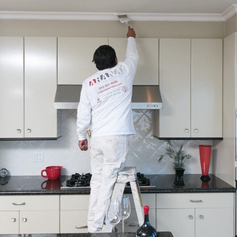 Credit: www.craftsmanpainters.com
A matte charcoal accent wall adds dramatic contrast to white modern kitchen cabinetry.
Credit: www.craftsmanpainters.com
A matte charcoal accent wall adds dramatic contrast to white modern kitchen cabinetry.
Conclusion
Pairing the right wall color with your white kitchen cabinets is one of the simplest, most high-impact upgrades you can make to your space, no full remodel required. The key to nailing the look is starting with your cabinet’s undertone, coordinating with your fixed finishes and lighting, and testing samples in your actual space before committing to a full paint job.
Whether you opt for a soft neutral, bold high-contrast shade, or gentle pastel, the right wall color will amplify your kitchen’s style, make the space feel larger, and create a welcoming atmosphere for everything from quick weeknight meals to hosting friends and family. If you’re also considering updating your cabinet color down the line, our guides to complementary wall shades for green and brown kitchen cabinets offer tailored recommendations for every design style.
Ready to start your kitchen refresh? For more guides to coordinating every element of your kitchen design, from cabinet hardware to durable backsplash materials, explore our full library of home improvement resources.