What Colour Walls Go With Dove Grey Kitchen Units: Stunning Ideas
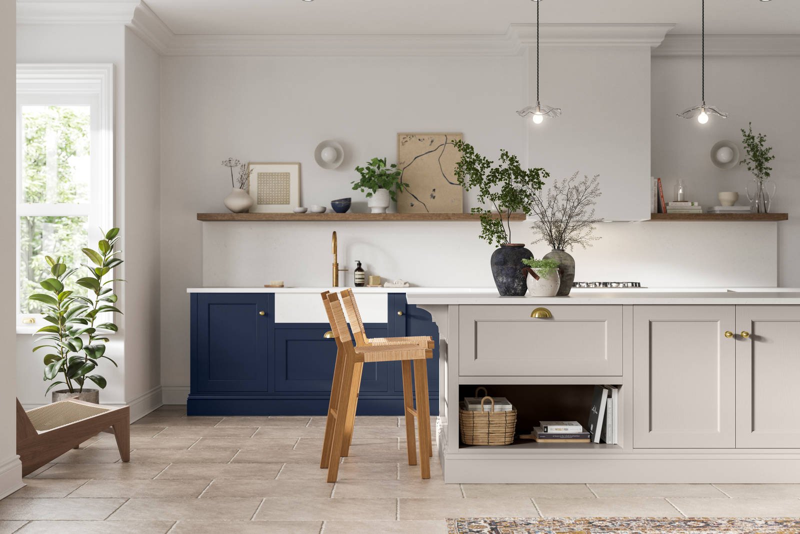
Dove grey kitchen units have earned their spot as one of the most popular cabinet finishes for 2026 remodels, striking the perfect balance between stark white and dark charcoal. Unlike pure white, they don’t show dirt or water stains as easily, and unlike dark charcoal, they don’t make small spaces feel cramped. The right wall color will enhance their soft, neutral tone, whether you want a cozy traditional kitchen, a bright modern space, or a dramatic contemporary hub. If you’re exploring other cabinet finishes for future projects, our wall pairings for green cabinetry guide covers similar neutral base considerations for equally versatile cabinet shades.
Why Dove Grey Kitchen Units Are the Perfect Design Base
Dove grey is a mid-tone neutral with subtle cool undertones, making it far more flexible than stark white or warm beige cabinets. It works with nearly every design style, from farmhouse to industrial, and pairs seamlessly with both warm and cool color families, so you won’t be limited to a narrow palette of wall shades. The National Kitchen and Bath Association lists dove grey as one of the top 3 cabinet choices for 2026 remotes, thanks to its ability to feel timeless without feeling boring, and its low maintenance requirements for busy households. UnlikeTrendy bold cabinet colors that fall out of style in 3-5 years, dove grey will look fresh and relevant for decades, making it a smart investment for any kitchen.
Key Factors That Determine Your Ideal Wall Color
Before diving into specific shade recommendations, there are three key variables that will change which wall color works best for your space, so you avoid costly, avoidable mistakes:
Kitchen Lighting
North-facing kitchens get cool, dim natural light, so warm neutrals or soft pastels work best to add coziness and prevent the space from feeling cold. South-facing kitchens get bright, warm sunlight all day, so cool tones or bold contrasts work well without feeling harsh or oversaturated. Don’t forget to account for your artificial lighting: cool white LED bulbs can make warm beige walls look slightly green, while warm incandescent bulbs can mute cool blue tones, making them appear almost grey next to your units. Always test paint samples under your existing kitchen bulbs before committing.
Cabinet Finish
Matte dove grey units absorb light, so they pair best with lighter, softer wall shades to avoid making your kitchen feel dark or heavy. Glossy dove grey units reflect light, so they can handle bolder, darker wall colors without overwhelming the space. You’ll also want to match undertones: if your dove grey has blue undertones, stick to cool or neutral wall shades; if it has neutral undertones, it will work with almost any color family.
Kitchen Size and Layout
Small galley kitchens, windowless pantries, or low-ceilinged spaces benefit from light, reflective shades (pale off-white, light greige, soft pastels) to maximize perceived space. Darker shades add coziness and define open-plan kitchen-living areas, but can feel oppressive in small, enclosed spaces if used on all four walls. If you love bold dark colors but have a small kitchen, limit them to a single accent wall behind your range or sink to add drama without shrinking the space. For warmer cabinet base options, our brown cabinet wall guide breaks down complementary warm neutrals for similar mid-tone cabinet finishes.
Stunning Wall Color Pairings for Dove Grey Units, Sorted by Style
Warm Neutral Pairings (Cozy, Traditional, Farmhouse)
Warm neutrals are the most versatile, foolproof option for dove grey units, creating a cozy, inviting space that works for nearly any kitchen style. Opt for shades with subtle yellow or brown undertones — think warm off-white, soft taupe, or warm greige with 10-20% beige pigment — to balance dove grey’s cool base without clashing. These shades are ideal for north-facing kitchens with limited natural light, as their warm undertones add coziness to dim, cool spaces. They also pair seamlessly with natural wood accents, brushed brass hardware, and classic shaker-style doors for a timeless farmhouse or cottage look.
A common mistake when pairing warm neutrals with dove grey is choosing shades with strong red undertones, which can create a muddy, uncoordinated effect next to the grey’s cool base. To avoid this, hold warm beige swatches up to your dove grey units in natural light before buying — if the beige looks slightly orange or pink next to the grey, skip it.

Cool Tone Pairings (Modern, Minimalist, Coastal)
Cool tones highlight the calm, airy feel of dove grey, making them perfect for modern, minimalist, and coastal kitchen styles. Stick to desaturated, muted shades like pale seafoam green, soft sky blue, muted lavender, or cool greige with subtle blue undertones — avoid overly saturated brights like royal blue or turquoise, which will clash with dove grey’s soft mid-tone. These shades work best in south-facing kitchens with plenty of natural light, as their cool undertones keep the space feeling fresh even on hot days. Pair them with white subway tile backsplashes, matte black hardware, and sleek quartz countertops for a crisp, contemporary look.
Bold Contrast Pairings (Dramatic, Contemporary, High-End)
If you want to make a statement, bold wall colors create striking contrast with dove grey’s soft mid-tone, adding depth, drama, and sophistication to your space. Top shades for this pairing include deep navy, forest green, charcoal, and rich plum — all desaturated enough to feel intentional, not overwhelming. These shades work best in large, open-plan kitchens with plenty of natural light, as dark walls absorb light and can feel oppressive in small, windowless spaces.
For hesitant DIYers, start with a single bold accent wall behind your range or dining area instead of painting all four walls, which adds drama without the risk of making your kitchen feel dark. Pair bold walls with light, neutral decor (white countertops, light wood accents) and ample artificial lighting to keep the space feeling balanced, not heavy. A common mistake when using bold wall colors with dove grey is choosing shades with clashing undertones (e.g. a warm red-based navy with cool dove grey), which can create a jarring, uncoordinated look. Stick to neutral-based bold shades for the most harmonious result.

Soft Pastel Pairings (Bright, Cheerful, Eclectic)
Soft pastels bring a delicate, cheerful touch to dove grey kitchens without overwhelming the space’s soft neutral base. Opt for cool-leaning pastels like blush pink, mint green, pale butter yellow, or soft lavender to complement dove grey’s cool undertones — avoid pastels with strong warm orange or red undertones, which can clash with the grey. These shades are ideal for small kitchens, family homes with kids, or eclectic design styles, as they add subtle personality without feeling cloying. Pair them with white trim, light wood accents, and simple decor to keep the space feeling fresh and airy.
2026 Trending Wall Color Ideas for Dove Grey Kitchens
Current kitchen design trends for 2026 prioritize timeless, low-maintenance shades that won’t feel outdated after a few years, with a focus on balancing dove grey’s neutral base with subtle personality. Top trending pairings include:
- Warm greige: The ultimate versatile bridge between warm and cool undertones, warm greige works with every dove grey finish and suits every design style from farmhouse to contemporary.
- Deep forest green: A top accent color for 2026, muted forest green adds moody, natural depth to dove grey units, especially when paired with brass hardware and marble countertops.
- Soft terracotta: A warm, muted pop that adds coziness without overwhelming, perfect for Mediterranean, farmhouse, and eclectic kitchen styles.
- Micro-cement: For a sleek, industrial look, seamless micro-cement walls pair perfectly with matte dove grey units, ideal for open-plan loft spaces. The National Kitchen and Bath Association emphasizes that pairing neutral cabinet bases like dove grey with intentional, complementary wall colors is one of the most cost-effective ways to refresh a kitchen without a full, expensive renovation. Kitchen color design guidance from the NKBA notes that these 2026 trends prioritize shades that work with existing decor rather than requiring a full overhaul of your kitchen’s look.
How to Test Wall Colors Before Committing
Paint can look drastically different on your walls than it does on a small swatch at the hardware store, so testing is non-negotiable to avoid costly, frustrating mistakes. Follow these steps to ensure your chosen shade looks perfect in your space:
Sample Pot Best Practices
Buy small sample pots of your top 3 shades, and paint 2×2 foot patches on at least three different walls in your kitchen: one near a window, one in a shadowed corner, and one behind your main work area. Let the paint dry for 24 hours before evaluating, as wet paint looks 1-2 shades darker than dry paint. Small 1-inch swatches don’t show the full effect of the color at scale, so always test on a large enough area to see how it interacts with your dove grey units.
Lighting Tests
Check your sample patches at 7am (cool morning light), 12pm (bright midday light), and 7pm (warm evening light), plus under your kitchen’s artificial lighting at night. This will show you how the color shifts throughout the day and ensure it looks good at all times, not just in perfect midday sun.
Long-Term Compatibility
Hold up swatches of your planned backsplash, countertop, hardware, and even your favorite dishware to the paint patch to ensure all elements work together. A common mistake is choosing a wall color that looks great on its own but clashes with your existing or planned decor. As the paint testing best practices guide from the University of Minnesota Extension recommends, this step eliminates 90% of paint regret for homeowners.
Complementary Decor to Tie Your Look Together
Once you’ve chosen your wall color, pair it with complementary decor elements to create a cohesive, polished look that feels intentional, not mismatched:
Backsplash Pairings
White subway tile is a classic, foolproof option that pairs with any wall color for a clean, timeless look. For a more elevated feel, choose marble-effect tiles with subtle grey veining to tie into the dove grey units. If you prefer pattern, opt for muted geometric matte tiles in a shade 2-3 darker than your wall color for depth. Avoid overly bright or dark backsplashes that compete with your wall color for attention.
Countertop Pairings
White or light grey quartz creates a fresh, airy feel that works with any wall color. Warm wood countertops (oak, walnut) add natural warmth that complements both warm and cool wall shades. Honed marble adds subtle texture and elegance, perfect for sophisticated designs. Avoid dark granite or black countertops if you have light walls and a small kitchen, as they can make the space feel heavy.
Flooring Pairings
Light oak or maple hardwood floors add warmth and blend seamlessly with dove grey units and any wall color. Warm grey or beige ceramic tile is a durable, low-maintenance option that works with both warm and cool wall shades. Patterned terrazzo or subtle encaustic tile adds personality without overwhelming the space. Avoid very dark hardwood or black tile, which can make even large kitchens feel small and dim.
Hardware and Accessories
Use small accents to tie your wall color to the rest of your kitchen: brushed brass or gold hardware adds warmth to cool wall shades, while matte black hardware adds sophistication to bold wall colors. Add throw rugs, dishware, and small decor in shades that pick up your wall color’s undertones for a cohesive, intentional look. Once you’ve finalized your color scheme, consider small, low-lift updates like updating a wall-mounted faucet or replacing dated hardware to refresh the space before committing to a full repaint.
Frequently Asked Questions
What wall colours complement dove grey kitchen units?
The most versatile wall colors for dove grey units are warm off-whites, soft cool blues, warm greige, and deep navy. The exact shade depends on your kitchen’s lighting, size, and desired style: warm neutrals work best for north-facing, cozy spaces, while cool tones suit sunlit, modern kitchens. Avoid shades with clashing undertones (e.g. red-toned beige with cool dove grey) which can create a muddy, uncoordinated look.
Can bold colours work with dove grey kitchen units?
Absolutely. Bold shades like forest green, deep plum, and charcoal create striking contrast with dove grey’s soft mid-tone, adding depth and personality to your space. For small or windowless kitchens, limit bold colors to a single accent wall to avoid making the room feel cramped, and balance them with light, neutral decor and ample artificial lighting.
Are warm tones suitable with dove grey kitchen units?
Yes, as long as you choose warm shades with undertones that complement dove grey’s cool base. Soft peach, warm cream, muted terracotta, and greige with brown undertones add coziness without clashing. Avoid warm shades with strong red or orange undertones, which can make the grey look dull and lifeless next to the cabinets.
Should kitchen walls be lighter or darker than dove grey units?
There is no hard rule, but the choice depends on your goals: lighter walls (off-white, pale pastels, light greige) make small kitchens feel larger and brighter, and are ideal for spaces with limited natural light. Darker walls (navy, charcoal, forest green) add drama, sophistication, and coziness to large, open-plan kitchens with plenty of natural light. If you’re unsure, start with a lighter shade and add depth with an accent wall or dark decor.
Can I use wallpaper with dove grey kitchen units?
Yes, as long as you choose durable, washable wallpaper rated for kitchen use (look for vinyl or wipeable paper grades). Subtle, textured patterns like grasscloth or faint geometric prints add depth without clashing with dove grey’s soft tone. Avoid bold, busy patterns in small kitchens, as they can overwhelm the space.
Do I need to match my wall color to my backsplash?
Not at all — in fact, matching them exactly can flatten your kitchen’s visual depth. Aim for a 2-3 shade difference between your wall and backsplash for a layered, intentional look. For example, pair dove grey units with a pale blue wall and a slightly darker blue geometric tile backsplash for a cohesive, polished design.
Final Recommendations
Dove grey kitchen units offer endless design flexibility, and the right wall color can transform your space from bland to stunning, no full renovation required. For most homeowners, warm greige or soft off-white walls are the safest, most versatile choice that works with any cabinet finish, lighting condition, and decor style. If you want to add more personality, opt for a soft cool tone like pale seafoam for a calming, modern feel, or a single bold accent wall in deep navy for dramatic contrast. No matter which shade you choose, always test samples in your space first to account for your home’s unique lighting, and pair your wall color with complementary backsplash, countertop, and decor elements for a cohesive, polished look that feels intentional, not mismatched. If your kitchen doubles as a hosting hub, a warm, inviting wall color sets the perfect backdrop for dinner parties, whether you’re serving dishes from our Rome pasta and wine guide or casual weeknight meals. For more budget-friendly kitchen refresh ideas and functional design tips, explore our overview of home wine making tools to add stylish, practical storage to your updated space. Ready to start your kitchen refresh? Grab 3 sample pots of your top shades this weekend and test them in your space — you’ll be amazed how much your home’s unique light changes the way paint looks next to your dove grey units.