What Colour Walls With White Kitchen Cabinets: Stunning Color Ideas
White kitchen cabinets are a perennially popular choice for their bright, clean, and timeless appeal, but picking the right wall color to pair with them can feel overwhelming. The wrong shade can make your space feel cold, stark, or disjointed, while the perfect hue will make your cabinets pop, tie together your countertops and backsplash, and set the exact mood you want for your kitchen—whether that’s a cozy cottage vibe, a sleek modern look, or a bold statement space.
In this guide, we’ll break down stunning, vetted wall color ideas for every style, kitchen size, and lighting condition, plus practical tips to avoid common design mistakes and create a cohesive, inviting space that feels uniquely yours. For more on this, see our guide on what color to paint my kitchen walls with.
Key Factors to Consider Before Choosing Your Wall Color
Before diving into specific shades, start with these core considerations to narrow down your options and avoid costly repaint mistakes:
1. Identify Your White Cabinet Undertone
Not all white cabinets are created equal: cool, blue-based whites (common in modern and coastal kitchens) pair best with cool wall tones like pale blue, soft gray, and lavender, while warm, yellow or beige-based whites (common in traditional and farmhouse kitchens) complement warm hues like beige, peach, terracotta, and warm taupe. A simple trick to test your cabinet undertone: hold a plain white piece of paper next to the cabinets in natural light. If the paper looks yellow next to the cabinets, you have cool white cabinets; if it looks blue, you have warm white cabinets.
2. Assess Your Kitchen’s Natural Light
North-facing kitchens get cool, dim light, so warm wall colors (beige, soft peach, warm gray) will help balance the coolness and make the space feel brighter. South- and west-facing kitchens get warm, bright direct sun, so cool tones (pale blue, soft mint, cool gray) will prevent the space from feeling overwhelming. If your kitchen has no windows, opt for light, reflective wall colors and finishes to bounce available light around the room.
3. Note Your Room Size
Light, cool wall colors recede visually, making small or narrow kitchens feel larger and more open. Dark, bold wall colors advance, which can make large kitchens feel cozy and intimate, but will make small spaces feel cramped unless used as a single accent wall.
4. Match Your Existing Hard Surfaces
Take stock of your countertops, backsplash, and flooring undertones: cool gray granite pairs best with cool wall tones, warm butcher block pairs best with warm hues, and neutral quartz works with almost any shade. If you have a busy, patterned tile backsplash, opt for a solid, neutral wall color to avoid visual clutter.
Top Neutral Wall Colors for White Kitchen Cabinets
Neutral shades are the most versatile, low-risk option for white kitchen cabinets, offering a timeless backdrop that lets your cabinets, countertops, and decor shine. These are the most popular, foolproof neutral picks for 2026:
Soft Warm Gray Tones
Soft warm grays are the most sought-after neutral for white kitchens, offering subtle contrast without feeling cold or stark. Shades like Benjamin Moore Repose Gray, Sherwin-Williams Agreeable Gray, and Valspar Ash Gray have subtle beige undertones that complement both cool and warm white cabinets, and work with every countertop material from stainless steel to natural wood. Warm grays also hide minor wall scuffs and dirt far better than pure white or cool gray, making them ideal for busy family kitchens.
Warm Beige & Taupe Shades
For a cozy, welcoming vibe, warm beige and taupe shades add softness to crisp white cabinets without darkening the space. Popular 2026 picks include Benjamin Moore Accessible Beige, Sherwin-Williams Kilim Beige, and Farrow & Ball Elephant’s Breath. These shades work especially well in kitchens with warm lighting, wood flooring, or brass hardware, and create a soft, timeless backdrop that never goes out of style.
Greige (Gray + Beige) Blends
Greige strikes the perfect balance between cool gray and warm beige, making it compatible with both cool and warm white cabinets. Shades like Benjamin Moore Edgecomb Gray, Sherwin-Williams Worldly Gray, and Behr Silver Sage are versatile enough to work with every décor style, from farmhouse to modern minimalist. Greige also adds subtle depth to white kitchens, making the space feel more layered without feeling busy.
Warm Off-White Walls
If you want subtle contrast without introducing a distinct color, warm off-white walls (like Benjamin Moore White Dove, Sherwin-Williams Alabaster, or Farrow & Ball Cornforth White) are a perfect pick. These shades have subtle yellow or beige undertones that soften the starkness of bright white cabinets, creating a cohesive, monochromatic look that feels warm and inviting, not clinical.
 Warm greige like Repose Gray adds depth to white kitchens while hiding minor wall imperfections.
Credit: www.kylieminteriors.ca
Warm greige like Repose Gray adds depth to white kitchens while hiding minor wall imperfections.
Credit: www.kylieminteriors.ca
Bold & Vibrant Wall Colors for a Statement Kitchen
If you want to add personality and drama to your white kitchen, bold, saturated wall colors are a stunning, low-commitment option (you can paint an accent wall first to test the look before committing to all four walls):
Deep Navy & Inky Blue
Deep navy walls create a sophisticated, cozy contrast with white cabinets that feels both timeless and modern. Popular 2026 shades include Benjamin Moore Hale Navy, Sherwin-Williams Naval, and Farrow & Ball Hague Blue. Navy works especially well with brass or gold hardware, natural wood accents, and marble countertops, and can actually make small kitchens feel larger by drawing the eye upward to the white upper cabinets. For a softer take, opt for a medium navy for all walls, or a deep navy accent wall behind your range or sink.
Forest Green & Sage
Earthy forest green adds a natural, calming vibe to white kitchens, while softer sage green offers a more muted, Scandinavian-inspired look. Top picks include Benjamin Moore Forest Green, Sherwin-Williams Evergreen Fog, and Farrow & Ball French Gray. Pair green walls with potted herbs, wooden cutting boards, and matte black hardware for a cohesive, organic feel. This is a great option for kitchens with lots of natural light, as the green won’t feel too dark.
Terracotta & Clay
Warm terracotta and clay shades add earthy, cozy warmth to white cabinets, perfect for farmhouse, southwestern, or Mediterranean-style kitchens. Popular shades include Benjamin Moore Rustic Red, Sherwin-Williams Cavern Clay, and Farrow & Ball Red Earth. For a more muted take, opt for a soft clay tone with subtle red undertones that won’t overwhelm the space. Pair with natural stone countertops and woven textiles for a warm, lived-in feel.
Sunshine Yellow & Butter
Bright, cheerful yellow walls inject energy and warmth into white kitchens, making the space feel sunny and welcoming even on overcast days. For a look that’s playful but not overwhelming, opt for a muted butter yellow (like Benjamin Moore Hawthorne Yellow or Sherwin-Williams Meadowlark) instead of a neon shade. Yellow works especially well in small, windowless kitchens, as it bounces light around the space to make it feel larger.
Cool & Calm Hues for an Airy, Relaxed Kitchen
Cool wall colors are ideal for warm climates, south-facing kitchens, or anyone who wants a bright, refreshing, spa-like feel in their cooking space:
Pale Blue & Sky Blue
Soft pale blue is one of the most popular wall colors for white kitchen cabinets, evoking the calm of a clear sky or coastal sea. Top 2026 picks include Benjamin Moore Palladian Blue, Sherwin-Williams Waterfall, and Farrow & Ball Borrowed Light. Pale blue works beautifully with stainless steel appliances, silver fixtures, and white subway tile backsplashes, and feels especially fresh in coastal or modern kitchens.
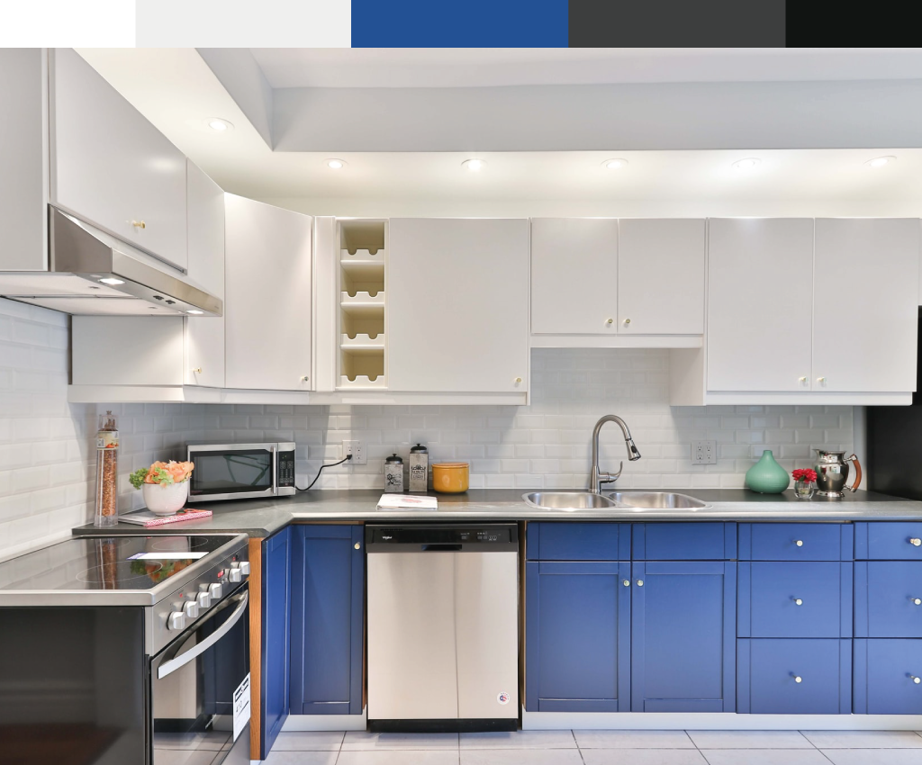 Soft light blue walls create a calm, airy feel that complements white cabinets and stainless steel appliances.
Credit: www.craftsmanpainters.com
Soft light blue walls create a calm, airy feel that complements white cabinets and stainless steel appliances.
Credit: www.craftsmanpainters.com
Soft Mint & Seafoam
Mint and seafoam green add a subtle, refreshing pop of color to white kitchens without feeling too bold. Shades like Benjamin Moore Sea Salt, Sherwin-Williams Mint Condition, and Farrow & Ball Pale Powder have subtle gray undertones that keep them feeling calm, not loud. Pair with natural wood countertops and potted succulents for a fresh, organic vibe.
Muted Lavender & Lilac
Soft purple tones like lavender and lilac add a subtle, elegant touch to white kitchens, creating a soothing, calming atmosphere that’s perfect for winding down after a long day. Popular shades include Benjamin Moore Lilac, Sherwin-Williams Magic, and Farrow & Ball Parma Gray. These shades work especially well with gray or beige accents, and feel particularly cozy in kitchens with warm, ambient lighting.
Warm & Cozy Wall Colors for an Inviting Space
If you want your kitchen to feel like the heart of your home—warm, welcoming, and perfect for gathering with friends and family—these warm wall shades are ideal, especially for north-facing kitchens or cold climates:
Soft Peach & Apricot
Soft peach and apricot tones add a gentle, sunny warmth to white cabinets that feels friendly and approachable, not overwhelming. Popular 2026 picks include Benjamin Moore Peach Echo, Sherwin-Williams Peachtree, and Farrow & Ball Setting Plaster. Peach walls soften the starkness of white cabinets, making the space feel less clinical and more lived-in, and pair beautifully with brass fixtures and wooden bar stools.
Warm Mushroom Taupe
Mushroom taupe is a rich, earthy neutral that adds subtle warmth and depth to white kitchens without feeling dark. Shades like Benjamin Moore Shaker Beige, Sherwin-Williams Sewer Taupe, and Farrow & Ball Mouse’s Back work especially well with natural wood flooring, stone countertops, and vintage decor, creating a cozy, rustic-modern vibe.
Creamy Off-White
For a monochromatic, cohesive look, creamy off-white walls (with subtle yellow or beige undertones) are a perfect pick. Shades like Benjamin Moore Classic Gray, Sherwin-Williams Creamy, and Farrow & Ball Pointing have just enough warmth to complement white cabinets without looking exactly the same, creating a soft, layered look that feels timeless.
Modern Dark & Contrasting Wall Ideas
Dark wall colors are a bold, trendy pick for white kitchen cabinets, adding drama and sophistication to large, well-lit spaces:
Charcoal & Matte Black
Dark charcoal or matte black walls create a dramatic, high-contrast look that makes white cabinets pop like nothing else. Popular shades include Benjamin Moore Iron Mountain, Sherwin-Williams Iron Ore, and Farrow & Ball Off-Black. To keep the space from feeling too dark, pair dark walls with light countertops (white quartz, marble), plenty of under-cabinet lighting, and metallic accents (brass, gold, or silver hardware and light fixtures). You can also paint just one accent wall (behind the range, sink, or island) to get the dramatic effect without committing to all four walls.
Dark Emerald & Forest Green
Deep emerald green walls add a luxurious, moody vibe to white kitchens, perfect for modern, art deco, or maximalist spaces. Top picks include Benjamin Moore Emerald, Sherwin-Williams Rockweed, and Farrow & Ball Studio Green. Pair with marble countertops, brass fixtures, and dark wood flooring for a high-end, sophisticated look.
Metallic & Textured Finishes
For a truly modern luxe feel, consider a subtle metallic paint (like Benjamin Moore Metallic Paint in silver, gold, or copper) or a textured grasscloth wallpaper on a single accent wall. Metallic finishes reflect light beautifully against white cabinets, making the space feel larger and more dynamic, while textured finishes add subtle depth without overwhelming the room. Avoid full-wall high-gloss metallic, which can feel overwhelming; stick to accent walls or small areas like the wall behind an open shelf.
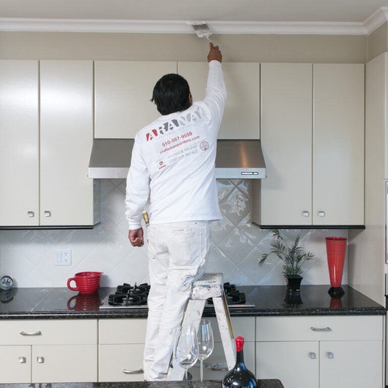 A deep navy accent wall adds dramatic contrast to white cabinets without overwhelming the whole space.
Credit: www.craftsmanpainters.com
A deep navy accent wall adds dramatic contrast to white cabinets without overwhelming the whole space.
Credit: www.craftsmanpainters.com
Paint Finish Tips for Kitchen Walls
The right paint finish will make your chosen wall color look its best, stand up to kitchen messes, and last for years without fading or peeling:
Best Finishes for High-Traffic Kitchen Areas
For walls near the stove, sink, or high-traffic walkways, opt for satin, semi-gloss, or eggshell finishes, which are moisture-resistant, scrubbable, and hold up to splatters, steam, and daily cleaning. Flat or matte finishes are best for low-traffic areas away from cooking zones, as they hide wall imperfections well but are harder to clean.
Low-VOC Options for Better Indoor Air Quality
Kitchens are high-moisture areas where paint fumes can linger, so opt for low- or zero-VOC (volatile organic compound) paints to reduce indoor air pollution. The U.S. Environmental Protection Agency sets strict safety standards for indoor paints, which are ideal for kitchens to reduce exposure to harmful fumes during application and over time. This is especially important for homes with children, pets, or residents with respiratory sensitivities.
How Finish Affects Color Perception
A higher-gloss finish will make your wall color appear brighter and more saturated, while a matte finish will mute the tone slightly. If you’re choosing a bold color, test both finish options on a 2×2 foot swatch to see how the color looks in your kitchen’s specific lighting before committing.
Coordinating Wall Colors With Countertops & Backsplashes
Your wall color doesn’t exist in a vacuum: it needs to complement your existing hard surfaces to create a cohesive, balanced space. Use this quick reference table to match your countertop material to the perfect wall shade:
| Countertop Material | Matching Wall Undertone | Example Shade |
|---|---|---|
| Cool gray granite or marble | Cool | Pale blue, soft gray, muted lavender |
| Warm butcher block or terracotta tile | Warm | Beige, soft peach, warm taupe |
| Neutral quartz or solid surface | Neutral | Greige, soft sage, warm off-white |
| Dark black or charcoal granite | Neutral or cool | Light gray, pale blue, soft white |
| If you have a busy, patterned tile backsplash (like geometric cement tile or ornate ceramic), opt for a solid, neutral wall color to avoid visual clutter. If your backsplash is plain (like white subway tile or solid stone), you can opt for a bolder wall color or subtle texture to add interest. If you’re also updating your kitchen’s plumbing fixtures as part of your refresh, our guide to removing an old wall-mounted faucet will help you prep the space for a seamless update. |
Common Mistakes to Avoid When Choosing Kitchen Wall Colors
Even the most stunning wall shade can fall flat if you make one of these common design errors:
- Ignoring your cabinet undertone: As mentioned earlier, pairing cool white cabinets with warm beige walls will make the cabinets look dull and yellowed, while warm white cabinets paired with cool blue walls will look stark and uninviting. Always test swatches against your cabinets in natural light at different times of day.
- Skipping the sample test: Paint colors look completely different in a store than they do in your kitchen, thanks to differences in lighting, existing fixtures, and surrounding colors. Paint 2×2 foot swatches on multiple walls, live with them for 3 days, and view them in morning, afternoon, and evening light before making a final decision.
- Using flat paint in high-moisture areas: Flat paint absorbs moisture and is impossible to clean, so it will peel and stain quickly near the stove, sink, or dishwasher. Stick to satin, semi-gloss, or eggshell finishes in these areas.
- Clashing with your flooring: If you have warm wood flooring, avoid cool, blue-based wall colors that will create a disjointed, mismatched look. Stick to warm or neutral wall shades to tie the space together.
Frequently Asked Questions
What wall colors complement white kitchen cabinets?
The most versatile, foolproof wall colors for white kitchen cabinets are neutral shades like soft warm gray, warm beige, greige, and warm off-white, which work with every décor style and cabinet undertone. For bolder looks, pale blue, soft sage, muted lavender, deep navy, forest green, and terracotta are all stunning options. The best shade for your space will depend on your kitchen’s lighting, size, and existing countertop and backsplash materials.
Can I use bold colors with white kitchen cabinets?
Absolutely—bold wall colors like deep navy, forest green, terracotta, and even matte black create stunning, high-contrast looks that make white cabinets pop. To avoid overwhelming the space, start with a single accent wall (behind your range, sink, or island) if you’re new to bold colors, and pair the bold shade with light countertops and plenty of lighting to keep the space feeling balanced.
Are neutral colors better for white kitchens?
Neutral wall colors are a low-risk, timeless pick for white kitchens, as they create a cohesive, calm backdrop that lets your cabinets, countertops, and decor take center stage. They’re also ideal if you plan to sell your home soon, as neutral palettes have broad appeal. That said, bold or colorful wall shades are a great choice if you want to add personality and make your kitchen feel uniquely yours.
How do light wall colors affect small kitchen spaces?
Light, cool wall colors (pale blue, soft gray, light sage) recede visually, making small or narrow kitchens feel larger, brighter, and more open. They also bounce natural light around the room, making windowless or dim kitchens feel airy. Avoid dark or bold wall colors on all four walls of a small kitchen, as they will make the space feel cramped and closed-in.
Do I need to match my wall color to my backsplash?
You don’t need to match your wall color to your backsplash exactly, but you should align their undertones to create a cohesive look. For example, a warm beige tile backsplash will pair best with warm beige or greige walls, while a cool gray marble backsplash will look best with cool gray or pale blue walls. If you have a busy, patterned backsplash, opt for a solid, neutral wall color to avoid visual clutter.
Final Tips for Choosing the Perfect Wall Color
Pairing the right wall color with your white kitchen cabinets is one of the easiest ways to transform your space without a full renovation. Start by assessing your cabinet undertone, kitchen lighting, and existing hard surfaces to narrow down your options, then test 2-3 swatches in your space before making a final call. Whether you opt for a soft neutral, a cool calm hue, or a bold dramatic shade, the right wall color will make your white cabinets shine and turn your kitchen into the heart of your home.
If you’re planning a full kitchen refresh as part of your repaint project, check out our guide to removing an old wall-mounted faucet to prep your space for new fixtures, or explore our tailored wall color guides for green kitchen cabinets and brown kitchen cabinets if you’re considering a cabinet update down the line.